
Cookie Consent Banner
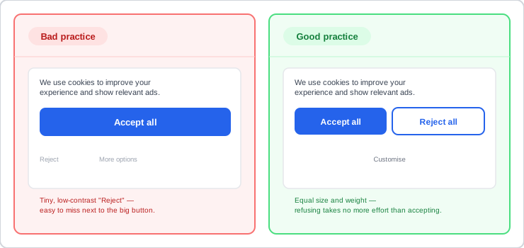 The difference between these two banners is the difference between a consent mechanism that’s actually valid and one a regulator would reject on sight.
Background
A cookie consent banner is the concrete UI a customer actually meets when GDPR (General Data Protection Regulation)‘s freely-given/specific/informed/unambiguous consent requirements come due — the legal conditions state what a valid consent has to be, but not what button layout, toggle default, or re-prompt schedule actually satisfies them in practice. It sits alongside Privacy Preferences‘s broader point that customers vary in how much disclosure and control they expect, and its most common failure mode is really a dark pattern wearing a compliance costume: a banner that looks like it’s offering a real choice while quietly steering toward acceptance.
Problem
A banner can look compliant — it mentions cookies, it has a button — while still failing to gather valid consent. Common ways this happens: a prominent “accept all” paired with only a buried “more options” path and no equally visible “reject all”; non-essential category toggles defaulted on rather than off; consent folded into a general terms-and-conditions acceptance instead of asked for separately; a long, undifferentiated wall of checkboxes that customers disengage from rather than actually read; a “legitimate interests” toggle defaulted on next to a separate “consent” toggle defaulted off, so the real choice is dressed up to look secondary; and a banner built and tested only for desktop that becomes hard to read or interact with on mobile, invalidating any consent gathered there.
A banner can look compliant — it mentions cookies, it has a button — while still failing to gather valid consent.
Solution
Give “reject all” the same visual prominence as “accept all”
Show both options at equal size and visual weight, with a “customise”/“more options” path alongside them for granular choices — not folded behind a link while “accept all” gets the primary button treatment. If refusing takes visibly more effort or attention to find than accepting, the resulting consent isn’t the freely-given choice GDPR (General Data Protection Regulation) requires.
Turn every non-essential category toggle off by default
Break choices into named purposes (e.g. essential, analytics, social media tracking, advertising) with essential left untoggleable and on, and every other category defaulted off until the customer actively turns it on. Never default a “legitimate interests” toggle to on beside a “consent” toggle defaulted to off — that pairing is specifically called out as designed to make genuine consent look like the secondary option.
Never default a “legitimate interests” toggle to on beside a “consent” toggle defaulted to off — that pairing is specifically called out as designed to make genuine consent look like the secondary option.
Never fold consent into a terms-and-conditions acceptance
Ask for cookie/tracking consent as its own separate action, with its own specific information about what’s being agreed to — not bundled into “I agree to the Terms and Conditions.” A single acceptance covering unrelated purposes at once (marketing personalization bundled with unrelated cookie categories, say) is unlikely to count as specific, informed consent either.
Keep a persistent, easy way to change consent later
Surface a standing settings control (a footer link, a persistent icon) that reopens the same consent mechanism at any time, rather than making the banner a one-time, unrepeatable prompt. Withdrawing consent has to be exactly as easy as giving it, and the mechanism has to be technically capable of actually removing what was already set — not just hiding the banner while cookies already placed keep running.
Withdrawing consent has to be exactly as easy as giving it, and the mechanism has to be technically capable of actually removing what was already set — not just hiding the banner while cookies already placed keep running.
Don’t re-prompt someone who’s already said no, too soon
Once a customer has refused, respect that choice for a real stretch of time rather than asking again on every visit hoping for a different answer — roughly six months is a reasonable interval to treat as a floor, except when the purpose or technology itself has genuinely changed, which calls for fresh consent regardless of timing.
Design and test the banner on mobile, not just desktop
A message box or overlay built and tested only on a desktop viewport routinely becomes hard to read or interact with on a phone — cramped tap targets, text that requires zooming, a “reject” path that’s technically present but practically unusable. Consent gathered from an interface that doesn’t actually work on the device it was shown on is on shaky ground regardless of its wording.
Related Concepts
Patterns
Principles
Standards
Further reading
Nielsen Norman Group’s “Cookie Permissions 101” (commercially published, no stated open license) makes the same equal-prominence accept/reject case above from a usability-research angle rather than a legal one, framing a manipulative-looking banner as a trust cost to the brand regardless of its technical compliance.
Sources
Guidance on the Use of Storage and Access Technologies (ICO) is this page’s sole source — the equal-prominence accept/reject requirement, granular default-off category toggles, the T&Cs-bundling ban, the legitimate-interests-toggle dark pattern, withdrawal-with-same-ease requirement, the six-month re-prompt guideline, and the mobile-usability caution all come directly from that guidance.