
Clear First Reads
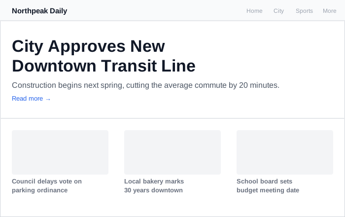 One headline, sized and positioned to dominate the page, while three secondary stories recede into uniform gray text below it.
Background
The first read is the single dominant visual element a visitor’s eye lands on first — a technique borrowed from graphic design, functioning as the page’s overall first impression or “gestalt” rather than any one fixed element type. Depending on the page, it can be a company logo, page title, news headline, advertisement, product name, or product image. The word choice isn’t a coincidence: a first read works by making one element the perceptual figure and everything else the receding ground, which is exactly Gestalt psychology‘s figure-ground organization principle applied to a Web page. The first read competes for the same scarce space as everything that needs to be Above the Fold — making it large enough to dominate the page can itself crowd out other above-the-fold content, so the two patterns have to be balanced against each other.
The first read is the single dominant visual element a visitor’s eye lands on first — a technique borrowed from graphic design, functioning as the page’s overall first impression or “gestalt” rather than any one fixed element type.
Problem
A Web page accumulates many competing goals and elements (branding, promotions, navigation, content) and risks losing any single unifying focus.
A Web page accumulates many competing goals and elements (branding, promotions, navigation, content) and risks losing any single unifying focus.
Solution
Pick one deliberate focus per page (or per group of similar pages), then make it stand out by coordinating several visual contrast variables at once rather than relying on just one: color (high contrast against the background — complementary colors, or simply black text on white), size (larger than every surrounding element), font (clean sans-serif faces such as Arial or Verdana read cleanly at a glance; avoid ornate display faces — Clear Typography covers how typeface choice, weight, and setting interact with readability at length), and position (top left is the conventional default — both because “inverse-L” navigation bars running along the top and left edge naturally converge there, and because most customers read left-to-right and top-to-bottom — though this is a default, not a fixed rule, and other constraints can justify placing the first read elsewhere). Design the first read for a screen resolution slightly below customers’ actual measured resolutions, to account for browser chrome and unmaximized windows. Validate it the same way as any other prototype: show a high-fidelity mock-up to representative customers for only a few seconds, then ask what they remember and what they think the page is about, revising until most people get it.
Validate it the same way as any other prototype: show a high-fidelity mock-up to representative customers for only a few seconds, then ask what they remember and what they think the page is about, revising until most people get it.
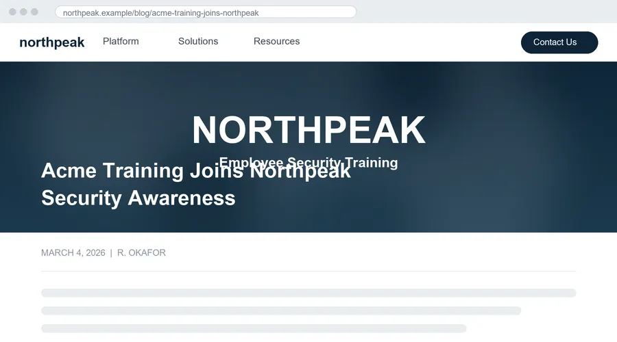 A hero banner where the background photo’s own baked-in tagline overlaps the actual article title directly behind it — neither reads as the clear figure the other recedes behind.
A first read doing nothing but naming the current section is also how Category Pages signals that a customer has “arrived” somewhere new — the same pattern, applied to a section rather than a whole page.
Related Concepts
Patterns
Principles
Processes
Further reading
Nielsen Norman Group’s “F-Shaped Pattern For Reading Web Content” (2006 — commercially published, no stated open license) reports the eyetracking evidence for why a first read has to land at a glance: readers sweep across the top of a page, then a shorter distance across lower down, then scan the left margin, which is why the opening two paragraphs carry most of what gets read at all and why headings, paragraphs, and bullets should open with their information-carrying words rather than building toward them.
Sources
The Design of Sites: Pattern Group I — Designing Effective Page Layouts (Pattern I3, Clear First Reads) is this page’s primary source — the first-read concept itself, its competition with Above the Fold, the color/size/font/position variables, and the below-measured-resolution design and testing guidance.
The Design of Sites: Glossary supplies this page’s own term — the book’s own short definition of “first read,” cross-referencing back to the fuller pattern treatment given here.
Color Theory (Wikipedia) backs this page’s mention of complementary-color contrast as one of the four levers for making a first read stand out against its surroundings.
Typography (Wikipedia) is the source for this page’s font-choice guidance — clean sans-serif faces reading cleanly at a glance, versus ornate display faces working against a first read’s clarity.
Visual Hierarchy (Wikipedia) is the source for the four-variable contrast framework (color, size, alignment/position, character) this page’s Solution applies specifically to building a first read.