
Action Buttons
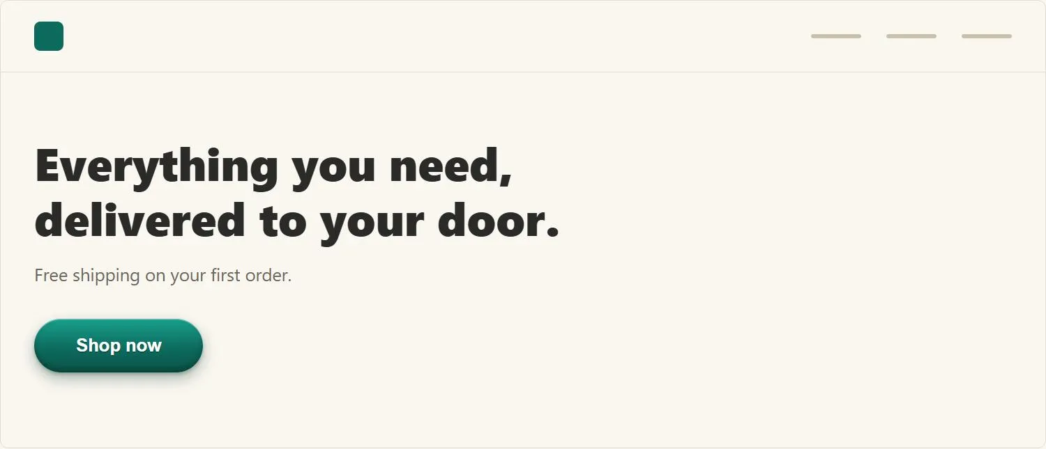 The gradient and shadow are what make this read as a physically pressable button, not just a colored shape — the same affordance cue as a real button.
Background
Action buttons help complete a Process Funnel by giving each step of a multi-step task a clear, unambiguous call to action.
Problem
Customers can’t tell what is and isn’t clickable on a page.
Customers can’t tell what is and isn’t clickable on a page.
Solution
Give an otherwise flat button a shaded, three-dimensional appearance. This works as a perceivable Affordance because it borrows two sources of prior knowledge: familiarity with physical three-dimensional buttons (keyboards, remote controls) — an interface metaphor in the same lineage as the desktop metaphor generally — and the learned behavior, from graphical user interfaces generally, that raised-looking elements can be pressed with a mouse.
There are two implementations: HTML buttons, rendered by the browser with limited control over appearance, and graphical buttons, implemented as one or more images, which give full design control at the cost of slower downloads — an image-based button should also carry a redundant text link to the same destination, so the destination is still reachable if the image fails to load or render.
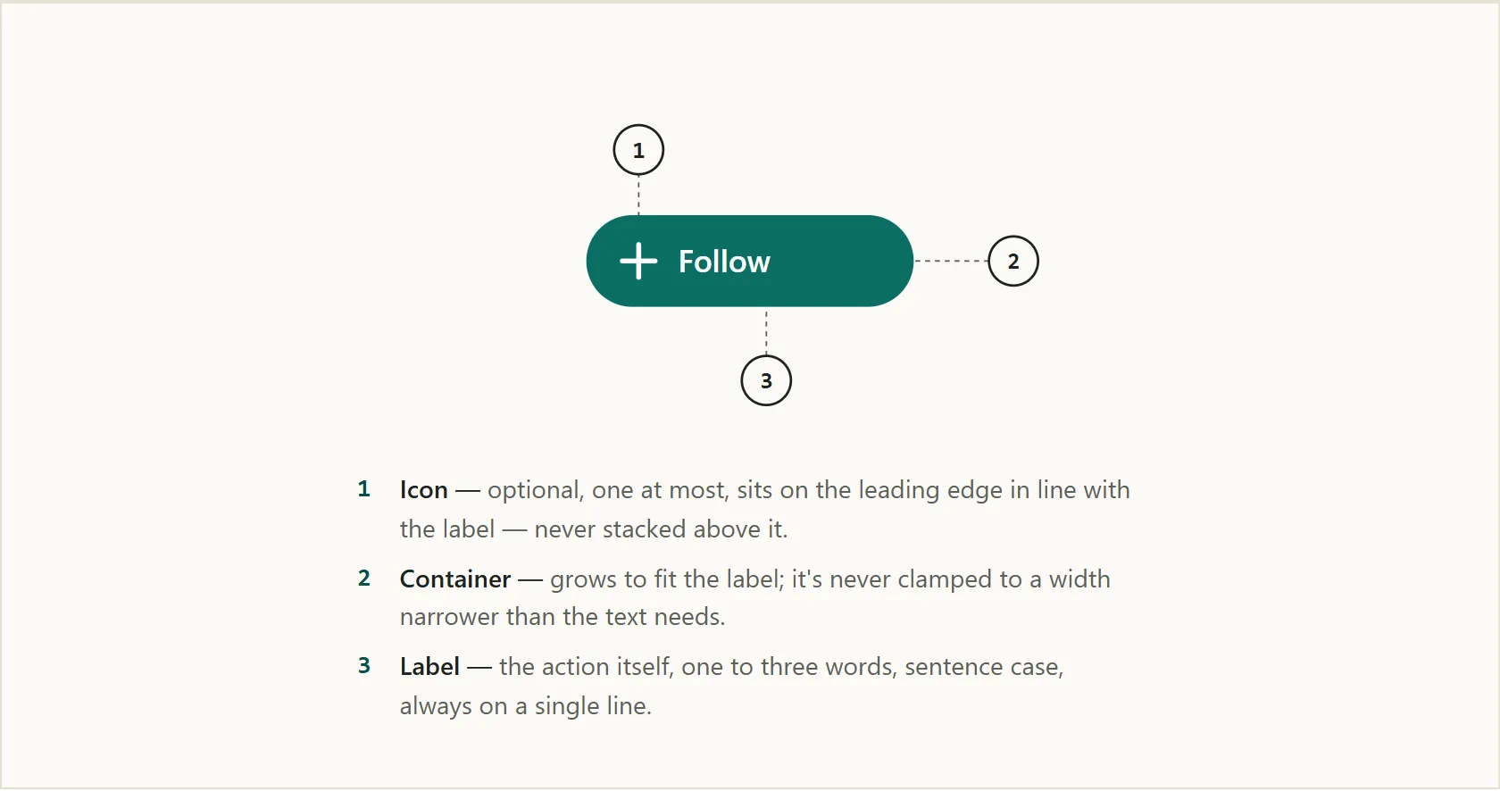 Icon, container, and label — the three parts every action button is built from.
Have a minimum target size
Per Fitts's Law, smaller and more distant targets take measurably longer to hit, so a graphical action button should be no smaller than roughly 20×20 pixels. Where a button’s visible image is smaller than that but its click target still needs to be large enough, a transparent “halo” — extra transparent pixels padding a GIF image beyond its visible edges — extends the effective clickable area without changing the button’s apparent visual size.
 A size scale from xsmall to xlarge — even the smallest already clears the minimum comfortable target.
Write action-oriented label text
Label text matters as much as visual appearance. Button labels should be action-oriented verbs or verb phrases describing what happens when the button is pressed — “Save Changes,” “Delete Account,” “Send Invite” — rather than nouns that describe a destination or concept (“Settings,” “Account”). Verb labels make the consequence of clicking legible before clicking; noun labels require the user to infer an action from a category name. Keep labels brief (a handful of words is usually enough — a button is a call to action, not a sentence), use sentence case rather than Title Case or ALL CAPS (capitalizing every word reads as more formal/shouted than a button label needs to be, and slows reading slightly), and never let a label truncate or wrap onto a second line — a button whose text is cut off or awkwardly broken undermines the exact legibility a clear label is supposed to provide, so size the button to the label rather than forcing the label into a fixed-width button.
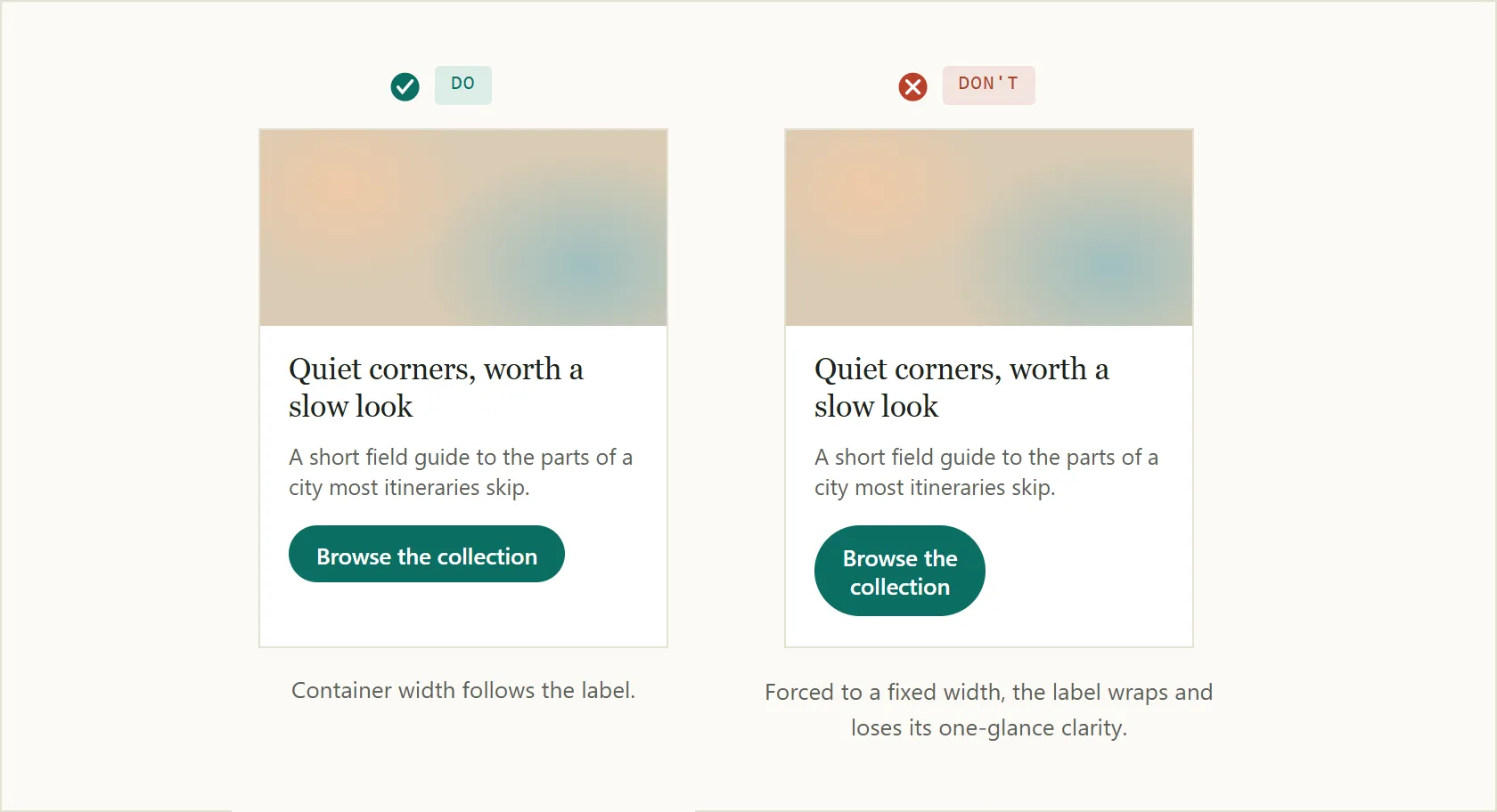 Sizing the container to the label keeps it legible; forcing a fixed width breaks it onto two lines.
Verb labels make the consequence of clicking legible before clicking; noun labels require the user to infer an action from a category name.
Standardize common action-verb labels, too. Beyond choosing a verb over a noun, near-synonym action verbs carry different implied consequences, and using them inconsistently across a product makes those consequences harder to predict. A few recurring distinctions worth standardizing on:
- Add (uses an existing object in a new context, e.g. “Add to cart”) vs. Create (makes a new object from scratch) vs. Insert (places an object at a specific position in an ordered view) — three different actions that blur together if used interchangeably.
- Cancel (stops the current action and closes the dialog — warn about lost changes) vs. Close (dismisses the current view without necessarily undoing anything) vs. Done (finished working, returning to where the user came from) — each ends an interaction differently.
- Delete (destroys an object permanently) vs. Remove (takes an object out of the current context without destroying it, e.g. removing a user from a group) vs. Clear (resets a field or selection to empty/default) — mixing these up misrepresents how reversible an action actually is.
- Save (persists changes without closing) vs. Apply (saves changes that affect subsequent behavior, without closing) vs. Save as (creates a new object from the current one) — distinct enough that a consistent choice matters for predictability.
- Undo (reverts the most recent change, repeatable in reverse order) vs. Reset (reverts to the last-saved state) vs. Restore (recovers something after deletion) — three different starting points to revert to.
Pick one term per concept and use it consistently across the whole product — the same terminology-list discipline Plain Language recommends for content generally applies to action labels specifically, since a button labeled “Remove” in one place and “Delete” for the same action elsewhere forces customers to relearn whether the two words mean the same thing.
Signal further choices
When a button will open a further set of options rather than immediately executing a single action, signal this with a ”+” icon (for add-type flows) or a chevron ”›” (for menus, selectors, or branching choices). The icon distinguishes “this will do something now” from “this will show me more options,” reducing surprise. When a button does carry an icon alongside its label, keep the two together as a single visual unit — an icon should sit on the button’s leading edge (before the label in left-to-right languages, mirrored to the trailing edge in right-to-left ones — see Internationalization) and stay horizontally in line with the label text rather than stacked above or below it, which reads as two disconnected elements instead of one control. Use at most one icon per button; a second icon has nothing left to communicate once the first already signals the action.
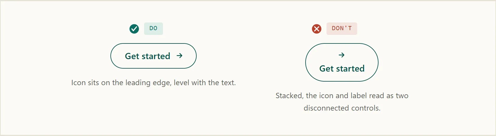 Stacked above the label, the same icon reads as a second, disconnected control.
A directional icon needs to point where the interface actually goes, not just toward “more options” in the abstract. A chevron or arrow is itself a spatial promise: it tells the customer, before they click, roughly where to expect the result to appear. When a menu item’s icon points down but the resulting panel actually opens beside it, or points right but the result appears below, the icon has made a prediction the interface then breaks — costing the same trust a mismatched signifier costs anywhere else (see Affordance). Match the icon’s direction to the real, current layout of what it opens, not a single default direction reused regardless of where the target actually renders.
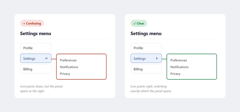 A downward chevron promises a panel below it; when the panel actually opens to the side, the icon has broken that promise.
Reserve state icons for the state they represent
An icon on a button carries meaning independent of its label, and needs to obey the same conventions a customer already associates with that icon elsewhere (see Icons for keeping one meaning per icon). A checkmark is one of the clearest cases: it conventionally signals a state that has already completed — saved, verified, done — not an instruction to click. A “Save changes” button decorated with a checkmark before anything has actually been saved tells the customer their edits are already safe, which can lead them to navigate away and lose the change.
The fix costs nothing: leave the button’s label plain until the save actually happens, and reserve the checkmark for the moment it’s genuinely true — a brief confirmation toast, a “Saved” status line — so the icon’s meaning stays trustworthy everywhere else it appears.
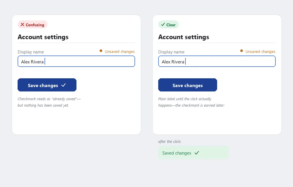 The checkmark belongs on the confirmation that follows, not the button that triggers it.
Write the accessible name, not just the visible label
The same action-verb discipline applies to what a screen reader announces for a button, which is often a separate aria-label rather than the visible text (icon-only buttons in particular have no visible text to fall back on). Three rules keep it useful instead of redundant. First, describe the action, not the icon’s appearance — a screen reader user needs to know what tapping a star icon does, not that it’s shaped like a star; a magnifying-glass button’s accessible name is “Search,” not “Magnifying glass icon.” Second, don’t restate what the control’s role or state already announces — a search field’s accessible name should be “Search,” not “Search field,” since the field’s ARIA role already tells the user it’s a field; a selected toggle doesn’t need “is selected” appended to its label if its checked state is already announced separately (see WAI-ARIA (Accessible Rich Internet Applications) for how roles and states get communicated to assistive technology). Third, for a control that toggles between two states — a favorite star, a follow/unfollow button — phrase the label as the action that will happen next, not a static name: “Add to favorites” when unselected, “Remove from favorites” once selected, rather than a single ambiguous label that doesn’t change with the button’s state.
Show state in toggle switches, not just toggle buttons
A toggle switch (an on/off control, like a settings screen’s Wi-Fi or notifications switch) is a different control from a toggling button (a favorite star, a follow button), even though both get called “toggles” casually. A toggle button gets its accessible name phrased as the next action (see Write the accessible name, not just the visible label above) precisely because its default appearance alone doesn’t otherwise make the current state legible.
A toggle switch has the opposite job: it has no separate action to announce, because its entire visual appearance is a live status display — the same way a physical rocker or slide switch’s position alone tells you whether it’s on, without reading a label first. The design consequence: a toggle switch’s color, knob position, and any icon in its track all need to describe the state that’s currently active, not the action a tap would perform.
A dark-mode switch showing a moon in its track while light mode is still active is making the same action-vs-state mistake as a checkmark on an unclicked save button (see Reserve state icons for the state they represent above) — it’s telling the customer what pressing it would do, not what’s true right now. Show a sun when light mode is active and a moon when dark mode is active, and the icon reads correctly the instant it’s seen, exactly like the color and position it sits alongside — the icon lives in the track’s open space next to the knob, not on the knob itself, the same way it’s drawn in a physical rocker switch.
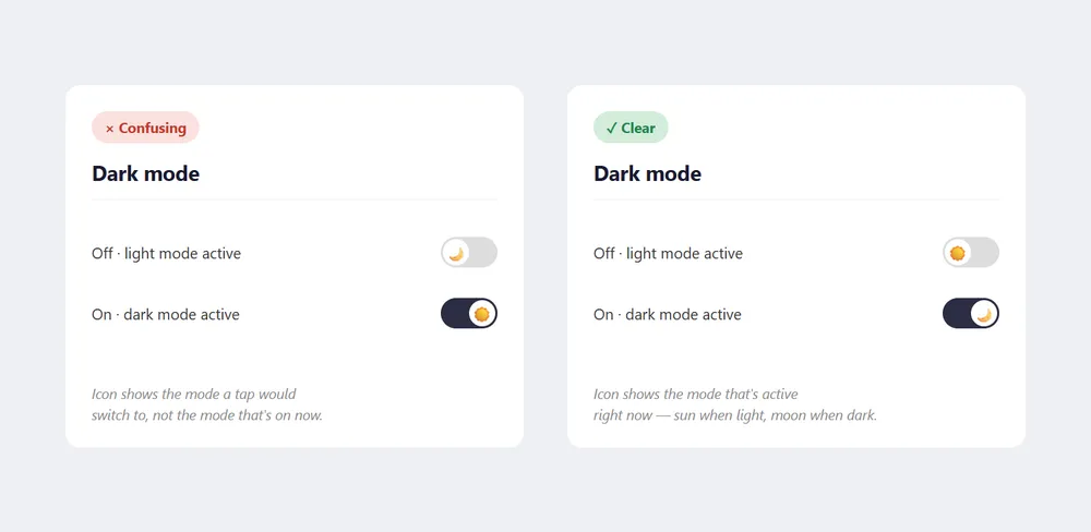 The icon should describe the mode already active, not the mode a tap would switch to.
Distinguish the selected option in button groups
When multiple buttons represent mutually exclusive states — a view-mode toggle, a filter selector, a button group — the currently active choice must be visually distinct from inactive options (pressed, highlighted, or otherwise differentiated in a way that is perceivable without relying on color alone). A group where selected and deselected states are visually identical leaves users unable to tell what is currently active.
Establish a button hierarchy
Most interfaces need more than one button type. A consistent hierarchy prevents users from having to decide which button carries more weight:
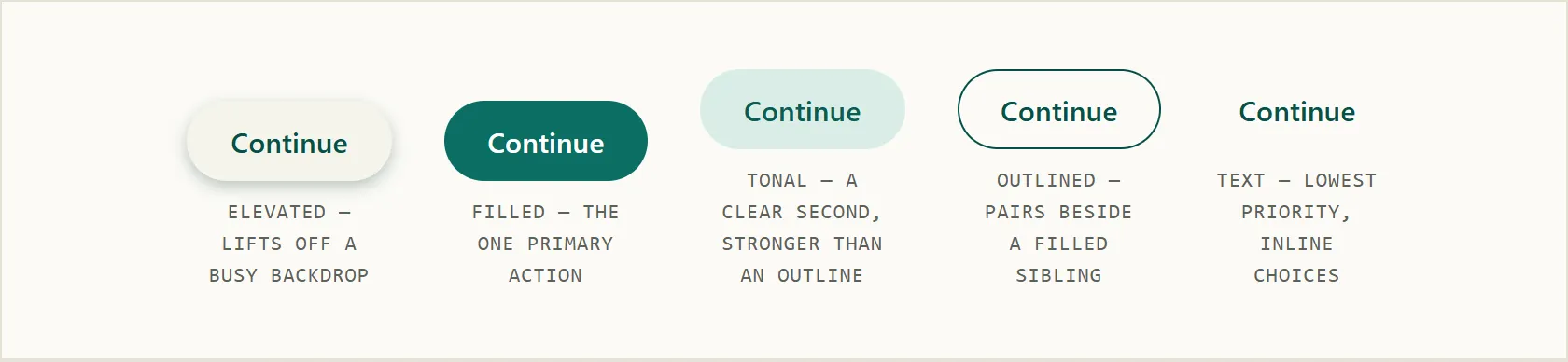 The same five-style emphasis scale, side by side — elevated lifts off a busy backdrop, filled marks the one primary action, tonal and outlined form two graduated secondary steps, and text is reserved for the lowest-priority, inline choices.
Use a primary button for the page’s main call to action. Use one per page or per form section. Makes the next step unambiguous. Labels should be action verbs describing what happens: “Save and continue,” “Submit application,” “Start now.”
For the one button that actually completes a process funnel step (a checkout’s “Place Order,” a form’s “Submit”), ordinary button styling isn’t enough — customers who scroll past it, or whose browser window is too small to show it without scrolling, can lose track of how to proceed. Three placement rules address this:
- Position it just below the top navigation bar, tab row, or progress bar — close enough to the top to be seen quickly, but not at the absolute top, where it would compete with the branding customers rely on to recognize the site (see Above the Fold).
- Repeat it below the fold if critical content pushes it out of the initial view, so a customer who has scrolled down to read or verify something doesn’t have to scroll back up to act.
- Make it visibly larger than every other button on the page, with a color that contrasts clearly against the background, and a label distinct from every other button’s label — the goal is that a customer scanning the page lands on this button before any other.
Align the primary button to the left edge of the form or content region — left-aligned buttons are read before content to their right, and are within easier reach on touch screens for right-handed users.
Use a start button to open a service’s first step, reserved for the primary call to action on a service’s start page or first step. Often includes a directional icon (arrow or chevron) to signal progression rather than submission.
A start button is frequently implemented as a link styled to look like a button, rather than a native <button> — visually correct, but a link’s default role (“link”) doesn’t match what it actually does (start a process, not navigate to reference content). role="button" corrects the accessible semantics to match the visual ones:
<a href="/start" role="button">Start now</a>Keep secondary buttons visually lighter than the primary, for alternative, lower-priority actions available alongside the primary action (e.g., “Save as draft” alongside “Submit”). Do not use so many secondary buttons that they compete with the primary action. Visual weight is what actually carries this hierarchy: a solid, filled container reads as higher emphasis than an outlined one, which in turn reads as higher emphasis than a button with no visible container at all (text-only, revealed only on hover or focus) — treat this as a graduated scale rather than a binary primary/secondary split, and reserve the heaviest style for the one action that most deserves it. When a screen genuinely doesn’t need a button-weight action at all, a plain text link, a smaller icon-only control, or moving the action into a secondary navigation area is often the better call than adding another lower-priority button — every additional button on a page dilutes the hierarchy the primary button is trying to establish. Getting this hierarchy backwards — a filled, high-emphasis Cancel sitting beside a plain, low-emphasis Save — is a concrete case of the Stroop effect: the styling and the actual intended next step point in two different directions at once, and a customer has to consciously override one signal to follow the other.
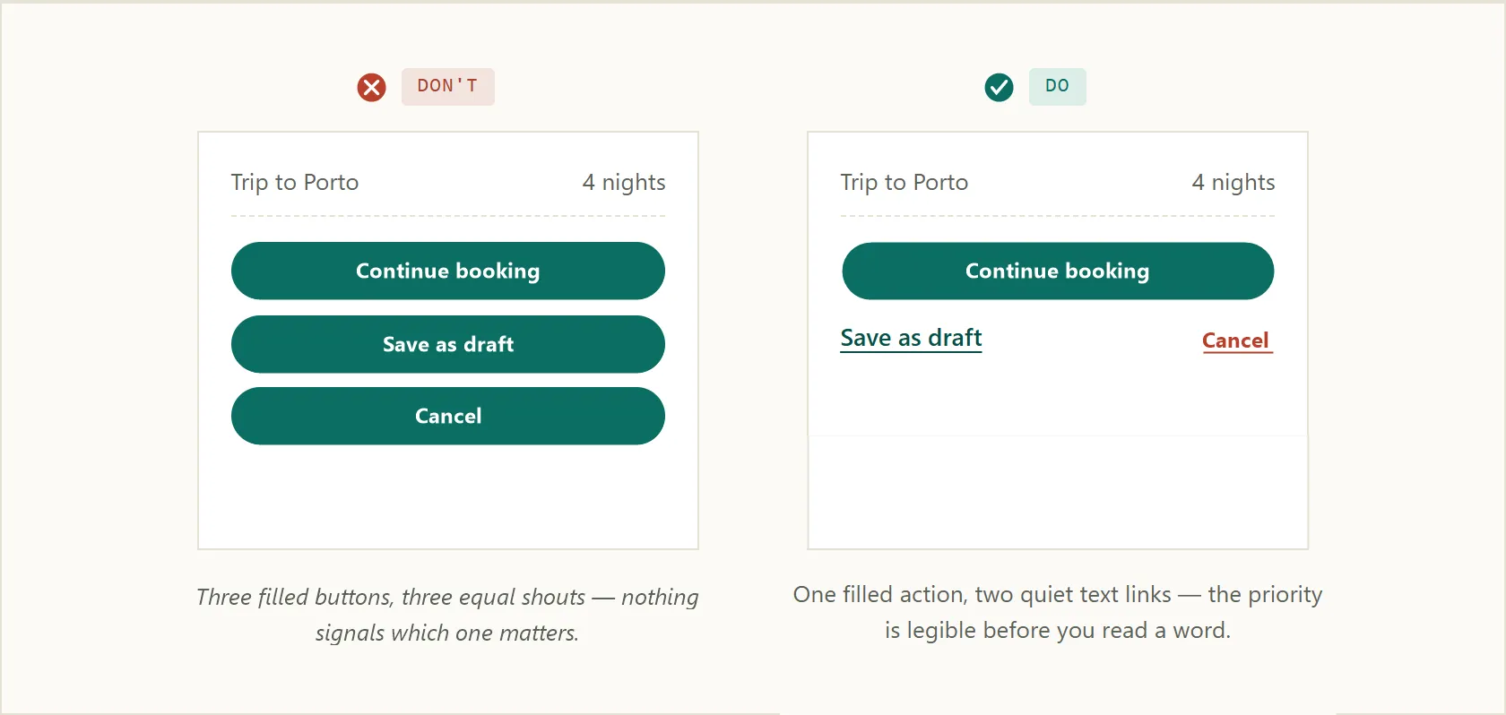 Equal-weight buttons force a reader to check every label; a clear hierarchy doesn’t.
This same graduated-weight principle applies inside a cluster of related buttons, not just at the page level — the one action a group’s other buttons support should still read as heavier than its siblings.
 Pause carries the primary weight here — larger and filled, while its secondary siblings stay outlined.
Use a warning button for destructive, hard-to-reverse actions — deleting an account, clearing all data, permanent removal. Conventionally red. Critical rule: do not rely on the red color alone to communicate the destructive nature; pair the warning button with a confirmation step and explain the consequence in the button’s context. Red-green color deficiency affects 8% of men; color-blind users read labels, not colors.
Critical rule: do not rely on the red color alone to communicate the destructive nature; pair the warning button with a confirmation step and explain the consequence in the button’s context.
Avoid disabled buttons
A button that users cannot click gives no information about why. The better pattern is to allow the click and show specific error messages explaining what is missing or wrong — see Form Design and Error Messages. If research shows disabled buttons genuinely improve usability in a specific context, use them, but ensure the disabled state has sufficient contrast to be perceivable.
Prevent double-clicks
Submit buttons on slow or consequential actions (payments, form submissions) should prevent double-submission — either via server-side idempotency, client-side disabling after first click, or a loading state. See Loading States.
Related Concepts
Patterns
- Process Funnel
- Form Design
- Loading States
- Error Messages
- Internationalization
- Above the Fold
- Navigation Menus
- Plain Language
- Dark Theme
- Icons
Principles
Processes
Standards
Further reading
Victor Ponamariov’s 50 Tips to Improve User Interface (goodreads.com/book/show/58085971-50-tips-to-improve-user-interface — self-published ebook, no stated license) adds one constraint: only one primary button should appear per form or view, since multiple competing primary buttons undermine the Visual Hierarchy that makes a call to action findable — see Form Design for more.
Domas Markevičius’s Designing the Perfect Button (Wix UX / Medium, 2022 — copyright Wix; https://wix-ux.com/designing-the-perfect-button-e77ec1f32ee5) covers Wix’s design-system approach to button craftsmanship, drawn from field studies on icon/text combinations, modal labeling, and button placement. One finding: converting icon-only secondary CTAs to include text substantially increased click rates.
Google’s Material Design 3 buttons component guidelines (m3.material.io/components/buttons — no stated content license, unlike the Apache-2.0-licensed Material 2 accessibility page; not ingested as a source) name five color/emphasis styles in descending visual weight — elevated, filled, filled tonal, outlined, and text — a more finely graduated version of the primary/secondary/text distinction in the body above. It also covers button groups: a cluster of related buttons that can respond to each other, with the primary action inside the group given more size/color/shape weight than its siblings.
Nikita Prokopov’s grumpy.website (personal link-blog, all rights reserved; https://grumpy.website/1782) flags a concrete signifier mismatch: a “Save Changes” button carrying a checkmark icon, when a checkmark conventionally signals a completed, already-saved state rather than “press this to save” — on the flagged page the settings shown are not actually saved yet, so the icon promises a state that hasn’t happened.
A companion post on the same site (https://grumpy.website/1780) makes the general case this section’s directional-icon paragraph draws on: “icons must help you understand, they are not just random sigils” — if a list expands to the right, its icon must point right, not in some other direction disconnected from what actually happens.
A third post on the same site (https://grumpy.website/1770) is the source for the toggle-switch-vs-toggle-button distinction above: “action vs state is a controversy in buttons, it’s not in toggles — toggle icon should show current state, that’s the way it always worked in physical toggles.” The post illustrates this with an ambiguous switch next to a clear one, and two photos of a physical rocker switch as the origin of the convention.
Bruce Tognazzini’s First Principles of Interaction Design (asktog.com — no stated open license) names “Human Interface Objects” as their own category, with standard resulting behaviors a design shouldn’t quietly redefine — e.g. dropping a document on a trash-can icon should only move it there, never delete it outright, since “Empty Trash” is a separate, deliberate action.
Anthony Hobday’s Visual design rules you can safely follow every time (anthonyhobday.com — no stated open license) gives a specific button-proportion rule: make horizontal padding around a button’s label roughly twice its vertical padding, since a wider-than-tall shape is what reads as a recognizable button in the first place.
Unbounce’s own CTA-placement test (unbounce.com/conversion-rate-optimization/landing-page-cta-placement/ — copyright Unbounce, no open license) found repositioning a page’s primary call-to-action button above its pricing grid, rather than below it, produced a 41% conversion lift over the original placement — concrete evidence behind the “position it near the top” placement rules above.
Sources
The Design of Sites: Ch. 2 — Making the Most of Web Design Patterns is the source for this page’s role as the worked example demonstrating the book’s six-part pattern format and “forces” concept, named directly in the Background section.
GOV.UK Design System is the source for the primary/start/secondary/warning button taxonomy, the one-primary-button-per-page rule, pairing warning buttons with a confirmation step, avoiding disabled buttons in favor of specific error messages, left-aligning buttons in forms, and sentence-case labeling.
Accessibility (Material Design) supplies the accessible-name-labeling craft in Write the accessible name, not just the visible label — labeling by action rather than appearance, not restating a control’s announced role/state, and phrasing a toggle’s label as the next action.
The Design of Sites: Pattern Group K — Making Navigation Easy is the K4/K5 High-Visibility Action Buttons pattern this page is directly built from — the HTML-vs-graphical-button distinction, the transparent-halo sizing trick, and the placement/sizing rules for the one button that must complete a task.
Carbon Design System: Accessibility, Content, Color, Motion, Spacing, and Icon Guidelines (IBM) supplies the standardized action-verb glossary in Standardize common action-verb labels, too — the Add/Create/Insert, Cancel/Close/Done, Delete/Remove/Clear, Save/Apply/Save as, and Undo/Reset/Restore distinctions.