
Trust and Credibility
Trust in a Web site is never assumed by default — it has to be actively earned, and re-earned on every visit, through consistent and verifiable signals rather than a one-time claim. See Dark Patterns for the failure mode this section is implicitly arguing against: interfaces that spend that trust deliberately, for a short-term gain.
Trust in a Web site is never assumed by default — it has to be actively earned, and re-earned on every visit, through consistent and verifiable signals rather than a one-time claim.
Trust signals (security indicators, plain language, visible policies) compete for the same above-the-fold space that Homepage Portal already has to divide between branding, navigation, and content — earning trust isn’t free; it costs real space and attention on the page itself.
Two e-commerce-specific trust signals deserve explicit treatment: payment security and return policy visibility. At payment entry, a visible privacy policy link and a secure-connection indicator (HTTPS lock icon) address the specific anxiety of handing over financial information — this is the highest-stakes trust moment in the checkout flow (see Quick-Flow Checkout). A clear, accessible return policy linked from every product page is a purchase-time trust signal, not only a post-purchase concern: customers who can see the policy before committing buy more confidently and return more often (see Easy Returns).
An AI-powered feature earns trust the same never-assumed way, plus its own levers: whether a person can override the system’s decision (see Human-AI Interaction), whether the system’s reasoning is visible (see Explainable AI), and whether AI-generated output is disclosed rather than hidden (see AI Content Marking).
Signal legitimacy clearly and consistently
Make it obvious, on every page, what the site is and who’s responsible for it: clear ownership, real contact information, and a connection that visibly matches what it claims to be. HTTPS with a current, valid certificate is now a baseline trust signal, not an optional extra — as is a properly configured Favicon, which browsers request on every page load and whose absence signals an unfinished site; for an official/institutional site, explicit identification as such (a visible badge or banner) matters too. This extends to content design generally — distinguishing official from non-official sources consistently (e.g. via shared design-system components) is one concrete way sites demonstrate the authoritativeness this signals.
Domain type carries its own credibility weight: .edu and .gov domains lend additional institutional credibility compared to .com for sites making authoritative claims; any custom domain is more credible than a hosted subdomain (e.g., businessname.example.com), which reads as a smaller or less established operation.
Link third-party credentials to a verifiable source
Security seals, certifications, awards, and partner badges from recognized bodies reinforce credibility when they do; an unverifiable badge backfires if a user tries to check it and finds nothing.
Limit generic stock photography
Overuse of staged stock images signals inauthenticity; real photographs of people, spaces, and products are more credible, even when technically less polished.
Keep content current and retire it carefully
Review content regularly for accuracy (at least an annual audit), mark when something was last updated, give time-bound campaigns a defined end, and promptly remove or properly redirect outdated or rarely-used material rather than leaving it to silently rot. The same logic applies at the link level: actively find and fix broken/rotted links rather than letting them accumulate, and give proper notice (and a forwarding path) when content itself is moved or removed, instead of leaving visitors at a dead end. Stale, undated, broken, or abandoned content undercuts the same trust that an active bug-reporting channel builds (below) — a site that looks unmaintained reads as untrustworthy even if nothing is technically broken.
Protect what customers hand over
Sensitive data deserves protection appropriate to its sensitivity, and privacy commitments need to be both real and visible. This is the same trust burden Homepage Portal already flags when discussing personalization: customers need to trust a site enough to hand over the data it runs on. Personalized Recommendations is a concrete instance: disclose what behavioral/purchase data feeds a recommendation and how it’s used, and get explicit opt-in before reusing it for anything beyond the recommendation itself (e.g. outside marketing).
Plan for user-generated content’s legal exposure, not just its UX
A review system opens a site to obscenity, libel, and copyrighted material posted by customers — published use policies and filtering catch the routine cases, but the genuinely risky ones (a minor’s data, a libelous claim) are a legal question as much as a design one, worth involving counsel on rather than treating as a pure interface decision.
Be reliable, and own it when you’re not
Redundancy minimizes how much a single failure costs customers, and when something does break, a visible, responsive process for bugs and incidents does more for trust than silence. “Fail pets” — whimsical illustrated characters standing in for a bare error page, like Twitter’s Fail Whale or GitHub’s Octocat on a 404 — are one concrete way brands have chosen to own an outage rather than hide behind generic text. The trade-off is real, not free: a distinctive failure illustration builds brand recognition (often via earned media, when people share it), but that same memorability is permanently tied to the failure it was shown during — the more it’s remembered, the more it also foregrounds that something broke, by the same logic Peak-End Rule describes for any intense moment in an experience.
“Fail pets” — whimsical illustrated characters standing in for a bare error page, like Twitter’s Fail Whale or GitHub’s Octocat on a 404 — are one concrete way brands have chosen to own an outage rather than hide behind generic text.
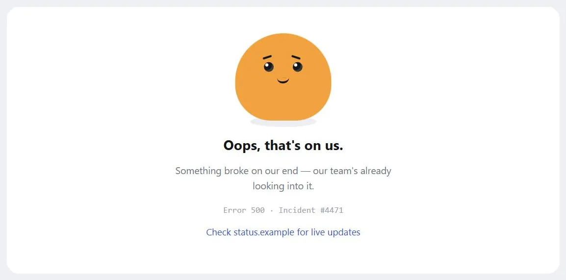 Owning the outage with a face and a status link reads very differently than a bare “500 Internal Server Error.”
Communicate honestly, in plain language
Content written so customers can actually understand it builds more trust than reassuring copy or polish. Concretely, that means writing for skimming and scanning rather than dense paragraphs, since almost nobody reads a page start to finish. This echoes a point in Design-Centering Styles: customers have little patience for documentation, so trust has to come from the interface and content actually being clear, not from a fallback explanation customers have to go dig for.
Build a consistent site brand
The Design of Sites frames brand as more than a logo — it’s what customers remember after they’ve left the site, and it can’t be revised the way a headline can once it’s formed. It proposes a five-criteria lens for how a site actually gets assessed: content quality, ease of use, performance, satisfaction, and brand value (does the site offer something important and unique?) — the first four are what most UX patterns are built to deliver; brand value is what differentiation and consistent execution earn on top of them. Four concrete graphic-design levers reinforce it on every page: consistency (the same fonts, graphics, relative positions, and navigation scheme site-wide, achieved through page templates built on a strong grid); size (a logo large enough to be the second or third first read on the page, not merely decorative); position (upper-left, where customers already expect to look to identify a site); and reuse of graphics for speed (a logo integrated into the navigation bar loads faster and keeps the page’s total file count low). A weak or overwhelmed brand leaves customers unsure where they are; an oversized one crowds out everything else the page needs to do.
The Design of Sites frames brand as more than a logo — it’s what customers remember after they’ve left the site, and it can’t be revised the way a headline can once it’s formed.
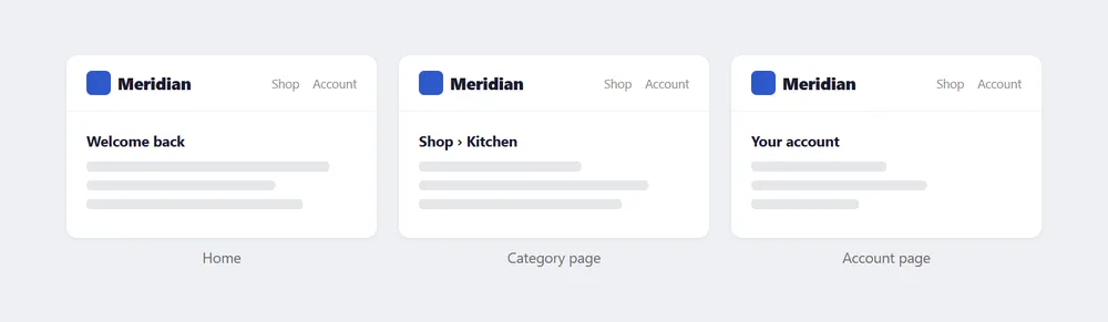 Same logo, same size, same position, same nav — the page content changes underneath a brand treatment that doesn’t.
Use secure connections, and say so
HTTPS — encrypted via TLS (Transport Layer Security; its predecessor SSL is deprecated and no longer used) — protects sensitive data in transit, but the browser’s own feedback that a connection is secure — a lock icon, a subtle chrome change — is minimal and easy to miss. Reinforce it explicitly: a labeled action button (“Proceed to Secure Checkout,” “Sign in using our secure server”) does more to reassure a customer at the exact moment they’re handing over sensitive information than relying on browser chrome alone.
Use secure connections everywhere sensitive information is entered or displayed — sign-in, checkout, account management, any page touching financial data — not only at final payment. Healthcare-adjacent interfaces have this made explicit rather than left to convention: HIPAA (Health Insurance Portability and Accountability Act) requires encryption for protected health information in transit.
Related Concepts
Patterns
- Homepage Portal
- Favicon
- Personalized Recommendations
- Recommendation Community
- Quick-Flow Checkout
- Easy Returns
- Page Template
- Clear First Reads
- Action Buttons
- Privacy Policy
- About Us Pages
- Email Communications
- Privacy Preferences
- Preventing Phishing Scams
- Customer Sessions
- Process Funnel
- Sign-In and Account Creation
- Account Management
- Plain Language
- AI Content Marking
Principles
Processes
Standards
Further reading
Victor Ponamariov’s 50 Tips to Improve User Interface (goodreads.com/book/show/58085971-50-tips-to-improve-user-interface — self-published ebook, no stated license) adds one concrete credibility tip: displaying a post date on articles lets readers judge whether content is current, directly reinforcing the “keep content current” guidance above.
Wathen & Burkell’s “Believe it or not: Factors influencing credibility on the Web” (Journal of the American Society for Information Science and Technology, 2002; asistdl.onlinelibrary.wiley.com/doi/abs/10.1002/asi.10016 — paywalled, no open license) reviews credibility research more broadly than any single signal above, synthesizing how a source’s, message’s, and medium’s own characteristics each separately shape a reader’s trust judgment.
Fogg et al.’s “How do users evaluate the credibility of Web sites? A study with over 2,500 participants” (Proceedings of the 2003 conference on Designing for User Experiences; dl.acm.org/doi/abs/10.1145/997078.997097 — paywalled, no open license) found visual design to be the single most-cited factor in credibility judgments, named in 46.1% of participant comments — more than any other factor, including a site’s information structure or content.
Metzger & Flanagin’s “Credibility and trust of information in online environments: The use of cognitive heuristics” (Journal of Pragmatics, 2013; sciencedirect.com/science/article/pii/S0378216613001768 — paywalled, no open license) names the mental shortcuts readers substitute for careful evaluation online, including an expectancy-violation heuristic: judging a site not credible the moment it fails to meet an expectation, regardless of the site’s actual content.
Sources
Design Principles (U.S. Web Design System)‘s “Earn Trust” principle is this page’s structural backbone — the never-assumed, only-earned-and-re-earned framing, and its identity-signals/sensitive-data/reliability/plain-language sub-points map directly onto the Signal legitimacy, Protect what customers hand over, Be reliable, and Communicate honestly sections above.
An Introduction to Content (Digital.gov) supplies the Keep content current guidance — reviewing content on a regular cadence, marking last-updated dates, giving campaigns a defined end, and promptly retiring or redirecting outdated material — plus the design-system-component approach to demonstrating authoritativeness.
The Design of Sites: Pattern Group G — Advanced E-Commerce is the source for the personalized-recommendations disclosure and opt-in guidance in “Protect what customers hand over,” and for the user-generated-content legal-exposure caution drawn from its G4 recommendation-community pattern.
The Design of Sites: Pattern Group F — Basic E-Commerce supplies the two e-commerce-specific trust moments named above the section headings — payment-entry security signals from its F1 quick-flow-checkout pattern, and pre-purchase return-policy visibility from its F9 easy-returns pattern.
The Design of Sites: Pattern Group E — Building Trust and Credibility is the source for the Build a consistent site brand section (the five-criteria assessment lens and four graphic-design levers, from its E1 pattern) and the Use secure connections section (from its E6 pattern).
Error message (Wikipedia) is the source for the “fail pets” discussion — Twitter’s Fail Whale and GitHub’s Octocat as examples, and Sean Rintel’s framing of the brand-recognition-versus-failure-memorability trade-off.
AI Risk Management Framework (AI RMF 1.0) is the source for the AI-specific trust levers named alongside the e-commerce trust signals above.