
Clear Typography
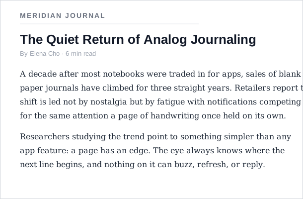 A narrow column of serif body text, generous leading, and a ragged right edge — no line asks the eye for more than three or four jumps.
Background
Typography is the art and technique of arranging type to make written language easy to perceive, easy to read, and visually appealing — see Legibility vs. Readability below for how the first two, often conflated, actually differ. It encompasses typeface selection, point size, line length, line spacing (leading), letter spacing (tracking), and kerning — every variable that shapes how a block of text actually appears once it’s set.
Problem
When typography is made well, it becomes invisible to the reader: attention stays on the content — what the words actually mean — rather than on the letterforms, spacing, or layout carrying it. Made poorly, typography stops being invisible and instead gets in the way: strained legibility, awkward line breaks, and cramped spacing all pull attention toward the mechanics of reading itself, directly impeding comprehension or discouraging reading altogether.
When typography is made well, it becomes invisible to the reader: attention stays on the content — what the words actually mean — rather than on the letterforms, spacing, or layout carrying it.
Solution
Match typeface and text composition deliberately to what’s being read and where — legibility and readability requirements, content category, display vs. body context, and the constraints particular to screens and the web’s font-resolution chain.
Legibility vs. Readability
These are distinct but related concepts, often conflated.
Legibility is perception: how easily individual characters can be distinguished from one another. A font is legible when characters like b and h, or numerals 3 and 8, remain distinguishable at small sizes; brush scripts and decorative faces are notorious for poor legibility. All-caps text reduces legibility because lowercase letterforms carry more variation than capitals. Walter Tracy’s definition: “the quality of being decipherable and recognizable.” A wearable’s own type scale is typically user-configurable, so legibility has to hold up at whatever size a person has actually set, not just the default.
 Not a matter of taste — a script face’s letterforms are genuinely harder to tell apart at a glance, which is exactly what legibility measures.
Readability is comprehension: the ease of reading a body of text as a whole, not just individual characters. Margins, word spacing, line spacing, line length, and structural clarity (headings, consistent hierarchy) all affect readability independently of how legible the chosen typeface is. A legible typeface can still become unreadable through poor setting. Sans-serif fonts, for example, are legible at small sizes but have lower readability for extended prose — the eye tires across long runs without serifs as anchors.
Readability is comprehension: the ease of reading a body of text as a whole, not just individual characters.
The Royal College of Art’s Readability of Print Unit (Spencer, Coe, Reynolds) demonstrated that saccadic rhythm governs comfortable reading: the eye moves in discrete jumps, recognizing roughly three words per saccadic jump; lines requiring more than three-to-four jumps introduce strain and reading errors. This translates directly into line-length guidance — overly wide columns are harder to read not because of the font but because of the extra jumps required per line.
Select a typeface by content category
Different content categories have accumulated typographic conventions; working against them requires deliberate justification. Practical defaults:
- Use serif type for long-form body text: serif “text romans” or “book romans” — serifs aid horizontal tracking and differentiate letterforms in dense text
- Use tightly-fitted serifs for newspapers and compact layouts: maximizing readability per column inch
- Use sans-serif for short introductory copy or incidental text: works at short lengths; breaks down for extended reading
- Use larger display type for headlines: designed for contrast against body text; proportion and visual weight signal hierarchy before words are read
Late-twentieth-century convention pairs sans-serif headings with serif body text, using typeface category, weight, and size as the hierarchy signal.
Typeface selection is also a tone signal that precedes reading: the typeface chosen immediately cues the register of the content. Classical serifs with historical models suggest authority and permanence; geometric sans-serifs convey clean, contemporary neutrality; bold faces assert and attract attention. A 2020 study found subjects rated music “more pleasant” when CD covers featured round typefaces — even incidental typographic choices carry mood. Typographers must understand the text’s context and intent before selecting faces, not after.
Compose text carefully
Even distribution is the goal: a well-composed text block creates transparency — the reader attends to the content, not the container. Several variables interact:
- Keep line length to three-to-four saccadic jumps: controls the number of eye jumps per line; more than that is the comfortable upper bound
- Use generous leading (line spacing): helps the eye distinguish lines and return accurately; tightly packed lines cause doubling errors (re-reading the same line). For body text on screen, a line-height of 1.4–1.6× the font size (CSS
line-height: 1.4to1.6) covers most cases — slightly more generous than print conventions, to account for screen reading and variable display densities. Display text and headlines typically need less leading than body text. - Prefer ragged-right over full justification: full justification requires tight control of word spacing and hyphenation — standard software defaults rarely manage this well, leaving rivers of whitespace. Ragged-right setting is more reliable without expert intervention
- Limit the number of distinct fonts, sizes, and text colors on a page: each additional font family, size, or color a reader encounters adds another thing to visually parse before they can focus on content — as a rough default, 2–3 font families and a similarly small set of sizes covers body text, headings, and incidental elements without the page reading as cluttered or inconsistent. For body text specifically, a size in the rough range of 12–16pt (with 9pt as an absolute floor) balances legibility against how much fits on screen. A design system‘s own named type scale is what usually enforces this limit consistently across a product, rather than each page re-deriving its own set of sizes.
- Limit the number of distinct text alignments used, and avoid centering multi-line body text: a centered paragraph loses the fixed left edge the eye relies on to find the start of the next line, so every line-return demands a fresh horizontal search rather than a quick vertical drop — the same saccadic cost extra line length imposes, for no visual-hierarchy benefit past a line or two. Reserve centering for short, single-line elements (a heading, a button label) where there’s no line-return to disrupt in the first place; mixing left-, right-, and center-alignment freely elsewhere on the same page undermines the same predictable structure line length and leading are protecting.
 A page combining several of this section’s issues at once: a centered instructional paragraph, a low-contrast link, an unexplained acronym, and no dominant call to action.
- Avoid underlining for emphasis: it disrupts descending letters (p, g, y, q) that differentiate letterforms, reducing legibility; prefer weight or italic instead
- Keep tracking and kerning at normal defaults: overly tight or loose letter-spacing reduces readability; correct defaults assume normal reading distances and sizes
“Color” in typographic usage — distinct from Color Theory — refers to the overall ink density of a text block, determined primarily by typeface weight but also by word spacing, leading, and margin depth. A dense block feels heavy; loose spacing feels airy. This interplays with White Space and hierarchy to create tone that precedes reading.
Display vs. Text Typography
Display typography (advertisements, headlines, signs, posters, packaging, logos, motion graphics) prioritizes visual impact and can trade some readability for attraction. At larger sizes, letterform details are magnified and small legibility imperfections become prominent; color and size carry more communicative weight than text design does at the word level.
Overusing display techniques in body context — bold colors, multiple competing typefaces, heavily decorated backgrounds — creates visual noise that prevents the message from being received. The guiding rule: every typographic variable (typeface change, size change, color, decoration) must serve the Visual Hierarchy rather than add to it. Clear First Reads relies on exactly this principle — font is one of four levers (alongside color, size, and position) for establishing a single dominant visual element; adding a second competing typeface without clear reason undermines the first read.
Meet WCAG contrast minimums for on-screen text
Digital character encoding separates text presentation from content meaning, allowing identical text to reflow with context-appropriate typefaces across devices. Screen rendering constraints (anti-aliasing, pixel density, dark mode, operating-system font rendering) introduce variables that print does not face. The core principles — legibility, readability, appropriate tone, structural hierarchy — hold across media; the specific defaults adapt.
WCAG (Web Content Accessibility Guidelines) luminance-contrast requirements (see Color Theory) add a minimum measurable bar for typographic color contrast that print typography historically relied on judgment for: at least 4.5:1 for normal text and 3:1 for large text, against whatever sits behind it — a solid background color or a background image. That bar applies to every state a piece of text can be in, not just its resting appearance: a link’s hover and visited colors need to clear the same ratio as its default color, since a link a reader can no longer see clearly the moment they interact with it has failed the same test its plain state passed.
A common screen-specific convention is to use very dark gray (e.g., #111 or #222) rather than pure black (#000) for body text on white backgrounds — the extreme contrast of pure black on white can contribute to visual fatigue during extended reading, even though it far exceeds WCAG minimums. This is a reading-comfort consideration distinct from accessibility compliance; it applies in contexts where text density is high and session length is long.
Plan for typefaces you can’t guarantee are installed
Web typography adds a practical constraint to the principles above: unlike print, a designer cannot guarantee which typefaces are installed on a reader’s system. Managing this gracefully requires understanding the browser’s font-resolution chain.
Web-safe fonts are typefaces reliably present on the vast majority of operating systems, making them safe to specify without a fallback. The core set was largely established by Microsoft‘s “Core Fonts for the Web” initiative (1996–2002), which distributed Arial, Georgia, Verdana, Times New Roman, Courier New, and several others under a freely-distributable license — these faces became the de facto fonts of the early web and remain ubiquitous today.
Font stacks and the fallback mechanism: the CSS font-family property accepts a comma-separated priority list. The browser tries each name in order, moving to the next if the font is not available, and ultimately falls back to its own default. A well-designed stack provides typographically similar alternatives at each step, ensuring the design intent is approximated even when the preferred face is absent. Every stack should end with one of the five generic font families — the last-resort fallback categories that guarantee at least the correct broad character:
- sans-serif — no decorative strokes; generally cleaner for screen reading at small sizes
- serif — decorative strokes; traditional association with print body text
- monospace — all characters equal-width; standard for code display
- cursive — script-like; legibility degrades quickly at small sizes
- fantasy — decorative/symbolic; unsuitable for body text
Web fonts: CSS @font-face allows loading custom typefaces from a server, giving designers typographic freedom equivalent to print — any typeface, not just those pre-installed on the viewer’s system. Freely-licensed libraries (Google Fonts, launched 2010, reaching 800+ families by 2016) have made this accessible at no cost, and by 2016 the majority of websites used web fonts. The trade-off is performance: each web font is an additional network request and file download, adding to page load time and potentially introducing a brief delay where a fallback font renders before the intended face arrives. A well-matched fallback stack reduces the visual disruption during that interval.
Avoid image replacement as an anti-pattern: before web fonts were practical, designers sometimes substituted images rendered in the desired typeface for the actual text. This resolved the font-availability problem but introduced serious costs: the text becomes unselectable by users, invisible to screen readers and assistive technology, excluded from search-engine indexing, and adds unnecessary download weight. Web fonts have made image replacement of body text or headings an obsolete workaround; if typographic control is the goal, a web font with a good fallback stack is the appropriate tool.
Web fonts have made image replacement of body text or headings an obsolete workaround; if typographic control is the goal, a web font with a good fallback stack is the appropriate tool.
Related Concepts
Patterns
Principles
Standards
Further reading
Victor Ponamariov’s 50 Tips to Improve User Interface (goodreads.com/book/show/58085971-50-tips-to-improve-user-interface — self-published ebook, no stated license) offers several specific typography applications, including the Z-pattern problem caused by stretching a text block to the full browser width.
Matthew Butterick’s Typography in Ten Minutes (practicaltypography.com — commercial publication, no open license) gives specific numeric targets for body-text quality, including recommended point sizes (10–12pt print, 15–25px web).
Anthony Hobday’s Visual design rules you can safely follow every time (anthonyhobday.com — no stated open license) adds two further numeric rules: keep body text at 16px or above (below that, most browsers’ own default, readability degrades), and aim for a line length around 70 characters, since going much past 60–80 starts to hurt readability either way.
Robin Williams’ The Non-Designer’s Design Book (4th edition, amazon.com/dp/0133966151 — commercially published, no stated open license) devotes a dedicated chapter to pairing typefaces well — choosing two faces that contrast enough to read as an intentional decision rather than an accident — going beyond the content-category defaults and font-stack mechanics this page covers.
Sources
Typography (Wikipedia) is this page’s primary source — legibility vs. readability, typeface selection by content category, saccadic rhythm and line-length guidance, and the display-vs-text-typography distinction all come from it.
Web Typography (Wikipedia) is the source for the “Web Typography and Font Stacks” section — web-safe fonts and the Core Fonts for the Web history, the font-stack fallback mechanism, the five generic font families, and image replacement as an obsolete anti-pattern.