
- Plan
- Explore
- Concept
- Evaluate
- Launch
Task Analysis
Overview
What do customers actually do today, and what are they really trying to accomplish?
A structured way of cataloging what customers currently do and what they want to do, before any design or implementation work starts. A task (used interchangeably with goal) describes what a customer wants to accomplish — “find the best digital camera under $500 and buy it” — deliberately without saying how it should be done; the how is exactly what the design process is supposed to figure out.
A task (used interchangeably with goal) describes what a customer wants to accomplish — “find the best digital camera under $500 and buy it” — deliberately without saying how it should be done; the how is exactly what the design process is supposed to figure out.
Follow this process
Identify the target customer population, find people representative of that population, then find out what they actually do. Early on this can be informed guesswork plus informal interviews with task experts; later it gets refined with the methods covered in Customer Research Methods — observation, surveys, and evaluation of competitors’ (or your own existing) site. The two should run in tandem — an initial task analysis focuses field investigation, while field evidence should be allowed to overturn the initial analysis, not the other way around.
The two should run in tandem — an initial task analysis focuses field investigation, while field evidence should be allowed to overturn the initial analysis, not the other way around.
Ask these question categories
Sample question categories used to drive a task analysis mirror the four elements in Know Your Customers:
- People — who they are, vocabulary, skills, physical constraints.
- Tasks — current behavior, frequency, time constraints, recovery from failure.
- Technology — browsers, plug-ins, connection speed, screen size.
- Social issues — work environment, noise/stress level, data sensitivity, who else the data is shared with.
Learn from two cautionary examples
Why this matters before implementation, not after:
- A company’s refund form was effectively undiscoverable through its own site search; the only fallback was a fax number. A task analysis would have surfaced “find and submit a refund form” as a real, common task and led to a downloadable (or directly submittable) online form.
- A dentist’s office paid to digitize paper billing forms, only to have staff reject the new system almost outright — the paper forms had carried informal handwritten margin notes (e.g., “this patient’s insurance takes longer than most”) that the new system had no way to capture. A closer look at how the existing artifact was actually used would have caught this before money was spent building the wrong thing.
A closer look at how the existing artifact was actually used would have caught this before money was spent building the wrong thing.
Reduce work by reusing familiar metaphors
Reusing a metaphor customers already know (a paper spreadsheet, a physical shopping cart) lowers the learning burden — but copying an old medium’s interface wholesale isn’t always right. Recreating a paper telephone directory as flippable page-images on the Web preserves its weaknesses (slow lookup, no partial-match search) instead of using the computer’s actual strengths.
Choose good tasks
For tasks used in scenarios (see Personas and Scenarios) or later customer testing, a task should be:
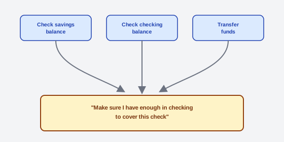 Three tasks that each pass their own usability test can still add up to one clumsy errand if nobody designs for the errand itself.
- Be detailed — specific to the customer and situation, still without specifying how.
- Be representative — a real task customers actually want, even for a genuinely novel site. (Sites like evite.com didn’t invent “inviting people to a party and tracking RSVPs” — they moved an existing task online.)
- Be common or important — either done frequently, or carrying real consequences if done wrong (e.g., getting your registered name/email wrong on an invitation site undermines the whole site).
- Be complete — a whole activity, not an isolated subtask. A banking site that’s only ever tested on “check savings balance,” “check checking balance,” and “transfer funds” as three separate tasks can still end up clumsy at the realistic combined task — “make sure I have enough in checking to cover this check” — which chains all three and benefits from being explicitly designed as one flow.
Related Concepts
Processes
Further reading
Nielsen Norman Group’s “Task Analysis: Support Users in Achieving Their Goals” (commercially published, no stated open license) adds a two-stage process this page doesn’t cover — information-gathering methods (contextual inquiry, critical-incident interviews, diary studies, activity sampling) that precede the analysis itself — and hierarchical task-analysis (HTA) diagramming as the concrete artifact for structuring observed behavior into major tasks, subtasks, and their sequence.
Sources
The Design of Sites: Ch. 3 — Knowing Your Customers: Principles and Techniques is this page’s sole source — the task-analysis process itself, the four question categories mirroring Know Your Customers‘s people/tasks/technology/social framework, the two cautionary examples (the unfindable refund form and the dentist’s billing system), and the four criteria for choosing good tasks.