
Content Organization Schemes
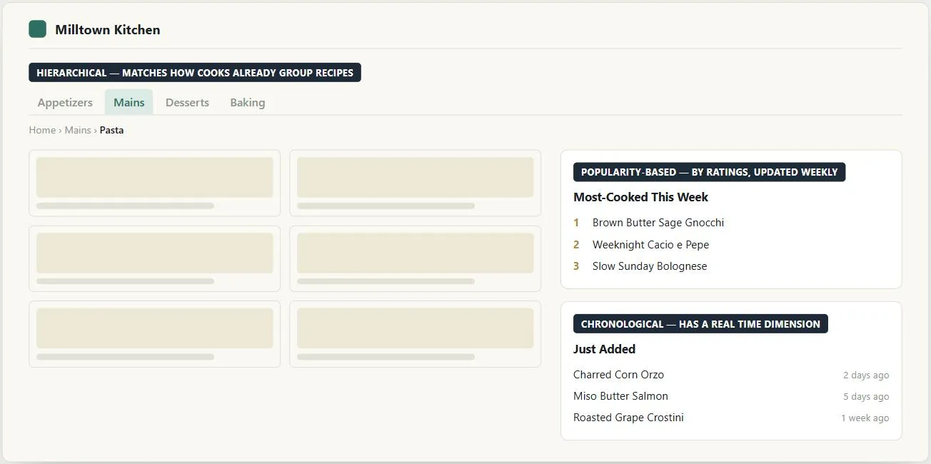 None of these schemes replaces another — hierarchy gives the site its overall shape, and whichever of the rest actually fits a given list gets layered on inside it.
Problem
A large collection of Browsable Content needs some grouping so customers can browse it, but no single grouping scheme fits every kind of content equally well.
A large collection of Browsable Content needs some grouping so customers can browse it, but no single grouping scheme fits every kind of content equally well.
Solution
Five named ways to group content for browsing, presented together because the source treats them as a menu of options to pick from (or combine) for a given collection, not as competing solutions to different problems. Each below was originally a separate, fully-documented pattern (B3–B7); they’re combined on one page here because none of them stands alone — choosing one is really one decision (how should this specific content be grouped?), not five.
Default to hierarchical organization for most large collections
Breaks a large collection into nested categories — the most generally useful scheme for large amounts of content, and the default choice absent a more specific reason for one of the others below. Two things make a hierarchy work: matching the way customers actually think and talk about a topic (verified with Card Sorting plus category identification and category description testing — showing people category names and tasks and asking which category they’d pick, or showing a category name and asking what they think it contains — both elaborated further in a not-yet-ingested pattern, FAMILIAR LANGUAGE, K11), and category labels that are both descriptive and distinctive from their siblings. One observed failure: a health site’s “Information” category, which made sense to its designers, left 70% of tested customers unable to find disease information filed under it — a vague or internally-coined label can break a hierarchy regardless of how logically it’s structured underneath. Keep subcategory lists under 50 items (two columns of 25) per category; past that, split further or combine categories.
One observed failure: a health site’s “Information” category, which made sense to its designers, left 70% of tested customers unable to find disease information filed under it — a vague or internally-coined label can break a hierarchy regardless of how logically it’s structured underneath.
Group by task when one action leads naturally to the next
Groups content by the sequence customers actually follow to get something done, so that finishing one task surfaces the next one they’re likely to want — e.g. a restaurant search on a map service surfacing nearby movie theaters next, or a customer relationship management (CRM) tool offering to schedule a follow-up right after a sales call is logged. Build this by studying what customers actually do (interviews, server logs, or direct observation — see Customer Research Methods), modeling which tasks regularly follow which, then linking task-completion pages directly into the next task rather than routing everyone back to a central hub.
Distinct from Process Funnel: a process funnel forces one specific, narrow task through a fixed sequence with few choices at each step, while task-based organization is about offering a relevant next step among several, not mandating one.
Use alphabetical organization only when customers know the exact name
Works only when customers already know the precise name of what they’re looking for — a list of customers, products, or documents with well-known names. Best kept on a single page with a jump-to-letter index at the top rather than split across multiple pages, since a customer can’t always predict which exact letter a multi-word name will be filed under (is it “The Last Tango in Paris” under T, or “Last Tango in Paris” under L?) — a single page lets them find it either way. Doesn’t translate well to non-alphabetic writing systems.
Use chronological organization for content with a real time dimension
Fits content with a real time dimension — historical events, scheduled items, change logs. Display as a vertical list, a (harder to implement, but more intuitive) horizontal timeline, or a calendar. As with hierarchical lists, keep any single list under 50 items by breaking it into smaller time-based groups (day/decade/century, or named milestones), since long undivided chronological lists become as tedious to scan as long undivided alphabetical ones.
Use popularity-based organization to surface what’s currently popular
Surfaces what’s currently popular — most-purchased, most-viewed, most-rated, or pulled from an outside source (e.g. a bestseller list). Requires two explicit decisions the source list doesn’t make for you: how popularity is measured (purchases, ratings, page views, an outside provider, or a recommendation community where customers themselves supply the ratings), and over what time period (a popularity list needs enough turnover between visits to stay interesting — daily rankings for daily visitors, monthly for less-frequent ones). Always label the list with what was measured and over what window; an unlabeled “most popular” list reads as arbitrary or untrustworthy.
Always label the list with what was measured and over what window; an unlabeled “most popular” list reads as arbitrary or untrustworthy.
Combine schemes
These are not mutually exclusive — a site might use hierarchical organization for its overall structure, with popularity-based or chronological sublists inside individual categories, and Category Pages as the consistent landing experience for each branch of the hierarchy. The same schemes apply just as well to grouping a search-results page as they do to browsing a site’s permanent structure. Faceted filtering layers on top of any of these schemes rather than replacing one — narrowing further by attribute within whatever grouping is already shown — and faces the same organize-vs-overwhelm tension as more facets are added.
Related Concepts
Patterns
- Browsable Content
- Process Funnel
- Category Pages
- Organized Search Results
- Account Management
- Jump Menus
- Site Map (Navigation Page)
- Recommendation Community
- Filters and Facets
Principles
Processes
Further reading
Schade, Cheng, and Sherugar’s Top 10 Enduring Web-Design Mistakes (Nielsen Norman Group, 2016 — copyright NN/g, no open license; https://www.nngroup.com/articles/top-10-enduring/) names organizing content around a company’s internal structure, rather than customers’ own mental models, as the most damaging of ten recurring mistakes — corroborating the “Information” category failure above and recommending the same remedy: Card Sorting, tree testing, and usability testing before committing to a structure.
Rosenfeld, Morville, and Arango’s Information Architecture: For the Web and Beyond (4th edition, amazon.com/dp/1491911689 — commercially published, no stated open license) is the standard reference covering organization, labeling, navigation, and search systems at length, treating the five schemes above as one chapter within the much larger Information Architecture discipline.
Sources
The Design of Sites: Pattern Group B — Creating a Navigation Framework (Patterns B3–B7, combined onto this one page) is this page’s sole source — the five organization schemes themselves, the health-site “Information” category failure, and the 50-item list-length guidance all come directly from it.