
Predictive Input
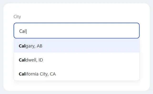 The matching prefix highlights as it narrows with each keystroke — arrow keys plus Enter pick a suggestion without touching the mouse.
Background
Predictive input is one of two techniques (with Drill-Down Options) for handling long or unwieldy pick lists in a form; choose predictive input when the list is very long, changes frequently, or needs to accept a value not on the list at all, and drill-down options when the options are cleanly hierarchical and interdependent instead.
choose predictive input when the list is very long, changes frequently, or needs to accept a value not on the list at all, and drill-down options when the options are cleanly hierarchical and interdependent instead.
Problem
Filling out forms — especially ones requiring a lot of typing — is a chore most customers would rather avoid.
Solution
Predictive input speeds up data entry and improves accuracy by suggesting or narrowing options as the customer types, rather than requiring every character to be typed out or every option scrolled through manually — trading a recall task (remembering and typing the exact value) for a recognition one (picking it out from a visible, narrowing list).
trading a recall task (remembering and typing the exact value) for a recognition one (picking it out from a visible, narrowing list).
Use basic pick-list type-ahead
Most browsers let customers jump forward in a long native pick list (the 50 U.S. states, for example) by typing the option’s first letter while the list has focus — pressing “M” jumps to Maine. This built-in behavior is real predictive input, and a keyboard shortcut in its own right, but it’s not discoverable — most customers never learn it exists, which is the gap the richer pattern below fills.
Add predictive text input
A richer form: a dropdown-like list of matching options appears as soon as the customer starts typing in a field, and narrows with each additional keystroke. Customers can pick an option with the mouse or the arrow keys plus Enter, or ignore the suggestions and keep typing something else entirely. Decide deliberately what the Enter key does in context — insert the selected suggestion into the field, or submit the whole form — since both are legitimate depending on the form.
Decide whether the value must be constrained
A select-only version of predictive input — built to enhance a plain <select> element rather than replace it — only accepts one of the predetermined suggestions; typing filters the list, but the field’s final value always has to be a real option. Use this when a mismatched value would actually break something downstream (a country code, a product SKU) and when consistent values matter across many submissions — free-text entry for something like a country name reliably produces messy variants a constrained list avoids by construction. An editable field instead allows an arbitrary typed value and uses suggestions only to speed up the common case, which is the right choice for a search box, where an unmatched search term is still perfectly valid.
Match the suggestion behavior to what you tell assistive technology
Four distinct suggestion behaviors are worth telling apart, since each sets a different expectation for what happens next as a customer types: no autocomplete (the list’s contents don’t change with what’s typed, e.g. a fixed recent-searches list), list with manual selection (suggestions filter to match, but the typed text stays the value unless a suggestion is actually picked — the richer pattern described above), list with automatic selection (the same, but the top match is pre-highlighted and becomes the value if the field loses focus unchanged), and list with inline autocomplete (automatic selection plus the untyped remainder of the top match shown inline right after the cursor). Whichever one is actually built should be declared via aria-autocomplete ("none"/"list"/"both") rather than left generic — assistive technology sets its own expectations from that value, and a mismatch actively misleads a screen reader user about what the widget will do next.
Wire up the underlying ARIA roles
<label for="city">City</label>
<input id="city" role="combobox" aria-expanded="false"
       aria-controls="city-listbox" aria-autocomplete="list">
<ul id="city-listbox" role="listbox" hidden>
  <li role="option" id="opt-1">Calgary</li>
</ul>
role="combobox" marks the input; aria-expanded tracks whether the suggestion list is currently visible; aria-controls points at the list; and once a suggestion is highlighted, aria-activedescendant on the input references it by ID, so a screen reader announces the highlighted option while DOM focus stays on the input itself rather than actually moving into the list. See WAI-ARIA (Accessible Rich Internet Applications) for how this roles/states/properties model works more generally.
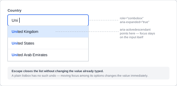 The same narrowing-list interaction, with the ARIA attributes that make it legible to a screen reader called out.
Escape should dismiss the list without changing a value the customer already had — exploring suggestions and backing out should never cost them what they’d already typed. This is a meaningful difference from a plain, non-editable pick list, where moving focus among options changes the selected value immediately with no equivalent undo.
Choose preloaded or dynamically loaded options
For option sets small enough to ship with the page (an airport list), preload them. For sets too large to preload efficiently, load them from the server as the customer types (an AJAX — Asynchronous JavaScript and XML — background request) — Google Suggest is the canonical example, aggregating search terms across many customers rather than pulling from any one customer’s own history. A simpler, purely client-side variant preloads a customer’s own previous answers to the same field from a stored cookie, needing no server round-trip at all.
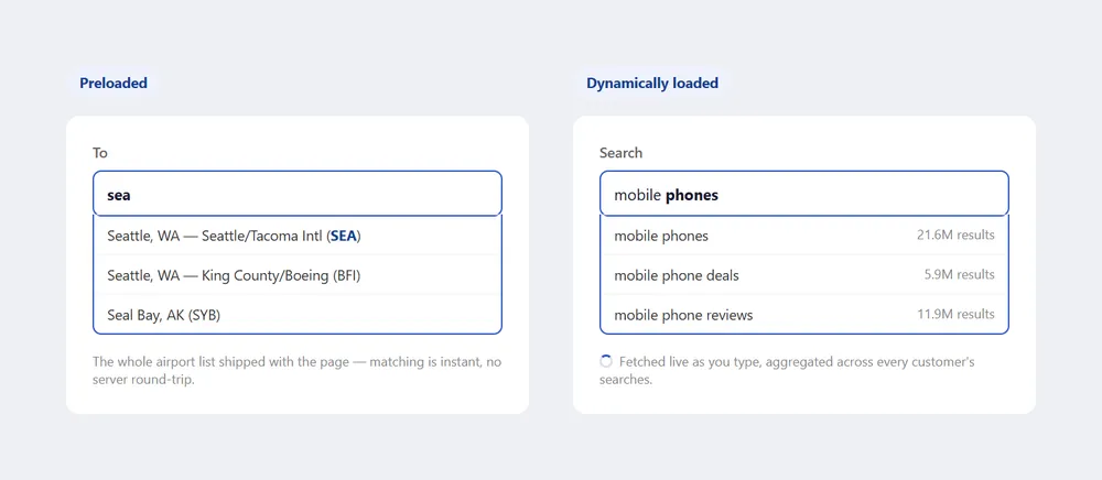 Same interaction on the surface, but one is a static list shipped with the page and the other is a live query — the spinner and result counts are the only visible clue which.
Build the list
Build a sorted list of viable text strings for the field in question, using whichever sort makes the list usable as customers type: alphabetical for names or places (so each keystroke narrows predictably), chronological for something like months, or a combined criterion (Google Suggest sorts by both alphabetical match and popularity).
Size the visible list
Size the suggestion window to the content: large enough that a short, bounded list (the 12 months) can be seen in full without scrolling, but small enough to avoid consuming excessive space or forcing customers to scan too many options — a window showing seven to ten entries at a time is a reasonable middle ground for a longer list like U.S. states. Keep the suggestion field within the page’s grid layout, and keep it above the fold so its suggestions don’t require scrolling to see.
a window showing seven to ten entries at a time is a reasonable middle ground for a longer list like U.S. states.
Related Concepts
Patterns
Principles
Standards
Sources
The Design of Sites: Pattern Group H — Helping Customers Complete Tasks (H11 Predictive Input) is this page’s original source — the basic pick-list type-ahead and richer predictive-text-input techniques, the preloaded-versus-dynamically-loaded distinction (Google Suggest as the dynamic example), and the visible-list sizing guidance all come directly from that pattern.
Combobox Pattern (W3C WAI-ARIA Authoring Practices Guide) is the source for the select-only/editable distinction, the four autocomplete behaviors, and the ARIA roles/states/properties and Escape-without-losing-value behavior above.
accessible-autocomplete (GOV.UK Design System) (OGL v3.0) is the source for the data-quality rationale behind constraining a field to known values.