
Alt Text
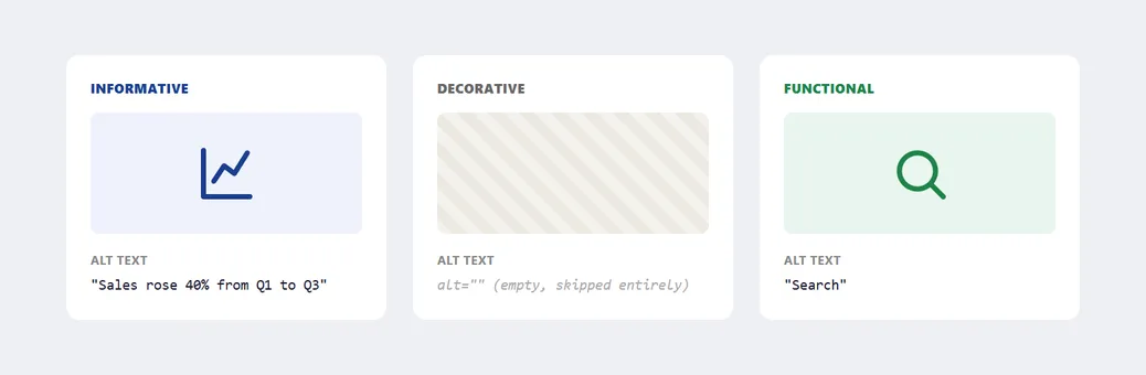 Same question — what should a screen reader say here? — with three different right answers depending on the image’s role.
Background
Alt text is one of the concrete techniques Accessibility as a whole depends on: every image needs a description for customers who can’t see it — a blind visitor relying on a screen reader, or anyone whose image failed to load. What that description should say depends on what kind of image it is (see Effective Images for the earlier decision of whether to use an image at all, and which type — photography, illustration, or icon — to reach for).
Problem
The same image can need three different kinds of description depending on its role on the page, and getting the wrong one wrong makes a page actively harder to use with a screen reader rather than merely incomplete.
The same image can need three different kinds of description depending on its role on the page, and getting the wrong one wrong makes a page actively harder to use with a screen reader rather than merely incomplete.
Solution
Match the alt text to the image’s role
Material Design’s accessibility guidance gives a three-category taxonomy for deciding what kind of description to write:
- Informative images (photos, illustrations representing a concept): alt text should convey the essential information the image communicates, not a literal description of the image (“A bar chart showing…” is worse than “Sales rose 40% from Q1 to Q3”).
- Decorative images (visual styling with no informational role):
alt=""so screen readers skip them entirely. - Functional images (logos used as links, submit button icons): alt text describes the function (where it goes, what it does), not the visual appearance. A magnifying-glass search button’s alt text is “Search,” not “Magnifying glass icon.”
Write alt text well
- Keep it to roughly 125 characters — most screen readers truncate or stop reading beyond that, so a lengthy description gets cut off mid-sentence regardless of how thorough it is.
- Skip the “image of” / “picture of” prefix — it’s implied by the fact that alt text only ever attaches to images.
- Write a short, informative phrase, not one or two bare words — “Skyline” tells a screen reader user almost nothing, while “A rooftop view of a lit city skyline and central tower at night” gives them the same context a sighted user gets at a glance.
- Include real, relevant keywords as part of that natural description (this helps search indexing too), but don’t stuff in disconnected keywords purely for search engine optimization (SEO) — a screen reader reads the alt text as a sentence, and a keyword list breaks that sentence into noise.
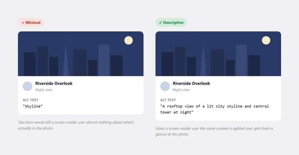 Same image, same character budget left to spare either way — one just spends it on actually describing what’s there.
“Skyline” tells a screen reader user almost nothing, while “A rooftop view of a lit city skyline and central tower at night” gives them the same context a sighted user gets at a glance.
Choose between alt text, a caption, and adjacent body text
Alt text isn’t the only channel available:
- A caption (visible text below an asset, explaining who/what/when/where) is available to sighted and screen-reader users alike and isn’t subject to alt text’s character limit, so it’s the better home for a long description.
- Adjacent body text that already explains an image can make alt text redundant entirely — if the surrounding prose covers what the image shows, leave
alt=""rather than repeating the same sentence a second time (and drop the image filename too, so it isn’t announced in its place). - Avoid duplication either way — if alt text and a caption say the same thing, a screen reader user hears the same content twice and it slows them down for no added information; use alt text only for details the caption or adjacent text doesn’t already cover, like specific colors, sizes, or spatial layout.
- Text baked directly into an image (a diagram with embedded labels) can’t be read by a screen reader at all, so if that embedded text carries essential information, it has to be repeated in the alt text explicitly.
A caption (visible text below an asset, explaining who/what/when/where) is available to sighted and screen-reader users alike and isn’t subject to alt text’s character limit, so it’s the better home for a long description.
Related Concepts
Patterns
Principles
Further reading
The W3C WAI‘s Images tutorial (w3.org/WAI/tutorials/images/ — W3C Document License; permits copying but not derivative works) extends the taxonomy above with categories for complex images and image groups.
Sources
Accessibility (Material Design) is this page’s sole source — the informative/decorative/functional taxonomy, the roughly-125-character guidance, and the caption/adjacent-text/alt-text division of labor are all drawn from it directly.