
Form Design
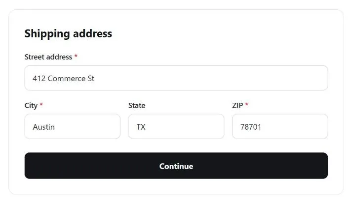 Grouped fields, a nearby action button, and widths sized to the expected answer all tell a customer what this form wants before they type a single character.
Background
A form is where an abstract system requirement collides with how customers actually type — the exact format a database expects rarely matches what a customer enters unprompted, and nearly every decision below comes down to whether the system bends to match customer behavior or the customer gets asked to match the system instead.
nearly every decision below comes down to whether the system bends to match customer behavior or the customer gets asked to match the system instead
Problem
Forms are the primary mechanism through which users submit data, authenticate, and complete tasks. Poor form design is among the most common causes of task abandonment.
Solution
Address labeling, layout, friction, and input assistance deliberately at each stage of a form, rather than leaving any of them to framework defaults — see Error Messages for validation timing and error-message design specifically.
Give every input a visible, well-placed label
Every input needs a visible label — not a placeholder alone. Placeholders disappear when a user starts typing, removing the only reference for what the field asks; they are also lower-contrast than true labels and can be mistaken for pre-filled content. Labels should be positioned close to their input, so the pair reads as a unit (an application of Gestalt proximity) rather than in a layout that requires a diagonal scan across the form.
A <label> associated with its input via matching for/id attributes keeps the pair connected programmatically, not just visually — a screen reader announces the label when the input receives focus, and clicking the label text moves focus to (or activates) the input itself:
<label for="email">Email address</label>
<input type="email" id="email" name="email">
Not every control takes a label, though: <input type="button">, <input type="submit">, <input type="reset">, <input type="hidden">, and <button> elements already carry their own accessible name from their visible text or value — pairing one of these with a separate <label> produces a confusing, redundant announcement instead of a helpful one. A label’s own content should also stay plain: headings, links, and block-level elements (<div>, <p>) nested inside a <label> create the same kind of confusing announcement.
Three conventional label positions, each with a real tradeoff:
- Side labels (left of the field, right-aligned toward it) sit close to their field but consume horizontal space, making it hard to fit multiple fields on one line unless the sub-fields share a single label.
- Top or bottom labels (left-aligned with the field beneath or above) leave room for longer label text and let related fields (City, State, Zip) sit on one line, but cost more vertical space — each field effectively needs three lines (label, field, spacing) — which can push action buttons below the fold.
- Combined side and bottom labeling pairs a side label with a lighter-weight instruction or example below the field; differentiate the two visually (e.g. text weight or color) so they don’t read as one label.
Label a sentence-embedded field with aria-labelledby
Some fields sit inside a sentence rather than beside a label of their own — “Delete history after [ ] days” — where the accessible name is split by the input itself, with text both before and after it. A single <label> can’t wrap content on both sides of a control, so point aria-labelledby at the ids of every text fragment that makes up the label, listed in reading order; a screen reader concatenates them into one name (“Delete history after 21 days”) the same way it would read an ordinary, unbroken label:
<span id="deleteLabel">Delete history after</span>
<input aria-labelledby="deleteLabel deleteValue deleteUnit" id="deleteValue" type="number" value="21">
<span id="deleteUnit">days</span>
Keep a conventional <label> in the markup too — aria-labelledby takes precedence where it’s supported, but the fallback label costs nothing and covers older assistive technology that doesn’t recognize it.
Use input width to signal expected length
A text input’s visual width communicates the expected answer length before the user types. A short fixed-width field signals a short, constrained response (postal code, account number); a wide field signals free text. Mismatched width is an Affordance failure — a wide field for a phone number suggests unlimited input when the opposite is true. Use fixed widths calibrated to the expected character count for structured fields; use full-width fields for free-form fields.
Choose the right option selector
Dropdowns hide their options until opened, imposing a decision cost invisible from the closed state. When the option set is small enough to show all at once — radio buttons, clickable cards, or tag-style toggles — users can scan and select without an extra interaction. Reserve dropdowns for longer lists or hierarchical data.
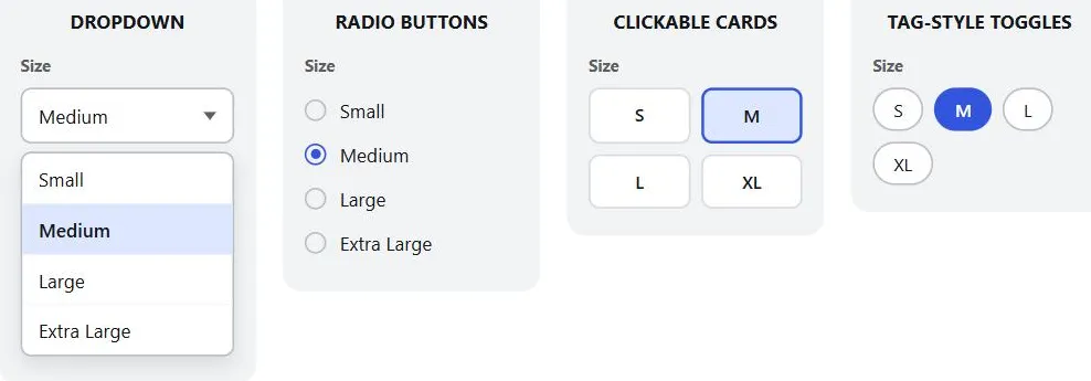 The dropdown hides its options until opened; the other three selectors show all four at once, with no extra click required.
Order radio buttons alphabetically, and never pre-select one. Single selection: order options alphabetically by default. Never pre-select an option — pre-selection increases the risk users miss the question or submit the wrong answer. When “none of the above” is a valid answer, include it explicitly; do not leave users with no correct option. If two options are the only choices (e.g. Yes/No), inline side-by-side layout is acceptable on desktop; on mobile they stack vertically regardless.
Replicate native <select> keyboard behavior in any custom dropdown. A browser’s built-in <select> element comes with two keyboard behaviors built in for free: arrow keys move the highlighted option, and typing a letter jumps straight to the next option starting with it. A custom-built dropdown widget doesn’t get either behavior automatically — reimplementing the visual look without also reimplementing the keyboard handling leaves customers stuck scrolling a long list by mouse alone, unable to use either shortcut a native element would have given them for free.
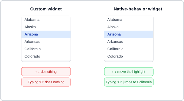 The same list, the same highlighted state — the only difference is whether the keyboard shortcuts a native
 <select> gives away for free actually survived the redesign.
Signal that checkboxes allow multiple selections. Multiple selection: add “Select all that apply” as hint text, because the visual design of checkboxes alone doesn’t reliably communicate that multiple selections are allowed. When “none of the above” is a valid answer, place it last separated by an “or” divider — and make it exclusive (selecting it deselects all other options).
Group related elements with a visible boundary
Group form elements in a visible box, with the action button inside the same box, so the boundary and the submit action read as one unit — this matters most when the button isn’t above the fold and needs another way to stay associated with the fields it submits.
The same boundary principle applies one level down, to related inputs within that box: group them so users perceive them as a unit. This is Gestalt proximity applied to form layout: billing address fields, card details, and personal details each belong together. Clear group headings make the structure explicit, helping users with cognitive disabilities orient themselves within long forms.
<fieldset> and <legend> make this sub-grouping programmatic rather than only visual: a screen reader announces the legend as context when it reaches any input inside the fieldset, so the group’s purpose stays clear even outside the surrounding visual layout:
<fieldset>
  <legend>Billing address</legend>
  <label for="street">Street address</label>
  <input type="text" id="street" name="street">
  <label for="city">City</label>
  <input type="text" id="city" name="city">
</fieldset>
Ask one question at a time
For multi-step forms and transactional flows, asking one question per page reduces cognitive overhead and improves error recovery. Every question page needs three things: a back link (users distrust the browser back button during data entry and need explicit reassurance that reversing is safe), a clear heading stating the question, and a “Continue” button (not “Next” — “Continue” implies progress rather than arbitrary sequencing).
When a page asks exactly one question, its heading and its field label are saying the same thing — so wrap the <label> (or the <fieldset>’s <legend>, for a radio/checkbox question) in the page’s <h1> rather than writing two separate elements. This gives the field an accessible name straight from the page heading, with no duplicate text on the page:
<h1>
  <label for="full-name">What is your full name?</label>
</h1>
<input type="text" id="full-name" name="full-name">
When to group multiple questions on one page: when user research shows that grouping related questions reduces confusion or speeds task completion for that specific flow. In practice, the single-question default is almost always the better starting point.
Pre-populate earlier answers wherever possible — never ask users to re-enter information they already provided earlier in the flow.
Autofocus a page’s one and only field
When a page exists to collect exactly one thing — a login password, a video passcode, an SMS verification code — put keyboard focus on that field automatically when the page loads, rather than leaving customers to click it first. There’s no second field competing for focus and no ambiguity about intent: if the page has one field, it’s the field the customer came to fill in.
Autofocus needs no more than one HTML attribute, cheap relative to the friction it removes — a customer who starts typing the instant a passcode arrives finds nothing happens if focus is sitting somewhere else, and has to notice the problem, locate the field, and click it before their first keystroke actually lands anywhere. This generalizes the same rule Sign-In and Account Creation covers for a 2FA one-time-password field specifically to any page whose entire purpose is one field.
if the page has one field, it’s the field the customer came to fill in
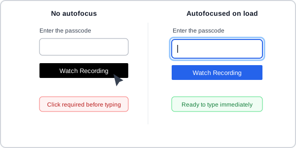 Same field, same page — the only difference is whether the very first keystroke actually lands somewhere.
Provide a payoff
Users are increasingly reluctant to hand over personal information for nothing in return. State an up-front value proposition for the form itself — exactly what the user gets for supplying the requested information — so filling it out reads as “helping myself” rather than “helping the site.” Splitting a form into labeled sections, each stating what that section’s answers are for, makes the payoff concrete piece by piece rather than as one abstract promise at the top.
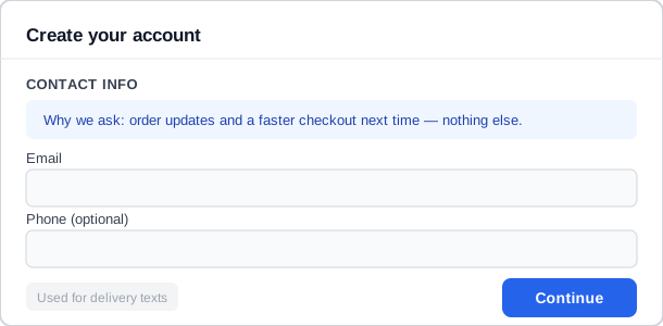 The payoff sits right next to the fields it explains, not as one promise at the top of the page.
Ask only for what’s genuinely necessary
Fewer fields reduce total friction — ask only what is genuinely necessary. Where structured data is required (phone numbers, dates, postal codes), showing the expected format as part of the field helps users succeed without having to fail first.
Reduce typing itself
Reduce typing itself, not just formatting friction: don’t ask for data the site already has (offer a saved-address picker instead of retyping, or a “same as billing” checkbox); convert fixed-option fields to pick lists; and for longer or interdependent option sets use Predictive Input or Drill-Down Options rather than a single long dropdown. Prefill fields that need a specific format (e.g. a greyed example address that clears on focus) so the expected shape is communicated without permanently occupying label or instruction space.
Pressing Enter in a text input should advance focus to the next field in sequence, or submit the form when focus is on the last input — this follows universal keyboard convention. Trapping Enter without advancing, or triggering submission from a field mid-form, both violate the user’s model of how forms work.
Use automatic formatting
Automatic formatting goes a step further than a format hint: split a compound field (e.g. a phone number’s area code / exchange / number) into subfields with automatic cursor advancement, or normalize free-typed input (e.g. “Jan. 31, 2009” → “01/31/2009”) in the background.
For near-term dates, an inline calendar picker in a floating window is often faster than manual entry; for dates spanning many years, paging through a calendar becomes more tedious than typing, so manual entry (or Predictive Input) wins instead. The same choice can be reframed around what the date means rather than how far away it is: reach for a calendar when the day of week or surrounding schedule context actually matters (booking an appointment), and use plain typed entry when the customer already knows the exact date by heart (a birthdate, an anniversary) and a calendar just adds a click.
Whichever a form leads with, always let customers type a date manually as well — usability testing consistently finds a share of people who prefer typing over a picker regardless of which one is offered by default. For typed entry, split the date into separate day/month/year fields sized to their expected digit count (each field’s width signals how many digits it wants) rather than one free-text field — this is the same “give numbers room, don’t make customers guess a format” logic covered for numeracy in general.
Tolerate flexible formats, and mask rigid ones
Where a field can unambiguously resolve multiple input representations to the same value, it should accept all of them. A workspace sign-in field should accept both a bare name (“fuguux”) and a full URL (“fuguux.slack.com”); a login identifier field should accept either a bare username or the equivalent full email address (Carnegie Mellon University’s login screen accepts either an AndrewID or the matching @andrew.cmu.edu address); a phone number field should strip dashes, spaces, and optional country-code prefixes; a URL field should accept input with or without the https:// scheme.
Moving the burden of format normalization from user to system removes a preventable class of errors — users shouldn’t need to know or memorize which exact syntax a field requires. Format tolerance and format hints (showing the expected format as part of the label or placeholder) work together: hints set expectations, tolerance catches the cases where users diverge anyway.
Getting this wrong is a common, concrete frustration: a credit card field that rejects a number typed with spaces, or a phone number field that bounces input back for reformatting rather than normalizing it — each additional site with its own idiosyncratic expected format compounds the cost of a mistake that’s trivial to prevent.
Where format tolerance normalizes whatever the customer types after the fact, an input mask takes the opposite approach: a field that guides typing toward a fixed pattern in real time, auto-inserting dashes in a Social Security number or a space every four digits of a credit-card number, preventing a malformed value from being entered at all. Masks suit fields with one predictable, widely-known format — a SSN, a phone number, a ZIP code — and fail badly on anything free-form or too complex to mask cleanly (an email address has no single fixed shape).
A mask’s own rigidity makes errors harder to recover from once something does go wrong, since it gives little feedback about what is wrong versus just refusing the keystroke — always pair a mask with a clear label and hint text showing the expected format, and delay any error styling until after the customer has actually finished with the field rather than showing it mid-keystroke.
Show a character count for length-limited fields
Where a field has a genuine reason to cap length — a legal character limit, or a UI that needs brevity (a summary, a tweet-style post) — show a live count of characters remaining rather than only rejecting text once the limit is hit. Skip the counter on fields where the limit is effectively never reached in practice (most name or address fields) or where the constraint comes from a backend system rather than the customer’s own writing, since a counter implies a constraint worth tracking and a customer will rightly wonder why it’s there if it never becomes relevant.
Associate the counter text with the input programmatically (aria-describedby) so a screen reader announces the remaining count along with the field itself, and pair the counter with the same visual error treatment other invalid fields get once the limit is actually exceeded, rather than a channel unique to this one field.
Use a search field focus mode
When a search input in a persistent header gains focus — competing for attention alongside page content — a full-page dimming effect makes the mode change unambiguous. Graying out everything behind the search field signals that keyboard input now routes to search rather than the page, and that other interactive elements are temporarily inactive. The dim also communicates the exit: clicking outside the overlay, or pressing Escape, restores the page and removes focus from the field. This pattern is most useful when the search input is small relative to the page (e.g. an icon that expands on click), when the surrounding page contains many interactive elements, or when it is not otherwise obvious that the keyboard’s focus has shifted.
Keep forms short
Keep forms short — collecting only what a field’s actual purpose needs is also a legal minimum, not just good practice, wherever a form touches health data (HIPAA (Health Insurance Portability and Accountability Act)‘s minimum-necessary principle) or a user known to be a child (COPPA (Children's Online Privacy Protection Act)‘s prohibition on requiring more than an activity needs). Make required/optional status visually redundant — a symbol (e.g. an asterisk) and a distinct color, not just one or the other, so the distinction survives for users who can’t perceive color.
Where a form can’t be shortened further, make it look shorter: trim instructions to the minimum a usability test shows is actually needed, or split it across multiple pages (see Progress Bar for the accompanying step indicator). Splitting also protects against data loss — each page’s entries are submitted before the next loads, instead of risking one long submission failing atomically.
Show a progress indicator
Multi-step forms benefit from a visible progress indicator. Knowing where they are in a sequence lets users decide whether to continue or return later, and reduces the anxiety of an open-ended task. The indicator must remain accurate — one that freezes or appears to regress is more disorienting than no indicator at all (see Interface Design Principles, principle 2). See Progress Bar for the full pattern: step labeling, visual completion state, clickable vs. non-clickable navigation, and edit-in-place.
Emphasize the primary action, and isolate irreversible ones
Only one primary (high-emphasis) action button should appear per form or view. Multiple competing primary buttons undermine the Visual Hierarchy that makes a call to action findable.
Irreversible actions (delete, permanent removal) deserve spatial separation from ordinary form controls — position alone can signal weight independently of any label or color. A reset button is the clearest case needing this isolation, or removal outright: a button that clears all form data with one click is almost never triggered intentionally and causes unrecoverable data loss. If a user wants to start over, navigating away and returning achieves the same result without the risk of accidental wipe.
Do not disable the submit button to indicate incomplete fields
A greyed-out submit button gives no feedback about what is missing or why the user cannot proceed. Let users attempt submission and show clear, specific error messages that identify the problem — see Error Messages.
A greyed-out submit button gives no feedback about what is missing or why the user cannot proceed.
Avoid forms in modal dialogs
Embedding a multi-field form inside a modal overlay creates tradeoffs: no stable URL, potential scroll conflicts with content behind the modal, and reduced screen space on mobile. For substantial forms, a dedicated page is more reliable — see Process Funnel.
Related Concepts
Patterns
- Process Funnel
- Action Buttons
- Error Messages
- Up-Front Value Proposition
- Predictive Input
- Drill-Down Options
- Progress Bar
- Sign-In and Account Creation
- Above the Fold
- Modal Dialogs
- Floating Windows
- Auto-save
Principles
- Interface Design Principles
- Cognitive Accessibility
- Hick's Law
- Cognitive Load
- Gestalt Psychology
- Fitts's Law
- Affordance
- Visual Hierarchy
- Dark Patterns
Standards
- HIPAA (Health Insurance Portability and Accountability Act)
- COPPA (Children's Online Privacy Protection Act)
Further reading
Bargas-Avila, J.A. et al. (2010). Simple but Crucial User Interfaces in the World Wide Web: Introducing 20 Guidelines for Usable Web Form Design. InTech. (intechopen.com/books/user-interfaces/simple-but-crucial-user-interfaces-in-the-world-wide-web-introducing-20-guidelines-for-usable-web-fo — CC BY-NC-SA 3.0) is an empirical synthesis of 20 guidelines for usable web form design, covering label positioning, input type selection, validation timing, and error handling. One counter-intuitive finding: real-time inline validation can increase error rates compared to post-submit embedded errors.
Victor Ponamariov’s 50 Tips to Improve User Interface (goodreads.com/book/show/58085971-50-tips-to-improve-user-interface — self-published ebook, no stated license) dedicates a large portion to forms, covering tips such as the ≤5–7 option threshold for switching from dropdowns to revealed choices.
ReForm: Free Chapters and Tips (reform.user-interface.io — ungated PDF, no stated open license) covers form-specific topics including auto-save with status indicators (saving in progress, save complete — see Auto-save), illustrated by Google Docs.
The W3C WAI‘s Forms tutorial (w3.org/WAI/tutorials/forms/ — W3C Document License; permits copying but not derivative works) covers similar ground to the GOV.UK-sourced guidance above — grouping related controls, per-control instructions, validating on submission rather than mid-type — from an accessibility-first angle. It includes worked examples for multi-page forms.
A MarketingExperiments field-length test on a Marketo lead-generation form (marketingexperiments.com/lead-generation/lead-generation-testing-form-field-length-reduces-cost-per-lead-by-10-66 — copyright MarketingExperiments, no open license) found conversion rose from 10% to 13.4%, and cost-per-lead fell from $41.90 to $31.24, when cutting the form from nine fields to five.
Luke Wroblewski’s inline-validation study (A List Apart, alistapart.com/article/inline-validation-in-web-forms/ — copyright A List Apart & Authors, no open license) tested six validation timings; the best-performing version — validating after a customer leaves each field, not on every keystroke — produced 22% more successful completions, 22% fewer errors, and 42% faster completion times than no validation at all.
UX Movement’s account of an Expedia checkout-form fix (uxmovement.com/thinking/the-12-million-optional-form-field/ — copyright UX Movement, no open license) attributes roughly $12 million in additional annual profit to removing a single optional “Company” field that customers were misreading as a place to enter their bank’s name, corrupting the address field and failing card verification downstream.
Clearbit’s guide to form conversion (clearbit.com/resources/guides/Adobe-Marketo-improve-form-conversion-rates — copyright Clearbit, no open license) cites Gong’s demo-request form, cut to a single email field with contact details auto-enriched afterward, producing a reported 70% lift in conversions.
A VWO case study (vwo.com/success-stories/payu/ — copyright Wingify, no open license) found removing the email field from PayU’s checkout — leaving only a phone number, since local law permitted either for a receipt — raised checkout rate 5.8%, a statistically significant lift.
Sources
GOV.UK Design System (Open Government Licence v3.0) is the source for the alphabetical radio/checkbox ordering rules, the fixed-width-signals-length guidance, and the one-question-per-page pattern above.
The Design of Sites: Pattern Group H — Helping Customers Complete Tasks‘s H10 Clear Forms pattern is this page’s structural backbone — label placement tradeoffs, the value-proposition framing in Provide a payoff, and the case against reset buttons all originate there.
The Design of Sites: Pattern Group K — Making Navigation Easy‘s K12 pattern supplies the format-hints-and-flexible-parsing guidance in Tolerate flexible formats, and mask rigid ones above.
It Just Works: Tiny Details That Matter in UX Design supplies the Slack workspace-name and Carnegie Mellon AndrewID examples grounding Tolerate flexible formats, and mask rigid ones above.
USWDS Components: Date Picker, Memorable Date, Character Count, Input Mask, Text Input, Validation (CC0 1.0 Universal) is the source for the calendar-vs-manual-entry date guidance, the character-count-field criteria, and the input-mask tradeoffs above.
Using ARIA for Labels with Embedded Fields (MDN Web Docs) is the source for Label a sentence-embedded field with aria-labelledby above.