
Sign-In and Account Creation
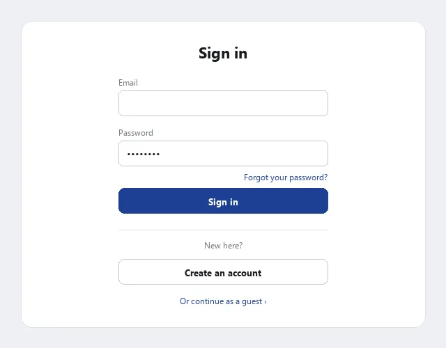 An easy path in for returning customers, an equally easy path to create an account for new ones, and a guest option that defers the choice entirely.
Problem
A single flow has to serve two different customers at once — returning customers who want to sign in and be recognized, and new visitors who need to create an account before they can get the same benefit.
A single flow has to serve two different customers at once — returning customers who want to sign in and be recognized, and new visitors who need to create an account before they can get the same benefit.
Solution
Offer an easy path in for people who already have an account and an easy path to create one for people who don’t — a variant of the Process Funnel pattern — and defer or make optional whatever isn’t strictly required from either path.
Minimize the barrier to a new account
Collect only the minimum information a new account genuinely needs — a long, invasive, or clumsy signup process costs signups. Where a site has an existing offline relationship with the customer (a magazine subscriber code on a mailing label, for instance), reuse that identifier to skip re-entering information the company already has.
Mark required and optional fields clearly (bold text or an asterisk convention, explained once), so customers aren’t guessing what they can skip. Prevent errors by showing the expected format for ambiguous fields (a phone number can be written several technically-correct ways) and accepting any of them rather than forcing one exact syntax.
State the site’s privacy information at account creation — link to the Privacy Policy and explain the fair information practices behind it: why each piece of information is needed and how it will and won’t be used (e.g. “we need your phone number in case of shipping problems, not for marketing calls unless you opt in”). If signup asks for a birthdate or other age-identifying field, COPPA (Children's Online Privacy Protection Act) governs what happens next for anyone who turns out to be under 13 — the field itself is what creates the actual knowledge the law’s obligations turn on.
Defer sign-in for first-time visitors
Don’t hide all content behind a sign-in wall. Two costs: search engines can’t index pages that require sign-in, so a walled site loses a whole acquisition channel (see Search Engine Optimization); and visitors dislike creating an account just to see what a site offers before they’ve decided it’s worth it. Split the site into a public sampler (headlines, some real content, or a few fully open pages) and a private area that requires signing in, and let the sampler do the persuading.
Split the site into a public sampler (headlines, some real content, or a few fully open pages) and a private area that requires signing in, and let the sampler do the persuading.
Offer guest accounts to defer account creation
A related pattern: rather than requiring account creation before a customer can act, let them complete the task first — most commonly finishing a checkout — and offer account creation as an optional step at the end, pre-filled with the shipping/billing information they just typed. Forcing an account up front repeats a barrier-to-entry customers don’t expect from an offline “sales script” (walking into a store to buy something doesn’t require joining first); telling customers up front that they won’t be forced into an account measurably reduces the friction of getting started. Guest accounts are implemented with the temporary side of Customer Sessions rather than a persistent one, since there’s no returning identity to remember.
telling customers up front that they won’t be forced into an account measurably reduces the friction of getting started.
 The account offer comes after the task is already done, pre-filled with information the customer already typed, and declining it is as easy as accepting.
Handle forgotten passwords
People forget passwords, especially across many accounts, so every sign-in flow needs a recovery path. Options, in increasing order of security:
- Email the password — the simplest option, but email is not secure end-to-end, and it’s a poor choice wherever the account guards something sensitive (grades, banking).
- Set a security question at account creation (“what street did you grow up on?”) — the customer answers it to get a hint or reset the password. Guard against the security answer being identical to the password itself, and give a meaningful error message if it is.
- Email a one-time reset URL — the password itself is never transmitted, and the link only works once, optionally combined with the security-question step for more protection.
- Verify identity in person — appropriate for sites serving a local, bounded population (a school, a university); more secure but not foolproof (IDs can be faked) and doesn’t scale.
The moment right after a password reset finishes is also a good point to offer a passkey as a way to avoid this same recovery flow next time — the frustration of a just-completed reset is exactly when that offer lands best.
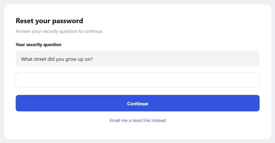 The security question the customer set at account creation stands in for the password itself, with a one-time email link still offered as an alternate path.
Streamline one-time-password entry
A 2FA screen is a specific case of autofocusing a page’s one and only field: put keyboard focus on the one-time-password field automatically when the page loads, the way Vanguard’s 2FA screen does. GitHub takes this a step further by auto-submitting the code as soon as the expected digit count is typed, so the user doesn’t need to also hit Enter or click Verify — cheap to implement relative to the friction and failed-login frustration it removes.
Guard against phishing at sign-in
The sign-in/account flow is a favorite phishing target — see Preventing Phishing Scams for the full countermeasure set. Two points specific to this flow: state explicitly, ideally right after account creation, what kinds of information the site will and won’t ask for by email; and never put a sign-in form or a direct sign-in link inside a subscription or transactional email (see Email Communications), since doing so trains customers to click exactly the kind of link a phishing email will imitate.
Handle sensitive data carefully
Two related warnings, covered in depth in Customer Sessions: never place sensitive data (a username, a password) inside a URL-embedded session identifier, where it’s visible to anyone glancing at the address bar or the server log; and treat identification (a username, a cookie — who someone claims to be) as distinct from authentication (a password — proof they are who they claim). Cookies streamline the former but should never stand in for the latter unless nothing sensitive is actually being protected.
Related Concepts
Patterns
- Process Funnel
- Form Design
- Error Messages
- Customer Sessions
- Preventing Phishing Scams
- Privacy Policy
- Email Communications
- Quick-Flow Checkout
- Account Management
- Search Engine Optimization
- Passwordless Authentication
Standards
Further reading
UIE’s account of an unnamed major e-commerce retailer’s guest-checkout addition (archive.uie.com/brainsparks/2011/10/17/the-back-story-for-the-300-million-button/ — copyright UIE, no open license) reports roughly 40% of the site’s registration-page visitors were requesting a password reset, with fewer than a quarter of those resets actually completed; adding a guest-checkout option produced $6 million in additional sales within the first week and an 80% drop in password-reset requests, an estimated $300 million/year run-rate.
First Round Review’s interview on Duolingo’s growth testing (review.firstround.com/the-tenets-of-a-b-testing-from-duolingos-master-growth-hacker/ — copyright First Round Review, no open license) reports that simply delaying account sign-up until after a customer had completed a lesson raised daily active users roughly 20%, later refined further (softer “Later” language instead of “Discard my progress,” and staged prompts before a hard registration wall) for another 8.2% gain.
Sources
The Design of Sites: Pattern Group H — Helping Customers Complete Tasks (Pattern Group H, H2 and H3) is the source for the minimal-account-information guidance, the forgotten-password recovery-option ranking, and the guest-account/deferred-sign-in pattern that make up most of this page’s Solution section.
It Just Works: Tiny Details That Matter in UX Design is the direct source of the “Streamline one-time-password entry” section — the Vanguard 2FA autofocus example and the GitHub auto-submit-on-digit-count behavior.