
Site Header
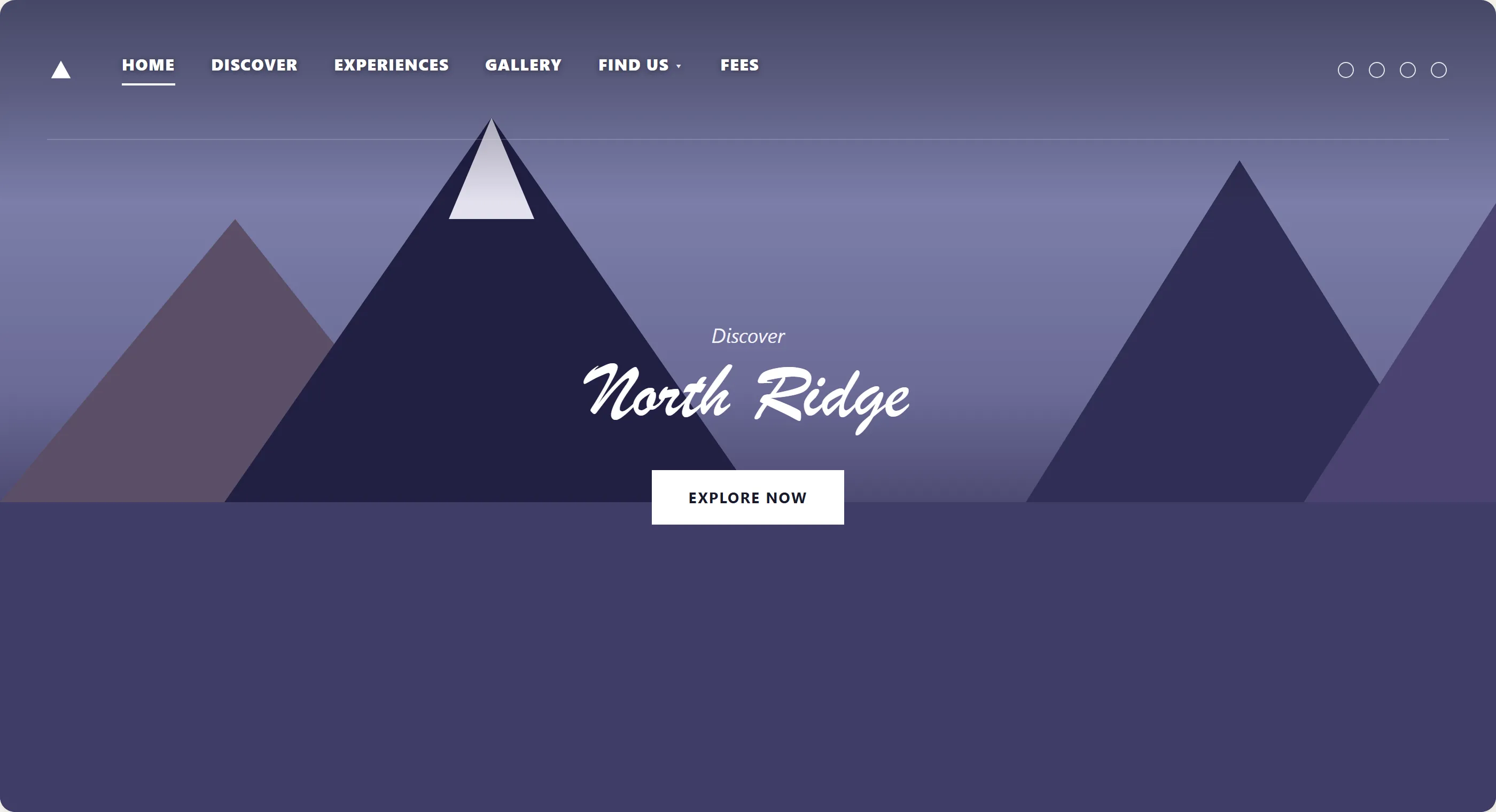 Showing the hero image straight through means the header needs no background of its own — until the page scrolls past the image, then it needs one so the nav text stays readable over whatever comes next.
Background
The header is the persistent structural region that opens every page’s content, paired with Site Footer at the close. It anchors user orientation, establishing where the user is and how to navigate, and — together with the footer — is among the strongest consistency signals a site can offer: users rely on finding it in the same position with the same content on every page.
It anchors user orientation, establishing where the user is and how to navigate, and — together with the footer — is among the strongest consistency signals a site can offer: users rely on finding it in the same position with the same content on every page.
Problem
A header that’s inconsistent across pages, missing on landing pages that came from an ad, or bloated with too much vertical space breaks the user’s trust that the site is a unified whole.
Solution
Give the header a consistent structure — identity, primary navigation, global utility links — keep it positioned consistently on every page, and build it with accessible landmark structure.
Include organization identity
Logo and/or site name, functioning as a link to the homepage. This is the primary “I’m lost — take me to the start” escape hatch and should always be present. The Favicon extends this identity into browser tabs, bookmarks, and history — the only visual brand signal visible when the site is in the background.
Provide primary navigation
The top-level menu giving access to the site’s main sections. In large or complex services, this is often separated from the brand identity into a distinct service navigation bar immediately below the masthead — keeping branding and navigation as distinct regions rather than intermixed. See Navigation bar (Wikipedia) for how the term “navigation bar” extends beyond this web-header sense, to file browsers, OS-level browser chrome, and the HTML5 <nav> element.
Add global utility links
Search, account/sign-in, language toggle, and cart — items that are relevant across the entire site rather than tied to a section. Conventionally placed at the far right (or far top-right in a two-row header). See Shopping Cart for the cart icon’s own role as the entry point into the cart from every page.
Appear identically on every page
Use the exact same header — same content, same structure — on every page of the site, including landing pages a visitor reaches directly from an ad or external link rather than the homepage. See Page Template for how a consistent header fits into a consistent page template.
Keep a consistent position
Top, every page, no exceptions. Users who encounter a page that breaks this pattern experience a mild disorientation that erodes confidence in the site.
Users who encounter a page that breaks this pattern experience a mild disorientation that erodes confidence in the site.
Keep a minimal footprint
The header should not use excessive vertical space. A header that pushes significant content below the fold on mobile imposes a layout cost on every page.
A header that pushes significant content below the fold on mobile imposes a layout cost on every page.
Use an accessible structure
The header must be wrapped in a <header> landmark element, so screen reader users can navigate directly to it. See Accessibility.
<header>
  <a href="/" class="logo">North Ridge Outfitters</a>
  <nav aria-label="Primary">
    <ul>
      <li><a href="/trips">Trips</a></li>
      <li><a href="/gear">Gear</a></li>
      <li><a href="/guides">Guides</a></li>
    </ul>
  </nav>
  <div class="utility-links">
    <a href="/search">Search</a>
    <a href="/account">Account</a>
    <a href="/cart">Cart</a>
  </div>
</header>
Related Concepts
Patterns
- Site Footer
- Page Template
- Navigation Menus
- Favicon
- Multiple Ways to Navigate
- Breadcrumb Navigation
- Sign-In and Account Creation
- Account Management
- Shopping Cart
Principles
Further reading
Chen Ben Ami’s 11 Tips for Designing a Great Website Header (Duda, 2018 — copyright Duda, no open license; https://blog.duda.co/11-tips-designing-great-website-headers) covers header-specific interaction techniques beyond this page’s structural guidance, such as sticky, shrinking, and transparent header behaviors on scroll. One example: a transparent header lets a large hero image show through behind the navigation, provided it gains a solid background once the visitor scrolls past that image so the nav text stays readable.
Sources
GOV.UK Design System (Open Government Licence v3.0) is the source for this page’s header-component guidance — organization identity as a homepage link, separating primary navigation into its own service navigation bar below the masthead in large services, and the <header> landmark-element requirement.
Navigation bar (Wikipedia) (CC BY-SA 4.0) supplies the aside noting that “navigation bar” as a term also covers file-browser paths, OS-level browser chrome, and the HTML5 <nav> element — contexts beyond the Web-header sense this page otherwise documents.