
Mobile-First Design
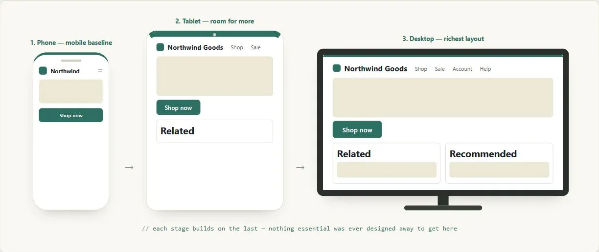 Every element in the mobile view still exists at desktop size — the design only ever grew outward from there, it never had to be carved back down to fit.
Problem
The more historically common approach — designing for desktop first, then trying to compress or adapt that design for mobile — often results in a degraded, afterthought mobile experience, because features designed for a wide canvas rarely reduce gracefully.
The more historically common approach — designing for desktop first, then trying to compress or adapt that design for mobile — often results in a degraded, afterthought mobile experience, because features designed for a wide canvas rarely reduce gracefully.
Solution
Mobile-first design is a sequencing strategy for responsive design: begin by designing for the smallest, most constrained device — typically a smartphone with a narrow viewport, limited bandwidth, and touch input — and then progressively enhance the design for larger screens and more capable devices.
Mobile-first design is a sequencing strategy for responsive design: begin by designing for the smallest, most constrained device — typically a smartphone with a narrow viewport, limited bandwidth, and touch input — and then progressively enhance the design for larger screens and more capable devices.
The logic is one of constraint-driven clarity. A small screen forces ruthless prioritization: only content and actions that genuinely matter to the user can fit. Starting there ensures that the core experience is solid for the most constrained context. Enhancements for tablet or desktop — wider layouts, richer imagery, additional columns of secondary content — are then layered on top of that working foundation, not the other way around.
A small screen forces ruthless prioritization: only content and actions that genuinely matter to the user can fit.
Mobile-first predates responsive web design (RWD) as a concept and complements it in practice. RWD provides the technical mechanism (fluid grids, breakpoints) for adapting layout across screen sizes; mobile-first provides the design priority order for deciding which content and interactions receive that adaptation effort first. The two are often combined: a responsive site built mobile-first uses the smallest breakpoint as its baseline and adds layout complexity as viewport width grows.
Mobile-first is also relevant beyond screen size: designing for mobile often surfaces Accessibility improvements that benefit all users — simpler navigation, larger tap targets, reduced Cognitive Load from fewer simultaneous choices.
See Mobile Screen Sizing for the concrete content-prioritization decisions this strategy leads to once applied, and Mobile Input Design for the companion problem of designing for a mobile device’s more limited input capabilities.
Two real rebuilds show the payoff of taking the mobile experience this seriously rather than treating it as a scaled-down afterthought: Mynet’s combined AMP + Progressive Web App rebuild loaded pages roughly 4x faster and raised ad revenue per pageview 25%, time on site 43%, and pageviews per session 34%; Truebil’s PWA rebuild (code splitting, offline caching, installation prompts) raised conversions 61% and revenue-to-marketing spend 80% (both web.dev case studies, CC BY 4.0 — see web.dev: Core Web Vitals Business-Impact Case Studies).
Related Concepts
Patterns
Principles
Sources
Responsive Web Design (Wikipedia) is the source for framing mobile-first as a strategy that predates and complements responsive web design (RWD) — RWD as the technical mechanism, mobile-first as the priority order for which content gets that adaptation effort first.
web.dev: Core Web Vitals Business-Impact Case Studies (CC BY 4.0) supplies the Mynet and Truebil rebuild statistics — Mynet’s AMP+PWA speed and ad-revenue gains, and Truebil’s PWA conversion and revenue-to-marketing-spend gains.