
Data Tables
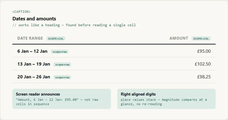 The caption and scope attributes cost nothing a sighted reader would notice — remove them, and the exact same table stops being usable by anyone who can’t see it.
Background
Visually, a table’s meaning is obvious at a glance — the eye tracks rows and columns automatically, lining up a value with its header without conscious effort. A screen reader has no equivalent shortcut: it can only expose whatever relationships are explicitly marked up in the HTML, which makes attributes like scope and <caption> — invisible to a sighted reader — carry the entire weight of making the table’s structure legible to anyone using one. The rules below exist to encode that structure explicitly rather than leaving it implicit in the visual layout alone.
A screen reader has no equivalent shortcut: it can only expose whatever relationships are explicitly marked up in the HTML, which makes attributes like
scopeand<caption>— invisible to a sighted reader — carry the entire weight of making the table’s structure legible to anyone using one.
Problem
When information has two independent dimensions to compare — dates against amounts, months against rates — plain prose forces a reader to reconstruct that grid themselves, and a table that isn’t marked up correctly locks out anyone using a screen reader from making the same comparison at all.
Solution
Reserve the table element for genuinely tabular data, never page layout
Never use a table to lay out unrelated content on a page — use a grid system for that instead (see Grid Layout). A table’s row/column semantics should always describe an actual two-dimensional relationship in the data itself — the same genuinely-tabular test applies when deciding whether a voice interface should fall back to a visual table at all.
Label rows and columns as machine-readable headers, not just visual ones
Give a table headers that tell the reader what its rows and columns represent, and mark each header cell’s scope attribute (col or row) so assistive technology can tell the two apart — this is what lets a screen reader announce “Amount, 6 Jan – 12 Jan: £95.00” instead of reading raw cell content in an undifferentiated sequence. Give every table a caption too: a <caption> element functions the same way a heading would, helping a reader find, navigate, and understand what the table is about before reading a single cell.
a
<caption>element functions the same way a heading would, helping a reader find, navigate, and understand what the table is about before reading a single cell
<table>
  <caption>Dates and amounts</caption>
  <thead>
    <tr>
      <th scope="col">Date range</th>
      <th scope="col">Amount</th>
    </tr>
  </thead>
  <tbody>
    <tr>
      <th scope="row">6 Jan – 12 Jan</th>
      <td>£95.00</td>
    </tr>
    <tr>
      <th scope="row">13 Jan – 19 Jan</th>
      <td>£102.50</td>
    </tr>
  </tbody>
</table>
Right-align numeric columns to make magnitude comparable at a glance
When a column holds numbers being compared against each other, align them to the right rather than the left. Right-aligned digits of the same place value stack directly above one another down the column, letting a reader compare magnitude visually without re-reading each individual value.
Right-aligned digits of the same place value stack directly above one another down the column, letting a reader compare magnitude visually without re-reading each individual value.
Split large tables rather than compressing them into one dense block
Where possible, reduce how much data lives in a single table at all — organize a large dataset into multiple tables, or across multiple pages, rather than one dense grid. Reserve any density-driven compromise (e.g. reducing text size specifically on small screens to give a data-heavy table more visual breathing room) for tables that genuinely can’t be split further; applying it to a table that doesn’t actually hold much data just makes it harder to read for no benefit, since a smaller table reads better at full text size.
Give a data visualization a table alternative
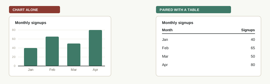 The chart’s own axis numbers are still just pixels to a screen reader — the table beside it is what actually puts the same four values within reach.
A chart or graph that distinguishes its data by color or shape alone excludes anyone who can’t perceive that visual channel, and excludes screen reader users from the data entirely regardless of how it’s colored — see Accessibility. Pairing the visualization with the same data laid out as an actual table, structured per the rules above, gives every reader access to the same numbers a sighted user reads off the chart. See Data Visualization for chart-type selection and color/differentiation guidance for the visualization itself — the same pairing applies to a details or events card inside a dashboard, not just a stand-alone chart.
Related Concepts
Patterns
Principles
Sources
GOV.UK Design System (Open Government Licence v3.0) is the source for this page’s core markup guidance — reserving tables for genuinely tabular data, marking header cells’ scope attribute and giving every table a caption, right-aligning numeric columns, and splitting large tables rather than compressing them into one dense block.
Carbon Design System: Accessibility, Content, Color, Motion, Spacing, and Icon Guidelines (IBM) (Apache License 2.0) is the source for the closing recommendation to pair a data visualization with a table alternative, so screen reader users aren’t excluded from the same data.