
Expanding and Fixed Screen Width
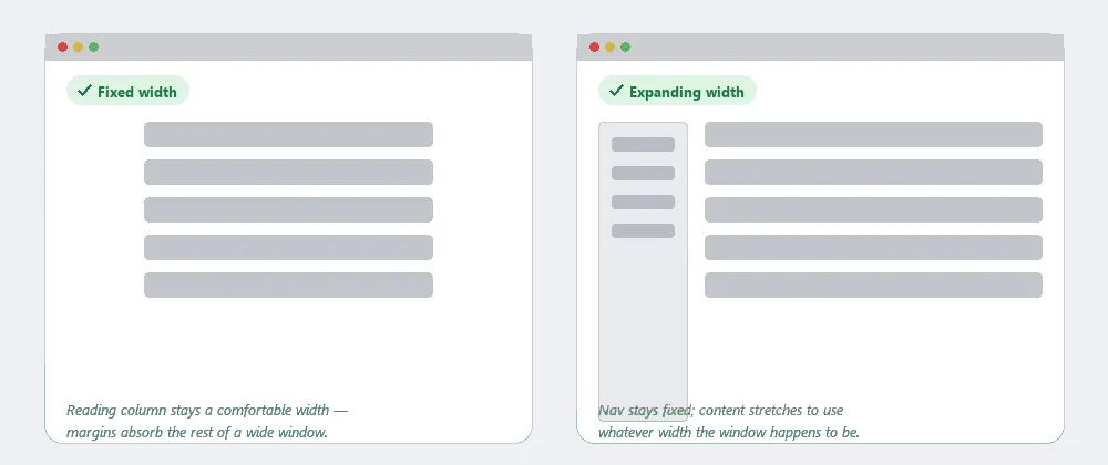 Fixed width protects readability for long text; expanding width uses whatever space a portal-style page is given.
Background
The choice between the two comes down to content type more than aesthetics — pages dominated by navigation and varied content modules lean toward expanding width; pages dominated by a single long passage of reading lean toward fixed width. Both are normally combined with Grid Layout and built into a reusable Page Template; the actual mechanics (HTML table widths vs. style-sheet-based layout) are a lower-level implementation detail than the layout decision itself.
Problem
A Web designer never knows exactly how wide a visitor’s browser window will be, and a layout that assumes one specific width either wastes space in a larger window or breaks down in a smaller one.
A Web designer never knows exactly how wide a visitor’s browser window will be, and a layout that assumes one specific width either wastes space in a larger window or breaks down in a smaller one.
Solution
Two contrasting strategies, covered together here because the book always presents them as a direct contrast with each other.
Use expanding width for navigation-heavy, portal-style pages
Let the page’s layout stretch to fill whatever width the browser window happens to be, typically by keeping navigation and side content at a fixed width while letting the central content column grow or shrink to absorb the difference. The payoff is not wasting space that a larger-than-expected window would otherwise leave empty — useful for pages with lots of navigation elements and varied content, such as a portal homepage. The tradeoff is reduced control over the page’s exact appearance, and there’s still a practical minimum width below which the layout breaks down, so designers still need to survey customers’ actual screen resolutions and decide on a floor to support (see Above the Fold).
The payoff is not wasting space that a larger-than-expected window would otherwise leave empty — useful for pages with lots of navigation elements and varied content, such as a portal homepage.
Use fixed width for long passages of reading text
Keep the page at exactly the same width regardless of browser size, usually by giving the column holding the main content (centered or left-aligned — a stylistic choice with no real functional difference) a fixed width. This is the better choice for articles, essays, and other long passages of text, because text allowed to stretch across an overly wide browser window becomes hard to skim and easy to lose your place in — readability, not screen real estate, is what drives the choice here.
This is the better choice for articles, essays, and other long passages of text, because text allowed to stretch across an overly wide browser window becomes hard to skim and easy to lose your place in — readability, not screen real estate, is what drives the choice here.
The fixed-vs.-expanding binary is the older framing of a question that Responsive Web Design now answers more generally: proportion-based fluid grids that reflow at defined breakpoints, so the same page serves both a narrow smartphone and a wide desktop without choosing one or the other. See Mobile Screen Sizing for the small-screen end of that range specifically, where the constraint is severe enough to need its own content-prioritization decisions rather than just a narrower version of the same layout.
Related Concepts
Patterns
- Grid Layout
- Above the Fold
- Responsive Web Design
- Content Modules
- Mobile Screen Sizing
- Mobile-First Design
Processes
Sources
The Design of Sites: Pattern Group I — Designing Effective Page Layouts is this page’s I4/I5 pattern source — the direct expanding-vs-fixed-width contrast and the content-type reasoning (portal pages vs. long-form reading) that decides between them.
Responsive Web Design (Wikipedia) (CC BY-SA) supplies the framing of responsive design as the broader, breakpoint-driven generalization of the older fixed-vs-expanding binary, described at the end of Solution above.