
Responsive Web Design
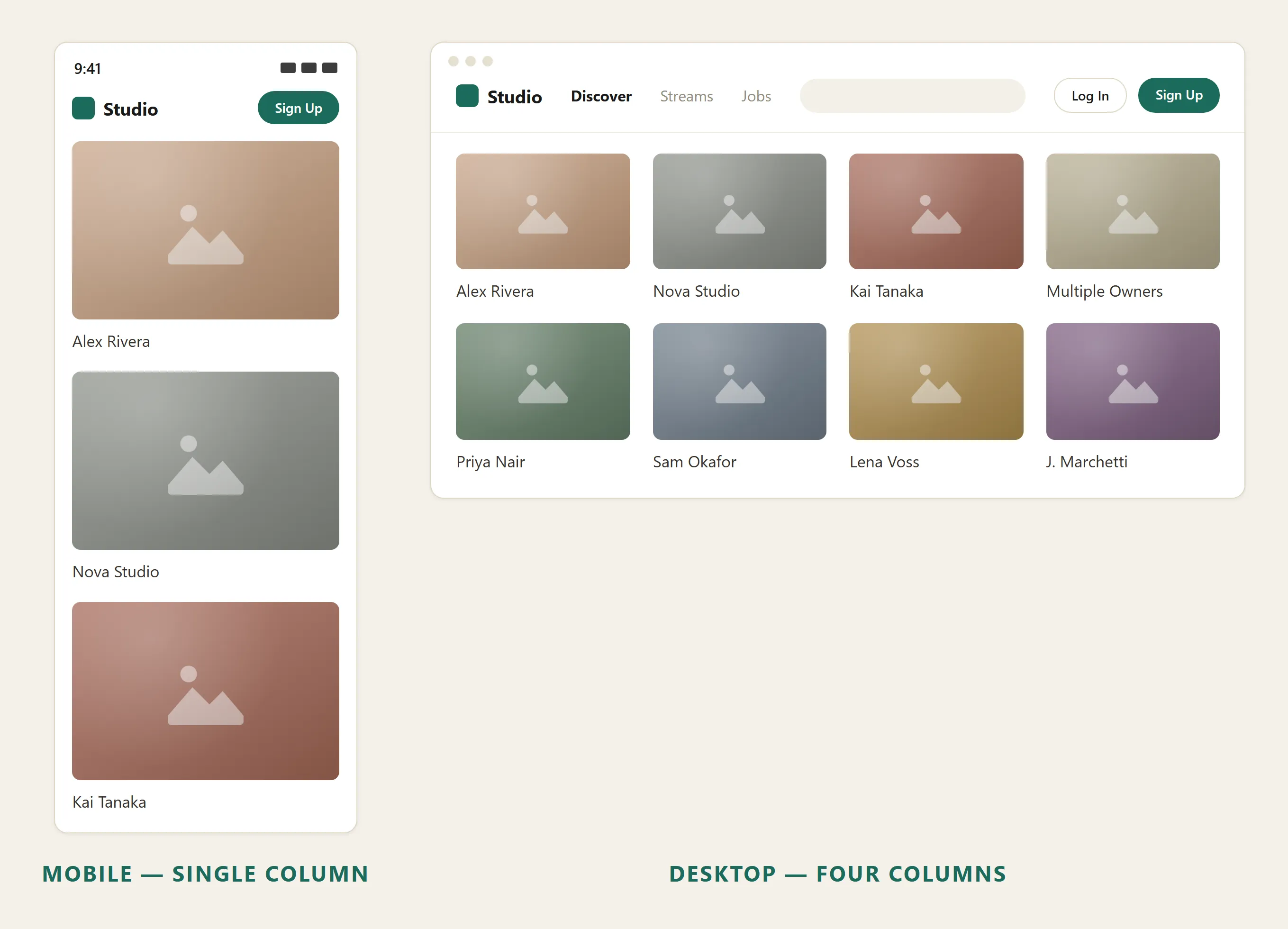 The same site reflowing from a wide desktop grid down to a single mobile column.
Background
Grid Layout and Expanding and Fixed Screen Width describe the foundational decisions that responsive web design (RWD) builds on. RWD and mobile-first design are complementary but distinct: RWD is the technical/design approach; mobile-first is a sequencing strategy for applying it — design for the smallest screen first, then progressively enhance upward.
Problem
A layout designed only for desktop-sized viewports forces mobile users to pinch-zoom, scroll horizontally, and tap tiny targets — directly harming usability. From approximately 2013 onward, mobile devices have represented the majority of web visitors for most sites, so this failure mode affects most of a site’s traffic, not an edge case.
A layout designed only for desktop-sized viewports forces mobile users to pinch-zoom, scroll horizontally, and tap tiny targets — directly harming usability.
Solution
Responsive web design is an approach to web design that makes pages render usably across the full range of device sizes and screen widths — from a small smartphone to a wide desktop monitor — without requiring a separate mobile site. The guiding metaphor is “content is like water”: rather than having a fixed shape, content adapts to fit whatever container (screen) it is poured into.
The guiding metaphor is “content is like water”: rather than having a fixed shape, content adapts to fit whatever container (screen) it is poured into.
Build on three technical pillars
The approach rests on three technical pillars, each operating at the UX level:
- Fluid, proportion-based grids — layout columns are sized as percentages of the available viewport rather than fixed pixel widths, so the layout scales smoothly as screen width changes. This extends the Expanding and Fixed Screen Width tradeoff from a binary choice into a continuous spectrum.
- Flexible images — images scale within their containing column so they neither overflow a narrow viewport nor leave awkward gaps in a wide one.
- Breakpoint-driven layout shifts — at defined screen-width thresholds (“breakpoints”), the layout restructures significantly: columns may stack vertically, navigation may collapse, secondary content may hide. This is the mechanism that turns a multi-column desktop layout into a single-column mobile layout. Choose a breakpoint by where the content itself starts to look bad — a column squashed to two words per line, an image cramped against its caption — rather than by targeting the screen width of a specific named device; today’s device sizes are too varied, and tomorrow’s don’t exist yet.
RWD resolves this by building adaptability into the layout itself rather than maintaining separate codebases.
Include the viewport meta tag
Breakpoints and fluid grids only work on mobile if the browser is told to render at the device’s actual width in the first place:
<meta name="viewport" content="width=device-width, initial-scale=1">Without it, a mobile browser defaults to rendering the page at a fixed desktop-like width (historically 980px) and shows a zoomed-out version of that layout for the customer to pinch and pan around — the exact failure mode this page’s Problem section describes. A narrow-screen breakpoint defined at 480px never fires if the browser is reporting a viewport of 980px regardless of the device’s real screen size, so this single tag is a prerequisite for every other technique here, not an optional refinement.
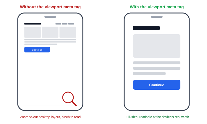 Same page, same device — the only difference is one meta tag telling the browser its actual width.
RWD is an instance of user interface plasticity — the capacity of a UI to maintain its usability goals across variations in the system’s physical characteristics (screen size, pixel density, input method). A well-executed responsive design preserves the same Information Architecture and interaction patterns across devices; only the visual arrangement changes.
RWD is an instance of user interface plasticity — the capacity of a UI to maintain its usability goals across variations in the system’s physical characteristics (screen size, pixel density, input method).
Test across viewport sizes
Because a responsive design must hold up across a continuous range of widths and multiple device classes, usability testing (see Usability Evaluation Methods) should include representative small, medium, and large viewport sizes, not just desktop.
Related Concepts
Patterns
- Expanding and Fixed Screen Width
- Grid Layout
- Mobile-First Design
- Above the Fold
- Mobile Screen Sizing
Principles
Sources
Responsive Web Design (Wikipedia) (CC BY-SA 4.0) supplies this page’s core definition and history — the “content is like water” framing, the May 2010 A List Apart coinage, the three-pillar breakdown (fluid grids, flexible images, breakpoints), the roughly-2013 mobile-traffic-majority driver, and the user-interface-plasticity framing used to describe RWD’s underlying design goal.
Responsive Web Design (MDN) (CC BY-SA 2.5+) is the source for the content-driven breakpoint-selection guidance and the viewport meta tag above.