
Affordance
What an object or environment makes possible for an actor to do with it, and — crucially for design — what of that the actor can readily perceive without being told.
What an object or environment makes possible for an actor to do with it, and — crucially for design — what of that the actor can readily perceive without being told.
Gibson’s original sense
Gibson’s original definition: “the affordances of the environment are what it offers the animal, what it provides or furnishes, either for good or ill.” Gibson’s affordances are relational (a knee-high step affords climbing to an adult but not a crawling infant) and objective — they exist independent of whether the actor notices them. By this definition a chair affords throwing as well as sitting, whether or not anyone perceives the option.
Knurling — the small ridges cut into a knob or dial — is a clean physical example of an affordance and its own signifier arriving together: the ridges add real friction (the affordance, gripping the knob), and the same ridges are what a person actually sees and reads as “grip here” (the signifier). A perfectly smooth knob of the same shape and size affords gripping just as physically well, but gives no visual reason to expect that.
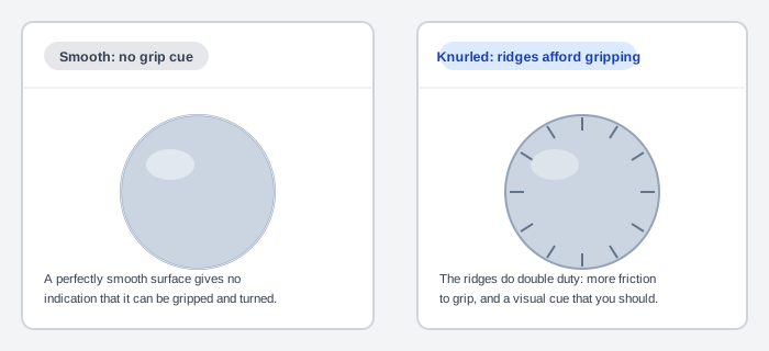 Same knob, same underlying grip — only the ridges tell you to expect one.
Norman’s design sense, and signifiers
Donald Norman narrowed the term for Human-Computer Interaction to only those action possibilities an actor can readily perceive. Where Gibson’s chair affords both sitting and throwing, Norman’s (perceived) affordances narrow that down to what the object’s appearance actually suggests — in this case, sitting.
Norman introduced a second term, signifiers, to split the two jobs cleanly: “Affordances determine what actions are possible. Signifiers communicate where the action should take place. We need both.” This split matters most for digital interfaces — a touchscreen’s flat glass has no physical property that affords tapping the way a raised button affords pressing, so on-screen designs lean almost entirely on signifiers (shading, icons, labels) to point at affordances that the hardware itself doesn’t supply.
A common example is doors: a flat plate signifies pushing, a small finger-sized button signifies pressing, a long rounded bar signifies pulling (doors are the field’s classic bad-signifier example, since a mismatched handle actively misleads about which action to take — one resort’s handle confused so many guests that the resort resorted to a printed sign next to it explaining how to open the door, a signifier failing badly enough to need a second, cruder signifier bolted on to compensate). Affordances and signifiers are specifically what narrows Norman’s gulf of execution — half of his seven-stages-of-action model — by making a system’s allowable actions visible rather than hidden.
Digital interfaces sometimes borrow a physical signifier’s appearance even without its physical function: older versions of Microsoft Windows added small ridges to a window’s resize corner purely to visually echo physical knurling, leveraging a person’s real-world grip association even though the screen itself offers no actual texture to feel.
Perceivable, hidden, and false affordances
William Gaver’s three-way split, used widely alongside Norman’s definition:
- Perceivable — the action possibility is apparent to the actor, e.g. a door knob shaped to suggest how it’s gripped and turned, or a teapot’s handle and spout shaped to suggest pouring.
- Hidden — a real action possibility exists but isn’t apparent from looking, e.g. a shoe can pry a cork from a wine bottle, but nothing about a shoe’s appearance suggests this; a clickable row in a list with nothing distinguishing it from the non-clickable rows around it is the same failure — not a Stroop-style conflict between two competing cues, but a missing cue entirely. A flat-design calendar-event screen makes the same mistake concretely: its location row (a GPS pin icon that opens Google Maps when tapped) looks exactly like the plain, non-interactive rows around it for time and notifications.
- False — an apparent action possibility with no real function behind it, e.g. a placebo button that produces no actual effect but is perceived as doing something.
A well-designed action button is a deliberate perceivable affordance: a shaded, three-dimensional appearance borrows prior knowledge (physical buttons, learned graphical user interface (GUI) behavior) so the button’s clickability doesn’t have to be explained.
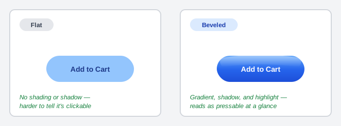 The flat button still works — but the shaded one borrows a lifetime of physical-button experience to signal “press me” before anyone reads the label.
Taken further, the same gap can open between plain text and an actual link or button: text reading “Here” with no other styling gives no indication it’s interactive at all, while the identical word set inside a colored button with an icon and a directional arrow removes any doubt. Flat design, the stylistic trend of stripping away shadows, gradients, and borders in favor of plain color fills, trades away exactly the affordance-signifying details it removes as “visually unappealing” — a real cost worth weighing deliberately against the aesthetic gain, not an incidental side effect.
Flat design, the stylistic trend of stripping away shadows, gradients, and borders in favor of plain color fills, trades away exactly the affordance-signifying details it removes as “visually unappealing” — a real cost worth weighing deliberately against the aesthetic gain, not an incidental side effect.
Elevation: shadow as a system-wide signifier
Google’s Material Design generalizes this same shadow-as-signifier idea beyond buttons into a system it calls elevation: every surface — cards, app bars, dialogs, floating action buttons — sits at a virtual height above a shared background plane, and shadow depth signals both a surface’s z-order and, implicitly, how interactive it is. Material Design’s head designer, Matías Duarte, frames the whole system as a deliberate but abstracted paper metaphor: “unlike real paper, our digital material expands and reforms intelligently. Material has physical surfaces and edges. Seams and shadows provide meaning about what you can touch.” It’s the same perceivable-affordance signifier already established for action buttons above, just applied consistently across an entire interface rather than to buttons alone — and a named instance of an Interface Metaphor, borrowing the physical metaphor of stacked paper sheets at different heights. See Material Design (Wikipedia).
every surface — cards, app bars, dialogs, floating action buttons — sits at a virtual height above a shared background plane, and shadow depth signals both a surface’s z-order and, implicitly, how interactive it is.
Text links: the case for the conventional signifier
The blue, underlined hyperlink is the Web’s oldest and most broadly recognized signifier, and it remains one for a simple reason: customers have learned it, site after site, since the Web’s earliest days. Departing from the convention isn’t wrong, but it trades a signifier customers already know for one they have to learn on your site specifically — worthwhile for a distinctive brand, a poor trade for a site that just wants to be easy to use. Concretely:
- Reserve blue and underlining for links only. Text styled like a link that isn’t one creates a false affordance in Gaver’s sense — a customer who clicks and nothing happens has reason to second-guess every other link on the page afterward, not just that one.
- If departing from blue, avoid a red/green pair for visited/unvisited state — the most common form of color deficiency makes exactly that pair hard to distinguish. Vary weight, style, or a color pair outside red/green instead.
- The HTML
titleattribute (<a href="..." title="...">) gives most browsers a hover tooltip and lets some screen readers announce a link’s destination before the customer follows it — a lightweight way to add context beyond the visible link text itself. - Novel link styling has a legitimate exception: sites whose purpose is deliberate exploration or artistic effect (a band’s site built around its own visual identity, for instance) can trade predictability for personality on purpose, since customers arrive expecting to explore rather than to complete a task efficiently.
Navigation bars are one context where the blue-underline convention is routinely and correctly broken: customers already expect navigation-bar items to be clickable from position and context alone, so navigation links don’t need the same signifier that body-text links do. Buttons, breadcrumbs, and tag chips break the same convention for the same underlying reason — each carries its own positional or visual signifier strong enough to substitute for blue-and-underline.
Related Concepts
Patterns
Principles
- Gestalt Psychology
- Seven Stages of Action
- Gulfs of Execution and Evaluation
- Stroop Effect
- Interface Metaphor
- Error Prevention and Recovery
- Accessibility
Further reading
Donald Norman’s “Signifiers, Not Affordances” (Interactions, 2008; self-archived at jnd.org/signifiers-not-affordances — no stated open license — later folded into the 2013 revision of The Design of Everyday Things) is the original essay splitting signifiers out from affordances, in Norman’s own words, including the door-handle example this page draws on.
Norman’s full book, The Design of Everyday Things (Revised and Expanded Edition, amazon.com/dp/0465050654 — commercially published, no stated open license), develops the door/signifier example above at book length, alongside discoverability and mapping that this page doesn’t otherwise cover — its theory of everyday error is now covered on its own terms via Error Prevention and Recovery.
Victor Ponamariov’s 50 Tips to Improve User Interface (goodreads.com/book/show/58085971-50-tips-to-improve-user-interface — self-published ebook, no stated license) applies perceivable affordance to UI patterns such as showing a partially-visible item at the edge of a scrollable list to signal more content exists.
Schade, Cheng, and Sherugar’s Top 10 Enduring Web-Design Mistakes (Nielsen Norman Group, 2016 — copyright NN/g, no open license; https://www.nngroup.com/articles/top-10-enduring/) names “hidden links” — real links styled aggressively enough (borders, unusual colors, graphics) that they read as advertisements and get ignored rather than clicked — as one of ten recurring mistakes, a false-negative mirror image of the false affordances above.
Sources
Affordance (Wikipedia) is the source for Gibson’s original definition and relational/objective framing, Norman’s narrowing of the term, and William Gaver’s perceivable/hidden/false three-way split.
The Design of Everyday Things (Wikipedia) supplies the signifiers quote (“Affordances determine what actions are possible…”) and the door-handle example, plus the pointer to Seven Stages of Action and its gulf of execution.
Affordances and Signifiers (FuguUX Blog Post) is the source for the knurling example and its illustration, the resort door-handle-needing-a-sign anecdote, older Windows’ corner-grip knurling mimicry, the flat-design “Here” text-vs-button comparison, and the GPS-pin-icon detail added to the flat-design calendar-event example.
The Design of Sites: Pattern Group K — Making Navigation Easy is the K10 Obvious Links pattern this page’s Text links: the case for the conventional signifier section is built from directly — the blue-underline convention, the title attribute, and the navigation-bar exception.
Material Design (Wikipedia) is the source for the elevation/shadow-as-signifier system and the Matías Duarte quote drawn on in Elevation: shadow as a system-wide signifier.