
Consistent Sidebars of Related Content
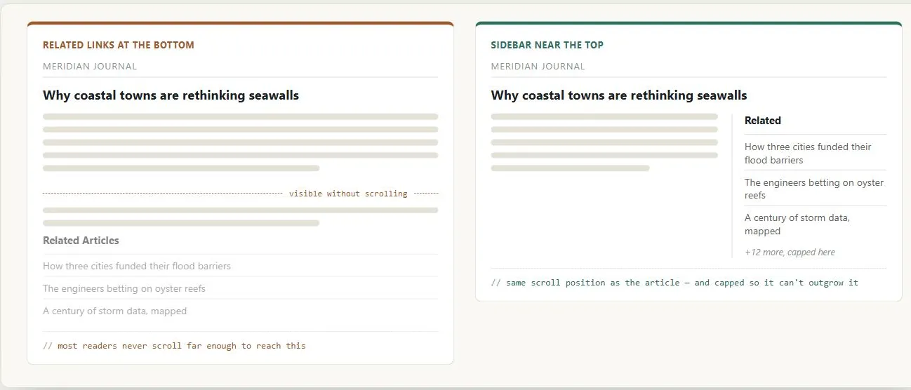 Both pages hold the same related content — only one puts it somewhere a reader still scrolling the article will actually pass by.
Background
In the vocabulary of Multiple Ways to Navigate, a sidebar of related content is the canonical “relate” navigation style — content a visitor wasn’t looking for but might act on anyway, which is exactly why it gets less valuable screen space than the navigation tools someone actually came for.
Problem
Customers reading a content page (a news article, a product page) often want related material — similar products, related articles, further discussion — but presenting those links well is awkward. Putting them at the bottom of the page risks visitors never scrolling far enough to see them, while overdoing it can distract from or crowd out the main content.
Putting them at the bottom of the page risks visitors never scrolling far enough to see them, while overdoing it can distract from or crowd out the main content.
Solution
Place related-content links in a sidebar near the top of the page, on the side, where they stay visually distinct from the main content without requiring a scroll. Because navigation bars conventionally run along the top and left and main content sits in the center, sidebars conventionally end up on the right.
Place related-content links in a sidebar near the top of the page, on the side, where they stay visually distinct from the main content without requiring a scroll.
Make the sidebar’s location consistent across the site by building it into the page’s Grid Layout and reusing that as a page template, and cap each sidebar’s length (manually, or automatically if its content is pulled from a database) so a long sidebar doesn’t make the page layout look lopsided next to shorter main content. The same sidebar can also cross-link into a distinct content type, such as discussion boards related to the page a customer is already reading.
Related Concepts
Patterns
- Grid Layout
- Homepage Portal
- Multiple Ways to Navigate
- Page Template
- Message Boards
- Content Modules
- Headlines and Blurbs
- Printable Pages
- Stimulating Arts and Entertainment
- Unified Browsing Hierarchy
Processes
Sources
The Design of Sites: Pattern Group I — Designing Effective Page Layouts (Pattern I6, Consistent Sidebars of Related Content) is this page’s sole source — the near-the-top sidebar placement, building it into the page’s grid/template, and capping sidebar length all come directly from it.