
Empty States
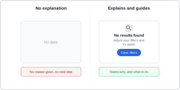 Same absence of data, two different messages — one looks broken, the other looks intentional.
Background
An empty state is the version of a page or component with nothing to show — a fresh dashboard, an empty search result, a permissions error, a just-finished process. It’s a distinct problem from a loading state: a loading state promises content is still coming, while an empty state has already concluded there’s nothing to show right now and needs to explain why, and what to do about it. Left unhandled, an empty space reads as a broken or abandoned page rather than an intentional design decision — an empty dashboard widget, an empty table, and a zero-result search page all share this same risk.
Left unhandled, an empty space reads as a broken or abandoned page rather than an intentional design decision — an empty dashboard widget, an empty table, and a zero-result search page all share this same risk.
Problem
An empty state can occur for genuinely different reasons — a new user hasn’t added data yet, a search matched nothing, a process just finished successfully, or a permission or configuration issue is blocking real data — and treating all of them with the same generic “nothing here” message either under-explains a real problem or over-explains a routine one.
Solution
Build every empty state from the same small set of visual elements, then match its content and tone to which of a handful of named scenarios actually caused it.
Name the specific scenario before writing anything else
Match an empty state’s content and level of detail to why the space is actually empty:
- No data / first use — nothing has been added yet. Explain what will appear once data exists and how to add it.
- No results — a search or filter matched nothing. Explain that nothing was found and suggest adjusting the search or filters.
- Success — a process or task just completed. Confirm what happened and give a next step; congratulatory tone is appropriate here even where it isn’t elsewhere.
- Creation — something needs to be added or created before related information can show. State what hasn’t been made yet, not that nothing was “found,” which can read as a system error rather than an expected state.
- Required configuration — the user must configure, connect, or enable something first. State what needs to be done, not what’s missing.
- No access — the user lacks the entitlements or permissions to view this area. State what’s needed to gain access (e.g. asking an administrator), not just that access was denied.
- Back-end / systems failure — an error is preventing real content from being displayed. State the error in plain language and how to resolve it, following the same specific, recoverable error-writing rules a form’s own error text uses.
Where several empty states could appear at once — several failed widgets on the same dashboard — repeating a full icon-and-button treatment for each one adds more noise than help; a plain-text message and a single tertiary action across the group reads better than repeating the same illustration several times.
Build every empty state from the same core elements
Combine an optional decorative image, a heading, a body, and one or more actions:
- Heading — a short, concise statement of the situation, phrased as a positive next step rather than an absence (“Start by adding data assets,” not “You don’t have any data assets”).
- Body — why the space is empty, and what taking the next step gets the user.
- Primary action — moves the user forward, as a button beneath the copy, a link inside the copy itself, or a direct pointer to the UI element that resolves it.
- Secondary action (optional) — an alternative, such as a documentation link.
A full-page empty state should drop toolbars and filters entirely, since there’s nothing yet to search or filter.
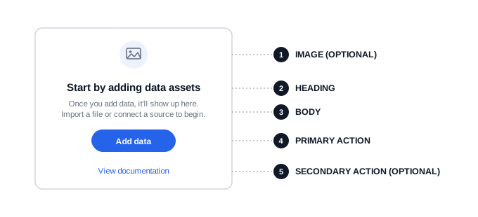 Same five slots in the same order every time — only the wording, icon, and tone change to fit the scenario.
State the next action, not the absence
Write empty-state copy the same way regardless of scenario: say what the user can do, not what’s missing or broken. Use sentence case, with a period ending each full body sentence but no period on headings or buttons. Address the user as “you”/“your” without ever implying it’s their fault, and drop “please” as unnecessary formality. Match tone to the moment — avoid exclamation points for a user who might already feel uncertain (a first-use or error state), but an achievement-toned “You’re all set” is fine for a success state.
Write empty-state copy the same way regardless of scenario: say what the user can do, not what’s missing or broken.
Map an icon and color to its scenario, not to decoration
Where an empty state uses an icon, keep the mapping between icon/color and scenario consistent across a product, so a person recognizes the situation before reading any text: a rocket for first use or getting started, a magnifying glass for no results, a wrench for a configuration issue, a lock for no access, a plus for something awaiting creation — each in a neutral gray — reserving color itself for a status signal, with red for an error state and green for success.
Offer more than a basic message for a primary first-use feature
For a feature central enough to warrant it, a basic empty state can be supplemented — never replaced — with a more involved first-use treatment: in-line documentation (a fuller explanation of the feature’s benefit, following Progressive Disclosure to link out to more detail rather than front-loading it all), starter content (pre-built, tinkerable sample data or a pre-configured workflow that gives a new user something to explore immediately), or a contextual onboarding tour that walks through the feature step by step. Keep any of these optional and paired with the basic empty state underneath, since a tour or documentation link is something a user can skip or dismiss.
Replace the whole element for screen readers, not just its content
An empty state should replace the entire element it stands in for, not just sit inside its otherwise-intact structure — an empty table should drop its column headers and footer along with its rows, and a zero-result search page should replace its whole results region. Otherwise a screen reader has to read through an empty structure before reaching the message explaining there’s nothing in it. Any purely decorative image accompanying an empty state should carry an empty alt attribute so it’s skipped rather than announced.
An empty state should replace the entire element it stands in for, not just sit inside its otherwise-intact structure — an empty table should drop its column headers and footer along with its rows, and a zero-result search page should replace its whole results region.
Size and center an empty state to match its container
On a full page, use a wide left margin or a horizontally centered block, with generous top spacing (roughly a 3xl-scale spacer on desktop, 2xl on mobile); position an accompanying image above the title for a wide image or beside the text block for a tall one. Inside a table, card, or wizard, center the state both horizontally and vertically within its container instead. In a small tile specifically, center the image above left-aligned text rather than left-aligning the whole block, so the state doesn’t read as ordinary content that’s safe to skip past.
Related Concepts
Patterns
Principles
Further reading
Nielsen Norman Group’s “Empty States in Application Design: 3 Guidelines” (commercially published, no stated open license) reinforces the core reframe above from an independent source, framing a well-designed empty state as a teachable moment that can double as onboarding rather than read as failure.
Sources
Carbon Design System: Empty States and Dashboards (IBM) is the source for the no-data/user-action/error-management scenario framing, the in-line-documentation/starter-content/onboarding first-use alternatives, the multiple-empty-states-at-once caution, and the replace-the-whole-element accessibility rule.
PatternFly: Empty State and Dashboard Design Guidelines (Red Hat) is the source for the seven-scenario taxonomy (getting started, no results, required configuration, no access, back-end failure, success, creation) and its icon/color mapping, the state-the-next-action copy rules, and the full-page and embedded spacing/centering layout rules.