
Cross-Selling and Up-Selling
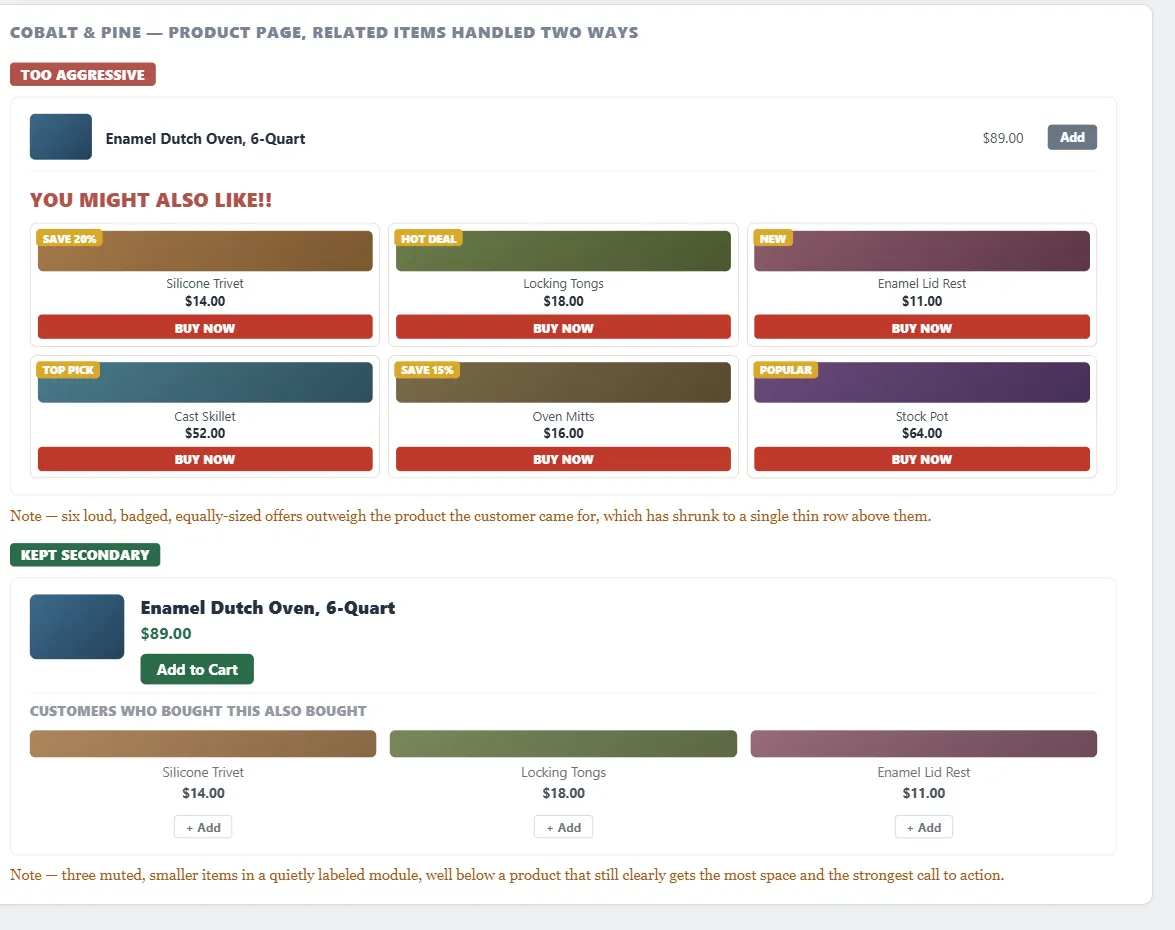 Six loud, badged offers can out-compete the very product the customer came for — the same items work better as a small, secondary module.
Background
The more screen space and the more aggressively related products are promoted, the more they compete with — and can actively undermine — the primary sale they’re meant to support.
The more screen space and the more aggressively related products are promoted, the more they compete with — and can actively undermine — the primary sale they’re meant to support.
Problem
Customers shopping for one item often have related needs they haven’t thought to look for, but pushing related products too aggressively crowds the page and annoys them — the same line a pushy in-store salesperson can cross.
Solution
In sales terms, cross-selling promotes accessories or complementary items (“do you want fries with that?”), while up-selling promotes a better, pricier version of the same choice (“do you want to supersize that?”). In practice the distinction blurs, and both serve the same goal: help customers find useful related items faster while increasing revenue per sale.
In sales terms, cross-selling promotes accessories or complementary items (“do you want fries with that?”), while up-selling promotes a better, pricier version of the same choice (“do you want to supersize that?”).
Connect products automatically from purchase data
Group products customers buy together and rank by co-purchase frequency to surface the top three to five related items on a product page — this updates itself as behavior changes, unlike hand-merchandised relationships (more work, but lets staff explain why two products go together).
Keep related products visually secondary
Set them off in their own labeled module, separate from the main product, so the page doesn’t read as cluttered — the main product should always get more screen space than what’s recommended alongside it.
Set them off in their own labeled module, separate from the main product, so the page doesn’t read as cluttered — the main product should always get more screen space than what’s recommended alongside it.
Let customers add a related item without losing their place
A quick-purchase action button (or checkbox) that adds the item to the cart without navigating away keeps the original purchase from getting derailed.
Repeat the offer at checkout, not just on the product page
Surfacing related items again in the cart, the order summary, or even the confirmation page recovers customers who missed the recommendation the first time.
Related Concepts
Patterns
- Featured Products
- Personalized Recommendations
- Recommendation Community
- Action Buttons
- Clean Product Details
- Shopping Cart
- Quick-Flow Checkout
- Unified Browsing Hierarchy
Sources
The Design of Sites: Pattern Group G — Advanced E-Commerce (Pattern G2) is this page’s source — the cross-sell/up-sell distinction itself, the co-purchase-frequency automatic-recommendation technique, the visually-secondary-module guidance, and repeating the offer at checkout to recover missed recommendations.