
Dark Theme
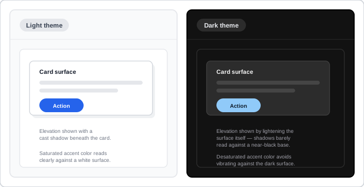 Dark theme isn’t the light theme with an inverted palette — every surface, elevation, and color rule gets its own separate treatment.
Background
A dark theme is a supplemental display mode built for the same reasons customers reach for it — reduced eye strain in low light, longer battery life on OLED screens, and simple visual preference — but it isn’t merely a light theme with its colors inverted: a naive inversion breaks contrast, elevation, and accessibility all at once. See Color Theory for the underlying contrast-ratio and color-mixing concepts a dark theme has to satisfy just as strictly as a light one, and Design Tokens for keeping a light and dark theme’s colors drawn from one named, consistent scale rather than two independently-maintained palettes.
Problem
Simply inverting a light theme’s colors produces a UI that looks dark but doesn’t actually work. Pure black backgrounds make shadows — the usual way a light theme signals which surface sits on top of another — nearly invisible, so elevation becomes illegible. Saturated colors that read cleanly on a white background instead visually vibrate against a dark one and frequently fail WCAG’s contrast requirements once applied to text or a small control. Without a deliberate, dedicated set of design rules, a dark theme ends up simultaneously harder to read and less informative about the interface’s own structure than the light theme it’s supposed to complement.
Simply inverting a light theme’s colors produces a UI that looks dark but doesn’t actually work.
Solution
Use dark grey surfaces, not true black
Set the primary dark-theme surface color to a dark grey (Material Design’s baseline is #121212) rather than pure black — shadows and depth stay legible against grey in a way they don’t against black, and light text sits at a gentler, less eye-straining contrast on grey than on black. True black is still a reasonable choice specifically for battery-conscious OLED devices like wearables, since those screens can power off any pixel displaying true black — but watch for a scrolling-induced blur delay as those pixels switch on and off.
Set the primary dark-theme surface color to a dark grey (Material Design’s baseline is
#121212) rather than pure black — shadows and depth stay legible against grey in a way they don’t against black, and light text sits at a gentler, less eye-straining contrast on grey than on black.
Convey elevation with a lighter overlay, not shadow alone
As a surface rises in elevation, lighten it with a semi-transparent white overlay instead of relying on shadow contrast the way a light theme does — scaling roughly from no overlay at the base level up to its lightest at the highest elevation makes the stacking order legible again on a dark background. Don’t apply this overlay to a surface using a primary or secondary brand color; keep its shadow dark instead, and don’t substitute a light glow for a dark shadow — a glow doesn’t represent elevation the way a cast shadow does.
Desaturate primary and secondary colors
A saturated color that reads cleanly in a light theme visually vibrates against a dark background and often fails a 4.5:1 text-contrast standard once applied to body text or a small control. Pull primary and secondary colors from the lighter, less-saturated end of their tonal scale for a dark theme rather than reusing the light theme’s saturated tones directly. Reserve full-saturation brand color for one or two small, deliberately prominent elements (a logo, a single button) — not applied broadly — so that a genuine brand moment still stands out precisely because it’s rare.
Hold text contrast to a stricter floor than the light theme
Keep dark-surface-to-white-text contrast comfortably above the 4.5:1 WCAG AA floor — high enough that body text still clears it even at a UI’s highest, lightest-elevated surface, where the overlay rules above have already lightened the background somewhat. Distinguish emphasis through opacity on that same white text (higher for primary content, lower for secondary or disabled) rather than introducing a whole second color scale just for emphasis levels.
Let customers choose the theme, and use it deliberately rather than uniformly
Offer an explicit toggle rather than forcing one theme — prominently, via an icon toggle like the toggle switches pattern, or with lower prominence inside a settings screen for customers who rarely change it. Dark theme doesn’t have to mean “everything dark, everywhere”: a single component can deliberately keep a light surface inside an otherwise dark UI — a status message that needs to interrupt, for instance — when standing out matters more than staying visually consistent with the rest of the theme.
Dark theme doesn’t have to mean “everything dark, everywhere”: a single component can deliberately keep a light surface inside an otherwise dark UI — a status message that needs to interrupt, for instance — when standing out matters more than staying visually consistent with the rest of the theme.
Related Concepts
Patterns
Principles
Standards
Sources
Dark theme (Material Design) is this page’s sole source — the dark-grey-over-black surface recommendation, the elevation-overlay technique, color desaturation for contrast, the stricter dark-theme contrast floor, and theme-toggle placement all come directly from that guidance.