
Error Messages
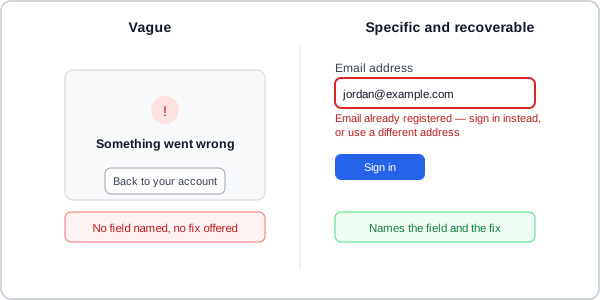 The vague version leaves the customer to guess what happened and what to try next; the specific version names the field, explains why, and offers the fix in one click.
Background
An error message is the point where a system tells a person something went wrong and, ideally, what to do about it — getting any one of its several design decisions wrong (timing, placement, wording) undoes the benefit of getting the others right, since a well-written message that appears mid-keystroke is as disruptive as a correctly-timed one that never says what to fix. A field-level error like this is one instance of a broader problem; see Empty States for the same specific/recoverable writing discipline applied to a whole page or component that has nothing to show rather than one invalid field.
Getting any one of its several design decisions wrong (timing, placement, wording) undoes the benefit of getting the others right, since a well-written message that appears mid-keystroke is as disruptive as a correctly-timed one that never says what to fix.
Problem
Validation and error-handling decisions made ad hoc — validating on every keystroke because that’s the framework default, showing only a summary banner because it’s less work than field-level messages, writing whatever text comes to mind first — produce forms that interrupt valid input mid-entry, bury the actual problem away from the field it concerns, or leave a person unable to tell what to fix.
Solution
Validate on submit, not while typing
Validate on submit, not while the user is still typing. Live validation that fires on every keystroke is disorienting — particularly for slower typists and for fields with strict formats. Exceptions (e.g. password strength meters) require user research evidence that the benefit outweighs the interruption cost. A middle ground exists between keystroke-by-keystroke and submit-only: validating when a customer leaves a field (on blur) catches an error while it’s still fresh in their mind, without the disorientation of judging half-typed input — reasonable for a field whose validity doesn’t depend on other fields, less useful for cross-field rules that can’t be checked until the whole form is in view.
This isn’t just a theoretical concern: USWDS built and later deprecated a live-validation component that showed a checklist of requirements (e.g. password rules) updating in real time as the customer typed. Testing found screen reader and screen-magnification users often didn’t notice the status change at all, and other users were confused about what the live checklist was even for — a live-feedback pattern that looked helpful on paper failed in practice for exactly the population it most needed to serve, and the safer default (validate on submit) doesn’t have that failure mode. Naming the mechanism: this is Change Blindness — a change that’s technically present but not visually salient enough to register as having happened at all.
Validation should prevent errors before they happen, not just report them clearly afterward. Accept any input format that isn’t genuinely ambiguous — a postcode with or without spaces, a name with an apostrophe, accent, or other diacritical mark — and have the code silently strip incidental characters (stray whitespace, punctuation) rather than rejecting the whole entry over something the customer didn’t even mean to type differently. Prevention this way avoids an error message entirely, which is always a better outcome than writing a good one.
Prevention this way avoids an error message entirely, which is always a better outcome than writing a good one.
See Error Prevention and Recovery for this same prevention-first logic applied beyond form validation specifically — forcing functions, constraints, and the fallback layers (detection, mitigation) for whatever prevention doesn’t catch.
Place validation errors near the field
Errors should always appear near the field they relate to, not only in a summary banner at the top or bottom of the form — a summary by itself still forces users to map each message back to the right field. See Show an error summary paired with inline messages below for pairing this with a top-of-page summary rather than choosing one or the other. In complex forms, a positive indicator on already-valid fields reduces the cognitive load of tracking progress. This near-the-field placement itself assumes a field exists to place it near — see Voice User Interface for the same recovery problem with nothing visual to point at.
Visual proximity alone doesn’t reach screen reader users, who don’t necessarily encounter the field and its error message in reading order — aria-describedby on the input (or the <fieldset>, for a grouped set of checkboxes/radios) closes that gap by pointing explicitly at the error text’s id. A visually-hidden “Error:” prefix gives the same context to a screen reader that color and position already give sighted users:
<fieldset aria-describedby="countries-error">
  <legend>Which countries will you visit?</legend>
  <p id="countries-error">
    <span class="visually-hidden">Error:</span> Select at least one country
  </p>
  <input type="checkbox" id="france" name="countries" value="france">
  <label for="france">France</label>
</fieldset>
Show an error summary paired with inline messages
When errors occur on submission:
- Show an error summary at the top of the page under a heading like “There is a problem” — linking to each specific field with an error. This catches users who may not have scrolled past the top, so show it whenever there are errors, even just one.
- Show an inline error message adjacent to each affected field, between its label and its input so message and field read as a pair, with wording identical to the summary’s (see Place validation errors near the field above for how to position and accessibly link it).
- Never clear the form. Retain both correct and incorrect values so users can review what went wrong and edit only the problem field without re-entering everything.
Each error summary item must link to its own field, not just name it — wrap the message text in an anchor pointing at the field’s id, so clicking (or activating via keyboard) jumps straight there. role="alert" on the summary makes assistive technology announce it as soon as it appears, without waiting for the user to navigate to it:
<div role="alert">
  <h2>There is a problem</h2>
  <ul>
    <li><a href="#full-name">Enter your full name</a></li>
  </ul>
</div>
Turn off the browser’s own built-in validation UI (the novalidate attribute on the <form>, and no bare required attributes left to trigger it) — native browser validation styling can’t be restyled consistently across browsers and often conflicts with the error summary/inline pairing above, producing two different, uncoordinated error experiences on the same field.
Write specific, actionable error message text
A recoverable error message has four characteristics: it clearly states the problem, avoids humor, explains how to recover, and appears near the problem it describes. Avoid humor in error messages specifically — frustration is already present when an error fires, and what reads as lighthearted to one user reads as dismissive or culturally opaque to another; there’s no upside worth the risk. Phrase recovery steps as instructions, not system description — “To remove an item from the cart, click Remove” tells the user what to do; “Items can be removed from the cart by clicking Remove” describes how the system behaves and leaves the user to infer the action. The instruction form is faster to act on because it doesn’t need translating.
A recoverable error message has four characteristics: it clearly states the problem, avoids humor, explains how to recover, and appears near the problem it describes.
Write error messages specifically for each failure mode rather than generically:
- For empty required fields: “Enter your [field name]” (instruction form)
- For format violations: “[Field name] must be [constraint]” (description form)
- Avoid: “An error occurred,” “Invalid input,” “Please fill in the field” — all fail to tell users what specifically went wrong or how to fix it. A short list of individual words worth cutting on sight: “sorry” (reads as filler, not help), “please” (implies the correction is optional), and “forbidden”/“illegal”/“prohibited” (blame-toned words that describe the system’s judgment of the input rather than what to do about it). HP’s classic “PC LOAD LETTER” printer error is the canonical negative example in the other direction — specific-sounding but so jargon-laden that most users had no idea it meant “load Letter-size paper.”
- Match the language from the question label so the error message is recognizable in context and when read in isolation from the error summary.
Message content should also scale to the error’s actual complexity and to any real display constraint (a length limit imposed by a small screen or hardware readout, for instance) — but neither of those is a license to fall back on the generic phrasing above.
Never let specificity leak exploitable information
A login form that shows “invalid username” or “invalid password” depending on which field was actually wrong hands an attacker a free signal about which usernames are valid — collapse both into one generic message (“invalid username or password”) instead. The same caution applies to any error surface that might otherwise expose internal detail a user doesn’t need and an attacker could use (IIS 5.0’s default error page once printed a full technical stack trace including a source-code fragment, a widely-cited example of this failure mode).
Related Concepts
Patterns
- Form Design
- Notifications
- Voice User Interface
- Empty States
- Action Buttons
- Context-Sensitive Help
- Process Funnel
- Sign-In and Account Creation
- Plain Language
Principles
Processes
Further reading
Nielsen Norman Group’s “Error-Message Guidelines” (commercially published, no stated open license) is a second research-based guideline set for the message-writing advice above, covering how visible an error should be, how to phrase it in human-readable language, and how to keep its tone from blaming the customer.
Sources
GOV.UK Design System (Open Government Licence v3.0) is the source for validating on submit rather than on input, retaining all entered values on redisplay, silently accepting and stripping tolerable format variations, turning off native browser validation, the error-summary-plus-inline-message structure, and the error-message-writing guidance (avoiding “sorry”/“please”/blame-toned words, phrasing recovery as an instruction, the visually-hidden “Error:” prefix).
The Design of Sites: Pattern Group K — Making Navigation Easy‘s K13 Meaningful Error Messages pattern is the source for the four characteristics of a recoverable error message.
USWDS Components: Date Picker, Memorable Date, Character Count, Input Mask, Text Input, Validation is the source for the USWDS live-validation-component deprecation case cited in Validate on submit, not while typing.
Error message (Wikipedia) (CC BY-SA) supplies the login-form information-leak example and the IIS 5.0 stack-trace case behind Never let specificity leak exploitable information, plus the “PC LOAD LETTER” example of jargon-heavy error text.