
Mobile Screen Sizing
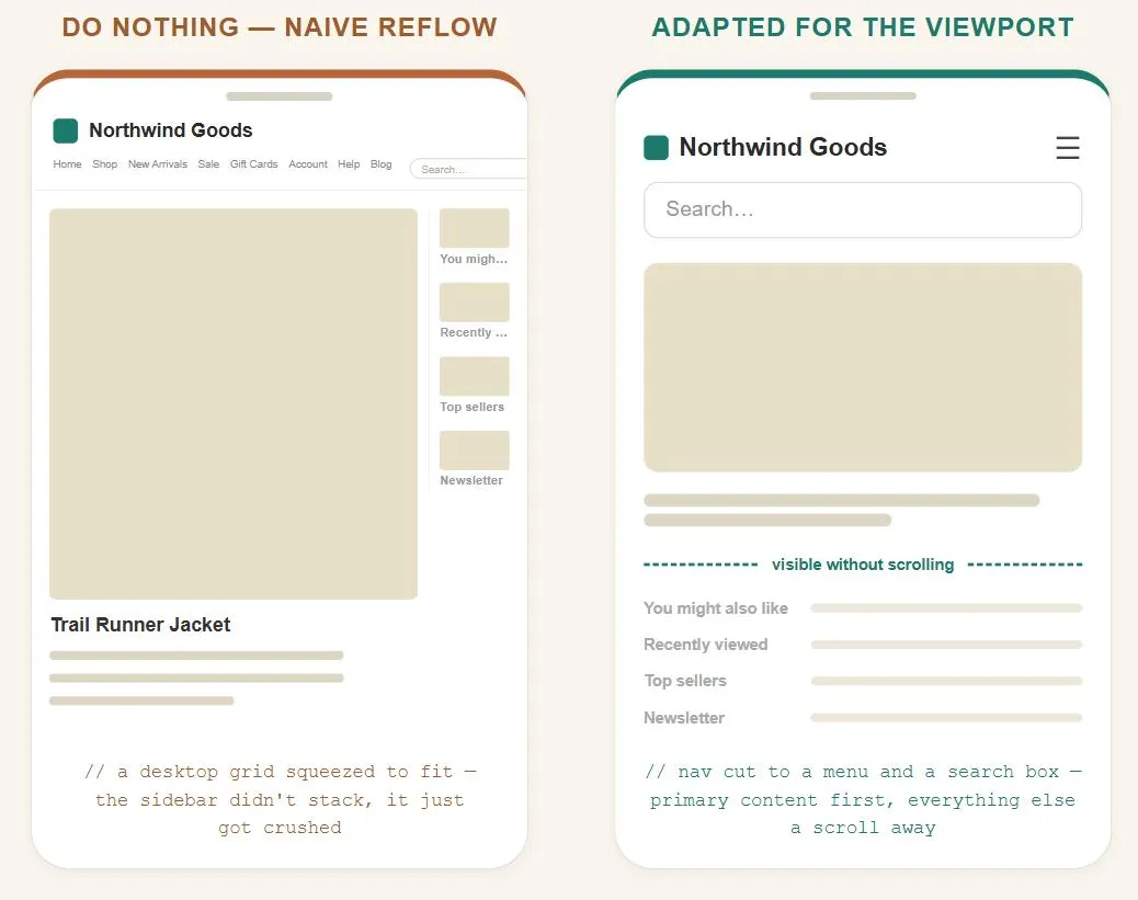 The layout never adapted — it just got squeezed, and the sidebar took the damage while the main content stayed fine.
Background
Minimizing navigation to keep more of the screen for content directly trades away some of a desktop site’s navigational richness — the right amount to cut depends on how narrow or exploratory the site’s typical mobile task actually is.
Problem
A mobile screen isn’t just a smaller version of a desktop screen — it’s small enough that the amount of content a customer can see at once, and how much scrolling they’ll tolerate to see the rest, becomes the central design constraint rather than a secondary one.
A mobile screen isn’t just a smaller version of a desktop screen — it’s small enough that the amount of content a customer can see at once, and how much scrolling they’ll tolerate to see the rest, becomes the central design constraint rather than a secondary one.
Solution
Decide deliberately how much of the desktop experience to carry over, and prioritize ruthlessly for the visible area.
Choose how much to adapt
Four escalating options, each trading more design/engineering cost for a better mobile experience:
- Do nothing and let the mobile browser reflow the desktop page as best it can. Cheap, but historically produces a poor result — full-page rendering that only shows a tiny scrollable corner of the original layout, or naive column-stacking that has no way to know which of a page’s elements actually matter most.
- Adapt the presentation for mobile screens specifically — reordering and trimming what’s shown (custom navigation “jump links” first, primary content next, secondary content and ads stripped or pushed down) while reusing the same underlying content.
- Redesign the content itself for mobile — justified only when adapting presentation alone isn’t good enough and the potential mobile audience is large enough to be worth the extra cost.
- Build a dedicated mobile application, which can justify richer interaction (see Mobile Input Design) at the cost of requiring a download/install step and higher implementation cost.
Cheap, but historically produces a poor result — full-page rendering that only shows a tiny scrollable corner of the original layout, or naive column-stacking that has no way to know which of a page’s elements actually matter most.
Deciding among these comes down to three questions worth answering before committing: how large is the realistic mobile audience, does a mobile-specific version unlock genuinely new capability (not just a smaller version of the same thing), and how much rework does reaching an acceptable result actually require.
Minimize scrolling
Scrolling costs more attention on mobile than on desktop, so keep the most important content and navigation above the fold and cut non-essential navigation to close to nothing — a single search box for a directory-style site, or direct jump links to entries for a content-heavy one. Put primary content immediately after the essential navigation, and push secondary material (a sidebar of related content, anything non-essential) further down rather than competing with it for the limited visible area.
Scrolling costs more attention on mobile than on desktop, so keep the most important content and navigation above the fold and cut non-essential navigation to close to nothing — a single search box for a directory-style site, or direct jump links to entries for a content-heavy one.
Connections to other patterns
Mobile-First Design is the sequencing strategy this pattern’s constraints justify — starting from the smallest, most content-constrained screen forces the same above-the-fold prioritization described here from the very first design decision, rather than retrofitting it onto an already-built desktop layout. Expanding and Fixed Screen Width and Responsive Web Design are the layout mechanisms a mobile-adapted presentation is typically built with. See Mobile Input Design for the companion problem of designing for a mobile device’s more limited input capabilities, once content is already sized to fit.
Related Concepts
Patterns
- Mobile-First Design
- Expanding and Fixed Screen Width
- Above the Fold
- Responsive Web Design
- Page Template
- Mobile Input Design
- Location-Based Services
Sources
The Design of Sites: Pattern Group M — The Mobile Web is this page’s sole source, its M1 pattern — the four-option adaptation framework (do nothing, adapt presentation, redesign content, build a dedicated app) and the above-the-fold-driven scrolling-minimization guidance.