
Stimulating Arts and Entertainment
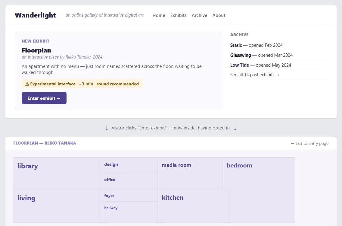 An “exhibit” here means the same thing it does in a physical gallery: one artist’s piece, credited and dated like a wall label, that a visitor opts into from a normal lobby. The rule-breaking only happens once inside it — the entry page stays ordinary, warns with specifics before the visitor commits, and still offers an exit once they’re in.
Problem
Arts and entertainment sites succeed by moving or challenging visitors, but a visitor who is dropped straight into an unfamiliar interface, an animated intro, or an intentionally rule-breaking navigation scheme before they’ve chosen to be there will usually just leave, rather than sit through something they weren’t warned about.
Arts and entertainment sites succeed by moving or challenging visitors, but a visitor who is dropped straight into an unfamiliar interface, an animated intro, or an intentionally rule-breaking navigation scheme before they’ve chosen to be there will usually just leave, rather than sit through something they weren’t warned about.
Solution
Separate where experimentation is earned from where it isn’t — keep entry pages conventional, and confine rule-breaking interaction to exhibits a visitor has deliberately chosen to enter.
Confine rule-breaking to exhibits visitors chose to enter
The entry pages of an arts/entertainment site should be conventional and easy — familiar navigation via Multiple Ways to Navigate, a straightforward homepage describing what exhibits exist and linking directly to them. Experimental or rule-breaking interface choices — unlabeled links, non-obvious navigation, an interaction style that intentionally violates ordinary Affordance conventions — are legitimate, but only inside an exhibit a visitor has deliberately chosen to enter, once they already understand roughly what they’re getting into. The mistake is putting the unconventional experience on the very first page, where no one has had the chance to opt in yet.
The mistake is putting the unconventional experience on the very first page, where no one has had the chance to opt in yet.
Warn with concrete numbers before a heavy exhibit
Tell visitors what they’re about to experience in concrete, specific terms before they commit to it — exhibit length, download size, expected time on a given connection speed, or that an exhibit uses an experimental, deliberately non-standard interface. A visitor warned “17 images, 2.5 minutes on a 1 Mbps connection” or “experimental interface” can decide whether to proceed; a visitor with no warning who hits a slow load or a confusing interaction just leaves.
A visitor warned “17 images, 2.5 minutes on a 1 Mbps connection” or “experimental interface” can decide whether to proceed; a visitor with no warning who hits a slow load or a confusing interaction just leaves.
Structure the archive
Use content modules to highlight new additions and a sidebar to link into the archive, so a growing library of past exhibits stays discoverable rather than being buried once something newer is published.
Related Concepts
Patterns
- Homepage Portal
- Multiple Ways to Navigate
- Content Modules
- Consistent Sidebars of Related Content
- Location-Based Services
Principles
Sources
The Design of Sites: Pattern Group A — Site Genres is this page’s sole source — A9 in Pattern Group A — covering the conventional-entry-page-versus-opted-into-exhibit distinction, the concrete-warning-before-a-heavy-exhibit guidance, and the content-modules/sidebar archive-structuring recommendation.