
Interface Design Principles
Seven general principles for tailoring design patterns to a particular situation, adapted from Ben Shneiderman’s eight golden rules of interface design, Jakob Nielsen‘s ten usability heuristics, and Edward Tufte’s writing on information presentation. Where design goals describe the destination, these principles describe the route — and the same list doubles as the checklist used in Heuristic Evaluation expert reviews (see Usability Evaluation Methods).
1. Be consistent throughout.
Same sequence of actions for similar tasks; consistent color, layout, and fonts (e.g. via style sheets); identical terms for the same concept everywhere on the site; familiar, non-technical language; navigation and action elements (e.g. Action Buttons) appearing in the same place across pages. Consistency also has to survive context changes a single design review won’t catch. The experience should hold together across devices and browsers (tested on actual phones, not just a resized desktop window), across separate visits and sessions (a multi-step process should let customers resume rather than restart), and over time as the site evolves.
The experience should hold together across devices and browsers (tested on actual phones, not just a resized desktop window), across separate visits and sessions (a multi-step process should let customers resume rather than restart), and over time as the site evolves.
A platform’s own HIG institutionalizes this same discipline at platform scale, so many independent developers converge on the same conventions instead of each re-deriving them. Breaking consistency doesn’t just create unfamiliarity — it can put two contradictory cues in front of a customer at once (a highlighted secondary button, a control placed against platform convention), which is the interference Stroop Effect names directly.
2. Offer informative feedback.
Keep the system’s status visible — e.g. indicating whether a connection is secure, or showing a progress indicator so customers know a page is still working rather than stalled. Perceived speed matters as much as actual speed, and the right indicator depends on what you can promise:
- Static text (“Loading…”) is simplest but indistinguishable from a crash if the page actually freezes.
- An animated “marching ants” indicator at least proves the browser is still alive, without claiming to know how long is left.
- A thermometer-style indicator is the most reassuring when accurate, but backfires badly when it isn’t, since a stalled or wildly wrong thermometer reads as more broken than no indicator at all.
- The strongest option, where the content allows it, is to display results as they actually arrive (e.g. a map rendering tile by tile) rather than making customers wait for the whole page at once — partial results can let a customer decide they have what they need before the page even finishes loading.
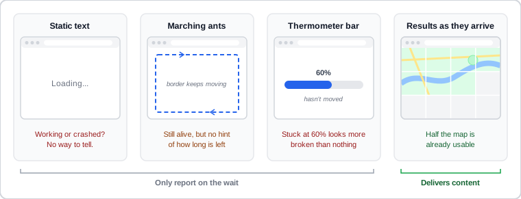 The same page, frozen mid-load: the stuck bar looks the most broken, and only the partly drawn map is still useful.
See Loading States for the fuller skeleton-screen-vs-spinner treatment of this same tradeoff.
Notifications and alerts are a form of system feedback and follow the same principle: limit them to avoid alert fatigue. When everything triggers a notification, users begin dismissing without reading. Non-urgent notifications (success confirmations, low-priority updates) should auto-dismiss after a short timeout. Any notification must also be manually dismissible. Use consistent patterns for severity: toasts/snackbars for transient, low-priority messages (auto-dismiss, appear at a screen edge); banners for persistent warnings that remain until resolved; modal dialogs (see Modal Dialogs) for decisions that require a response before the user continues. Reserve alerts for information that genuinely changes what the user needs to do next. See Notifications for the full severity-matching treatment, including alert-fatigue mitigation and per-channel user control.
When everything triggers a notification, users begin dismissing without reading.
3. Rely on recognition over recall.
Short-term memory is the bottleneck in human cognition; visible objects, actions, and options are easier to use than information a customer has to remember unaided — the reason visual interfaces (Mac/Windows) are easier to learn than command-line ones (DOS), and why action buttons should always pair an icon with a text label. This matters even more for customers with cognitive disabilities (see Accessibility) — e.g. a search-results page displaying the query a customer just typed, rather than expecting them to remember it.
4. Help customers avoid and recover from errors.
Prevent errors where possible; when they happen anyway, give meaningful error messages that explain what happened and how to recover — or better, recover automatically on the customer’s behalf. Usability Engineering‘s slip/mistake taxonomy sharpens “prevent”: a slip (right goal, wrong action — a typo, the wrong menu item) calls for reducing accidental wrong actions, while a mistake (a wrong goal, deliberately chosen) calls for catching a flawed plan before it’s acted on — different failure modes, different design responses. See Error Prevention and Recovery for forcing functions, constraints, detection, and recovery in full.
5. Support customer control and freedom.
Customers should feel their actions drive the site’s responses rather than being railroaded down one fixed path — Multiple Ways to Navigate, plus easy “exits” like undo/redo, browser Back/Forward, and breadcrumb trails for mistaken choices, and an alternative path (a resend link, a different verification method) for a step that can fail on its own rather than just restating that it failed.
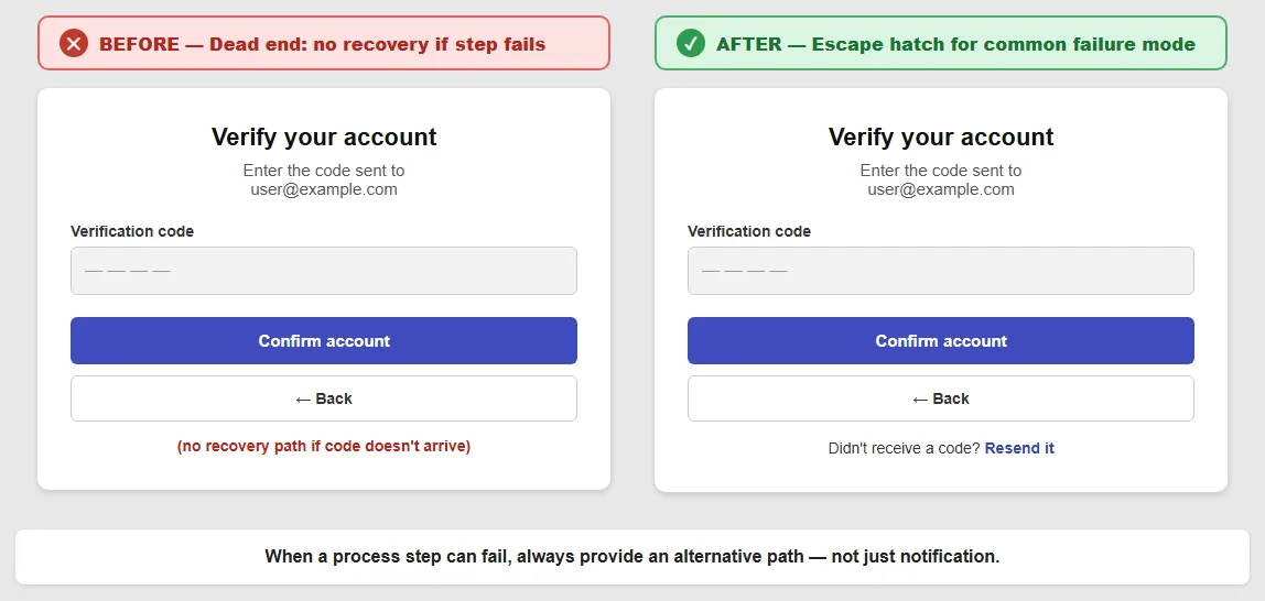 On the left, the only ways out are the code that never came and Back; the right adds a way forward when the code doesn’t arrive.
6. Help frequent customers use accelerators.
Support shortcuts for repeat actions — e.g. storing a shipping address and offering Predictive Input so it doesn’t need retyping, with an Account Management interface for customers to review/change what’s stored.
7. Strive for aesthetic and minimalist design.
Clean type, images, and layout (e.g. a Grid Layout) communicate how a site works; remove any element whose absence wouldn’t be missed, since every extra element competes for attention with the ones that matter. Each addition imposes an attention cost on every other element — the delight of a well-crafted detail is lost when it competes with five other details doing the same thing. Common violations of this principle:
- Decorative animation — animated elements that don’t signal a meaningful status change.
- Competing calls to action — several at once, all asking for the same click.
- Auto-advancing carousels — content that moves on before users have finished reading the current item.
- Stacked overlays — pop-ups or interstitials layered over page content.
- Too many typefaces — more than two typeface families on a single page.
Each addition imposes an attention cost on every other element — the delight of a well-crafted detail is lost when it competes with five other details doing the same thing.
These principles can conflict with one another — e.g. supporting customer control and freedom (principle 5) can work against helping customers avoid errors (principle 4). A Process Funnel is the canonical example of deliberately and judiciously restricting freedom in order to help customers complete a task, rather than treating “more freedom” as always better. Resolving such conflicts is a matter of judgment specific to the situation, not a fixed rule.
Related Concepts
Patterns
- Action Buttons
- Process Funnel
- Grid Layout
- Homepage Portal
- Multiple Ways to Navigate
- Form Design
- Loading States
- Empty States
- Error Messages
- Modal Dialogs
- Notifications
- Predictive Input
- Account Management
- Breadcrumb Navigation
Principles
- Accessibility
- Seven Stages of Action
- Recognition Over Recall
- Undo
- Keyboard Shortcuts
- Emotional Design
- Stroop Effect
- Error Prevention and Recovery
Processes
Standards
Further reading
Victor Ponamariov’s 50 Tips to Improve User Interface (goodreads.com/book/show/58085971-50-tips-to-improve-user-interface — self-published ebook, no stated license) applies and extends these principles throughout the book, for example by ensuring every end state — error pages, empty states, end-of-flow screens — offers a visible next step (see also Loading States and Form Design).
Bruce Tognazzini’s First Principles of Interaction Design (asktog.com — no stated open license) is a long-standing, widely-cited list covering many of the same ideas from a different angle, plus ideas this page doesn’t cover, such as Discoverability (“if the user cannot find it, it does not exist”).
Jakob Nielsen’s Designing Web Usability: The Practice of Simplicity (amazon.com/dp/156205810X — commercially published, no stated open license) is Nielsen’s own book-length treatment of principle 7’s simplicity theme, applied across page design, navigation, and site structure in more depth than this page’s own violations list covers.
Jeff Johnson’s GUI Bloopers 2.0: Common User Interface Design Don’ts and Dos (amazon.com/dp/0123706432 — commercially published, no stated open license) catalogs real interface mistakes across categories that map onto several of these seven principles at once, organized around why well-intentioned designers make each mistake rather than just what the mistake looks like.
Sources
The Design of Sites: Ch. 4 — Involving Customers with Iterative Design (Chapter 4) is the source for this page’s own framing — that the seven principles are adapted from Shneiderman, Nielsen, and Tufte to guide how patterns get applied toward iterative design’s goals.
The Design of Sites: Pattern Group L — Speeding Up Your Site supplies principle 2’s progress-indicator taxonomy (static message, marching-ants animation, thermometer, progressive display) and its warning that an inaccurate thermometer reads as more broken than no indicator at all.
Design Principles (U.S. Web Design System) supplies principle 1’s elaboration that consistency has to survive context changes — holding together across devices, browsers, and sessions — matching that source’s own “Promote Continuity” principle.