
Above the Fold
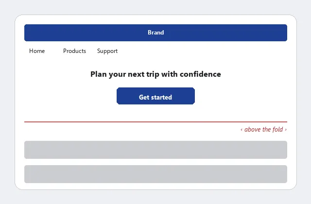 Everything a first-time visitor needs to recognize the site and decide whether to keep going sits above the fold — nothing essential waits on a scroll that might never happen.
Background
On the Web, “the fold” isn’t a fixed line — it’s wherever a given visitor’s screen and browser window happen to cut the page off, so a designer can never be certain exactly where it falls for any one visitor. Above-the-fold space is a page’s most contested real estate — marketing wants ads there, engineers want to show off the feature they just built, designers want to show off visual work — and reconciling those pulls with what customers actually need to see first is the core tension this pattern manages. It also competes directly with Clear First Reads: a first read needs to be large enough to dominate the page, but that size eats into the limited space available above the fold, so the two have to be balanced against each other rather than both maximized independently.
On the Web, “the fold” isn’t a fixed line — it’s wherever a given visitor’s screen and browser window happen to cut the page off, so a designer can never be certain exactly where it falls for any one visitor.
Problem
Visitors often miss content and navigation elements that require scrolling — many never realize there’s more below, so anything that matters has to be visible without scrolling.
Visitors often miss content and navigation elements that require scrolling — many never realize there’s more below, so anything that matters has to be visible without scrolling.
Solution
Decide on a minimum screen resolution to support (survey customers’ actual resolutions rather than guessing), then deliberately place the most important material within that minimum visible area: the page title, a clear first read, navigation bars, and key content modules. Placing a page’s most critical action here gains a second, motor benefit beyond simple visibility: it also shortens the travel distance a customer covers to reach it, the same distance term Fitts’s Law‘s formula penalizes.
The same placement-expectation research used in Grid Layout (the Wichita State University study) found people expect the shopping cart, account management, and help links at the top right, a sign-in link near the top left, and a clickable logo back to the homepage in the very top-left corner. Test candidate layouts across a range of screen sizes rather than just the designer’s own monitor — see Expanding and Fixed Screen Width for the layout strategies that determine what those sizes actually look like.
Test candidate layouts across a range of screen sizes rather than just the designer’s own monitor — see Expanding and Fixed Screen Width for the layout strategies that determine what those sizes actually look like.
Related Concepts
Patterns
- Grid Layout
- Clear First Reads
- Expanding and Fixed Screen Width
- Homepage Portal
- Organized Search Results
- Jump Menus
- Action Buttons
- Content Modules
- Account Management
- Shopping Cart
Principles
Processes
Further reading
Anthony Brebion’s Above the Fold vs. Below the Fold: Does it Still Matter in 2024? (AB Tasty, 2022 — copyright AB Tasty, no open license; https://www.abtasty.com/blog/above-the-fold/) argues the concept still matters but has changed shape, since scrolling behavior and device diversity have shifted substantially since the desktop-only 1990s. It names a “false bottom” — a page whose visual design makes it look like the content has ended when more actually sits below the fold — as a specific pitfall to avoid.
Sources
The Design of Sites: Pattern Group I — Designing Effective Page Layouts is this page’s sole source — the I2 pattern’s treatment of variable screen resolution, the minimum-visible-area guidance, and the Wichita State University placement-expectation findings (shopping cart, account management, sign-in link, and logo position) are drawn directly from it.