
Design Tokens
A design token set is a deliberately constrained palette of style values — a fixed set of colors, spacing amounts, type sizes, and similar — rather than letting every design decision reach for an arbitrary value. The comparison USWDS draws is to a musical scale: a scale doesn’t use every possible frequency, just a limited, named set of notes, and that limitation is exactly what makes the notes combinable and learnable rather than an unstructured wall of sound.
a scale doesn’t use every possible frequency, just a limited, named set of notes, and that limitation is exactly what makes the notes combinable and learnable rather than an unstructured wall of sound
Why constrain the choices at all
Without a shared, limited set of values, every designer or developer ends up picking their own slightly different shade of blue or slightly different spacing amount for what’s meant to be the same thing. Individually each choice looks reasonable; across a large site the accumulated small inconsistencies read as visually incoherent, even where no single decision was wrong on its own. A token system trades away that per-decision flexibility for two things instead: a visually consistent result, and a shared vocabulary — “space-2,” “primary-dark” — that designers and developers can both reference directly, rather than a designer’s exact pixel value needing to be re-translated into a developer’s implementation every time.
A token system trades away that per-decision flexibility for two things instead: a visually consistent result, and a shared vocabulary — “space-2,” “primary-dark” — that designers and developers can both reference directly
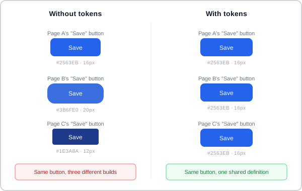 Same button, same role, built three times — nothing here was individually a bad decision, only collectively an inconsistent one.
What gets tokenized
The same constrained-scale treatment applies to several categories of value usually discussed independently:
- Color — a fixed palette rather than arbitrary hex values, with a light and a dark theme drawing from the same named tokens rather than each keeping its own separately-maintained palette; see Color Theory for the color-mixing and contrast reasoning a palette still needs to satisfy.
- Spacing — a scale of margin/padding amounts (often a consistent multiplier, e.g. 4px or 8px steps) rather than one-off pixel values chosen per component; see White Space for what that spacing is actually for.
- Typography — font family, size, line-height, and line-length (“measure”) drawn from a defined scale rather than set freely per heading or paragraph; see Clear Typography for the underlying legibility/readability goals a type scale still has to serve.
- Other visual properties — opacity, shadow depth, and z-index layering (which surface sits above which) follow the same pattern: a small named set of values rather than arbitrary ones chosen per instance.
A grid is really the same idea applied to layout position rather than color or type — a constrained set of column/row positions elements must snap to, instead of arbitrary placement.
Where the token idea comes from, and its limits
Design tokens are typically implemented in code as variables, functions, or utility classes (e.g. referencing a named color rather than writing a hex code directly) — the specific implementation mechanism is a lower-level detail than the underlying design discipline itself, but that discipline (choose from a defined scale, don’t invent a new value per instance) is the transferable part regardless of what tooling enforces it. A platform-scale human interface guideline or an organization-scoped design system applies the same idea at a larger scale — entire cross-platform interface languages (Material Design, Apple’s HIG) or a single company’s own component library formalize consistent values across every app built on them, not just one site’s own.
that discipline (choose from a defined scale, don’t invent a new value per instance) is the transferable part regardless of what tooling enforces it
:root {
  --color-primary: #2563EB;
}

.button {
  background-color: var(--color-primary);
}
A component references --color-primary by name rather than writing #2563EB directly, so changing the token’s value in one place updates every component that draws on it — the same shared vocabulary the button example above shows, expressed as code rather than a picture.
Related Concepts
Patterns
Principles
Standards
Further reading
Apple’s Human Interface Guidelines — Color (developer.apple.com/design/human-interface-guidelines/color — Apple Inc. copyright, no open license) names its own color tokens dynamic system colors: values defined by semantic purpose (a background, a label, a separator) rather than by a fixed hex value, so a design shouldn’t hard-code a color’s current value or reuse one token’s role for another. It also covers color-space management (sRGB vs. the wider Display P3 gamut) as a further axis a color token can vary across, beyond the light/dark/increased-contrast variants already covered on Color Theory.
Anthony Hobday’s Visual design rules you can safely follow every time (anthonyhobday.com — no stated open license) states the spacing-scale idea in its most concrete form: every measurement in a design — spacing, sizing, anything — should be a multiple of one base unit (e.g. 8px), rather than a value chosen freely per instance.
Sources
Design Tokens (U.S. Web Design System) (CC0 1.0 Universal) is this page’s source — the musical-scale framing for why a constrained value set beats arbitrary per-decision choices, and the token categories (color, spacing, typography, opacity, shadow, z-index) that constraint applies to.