
Wearable Interface
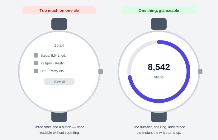 A face crowded with everything ends up legible for nothing; a face built around one number reads before the wrist finishes turning.
Background
A smartwatch strips away nearly everything a phone screen can rely on: the screen is round and small, worn on a moving wrist, glanced at rather than held, and used one-handed for at most a few seconds at a time. Voice and chat each drop one piece of a screen’s usual toolkit; a wearable keeps the screen but shrinks the display, the interaction time, and the hand available to use it, all at once. See Spatial Interface for what happens once the screen’s fixed size and position are removed altogether.
Problem
A layout built for a rectangular, two-handed, minutes-long phone session doesn’t survive being shrunk onto a round, one-handed, seconds-long watch glance. Text truncates, tap targets fall below comfortable reach, and a screen meant to be browsed instead has to be understood in a single glance while the wearer’s arm is already tiring.
A layout built for a rectangular, two-handed, minutes-long phone session doesn’t survive being shrunk onto a round, one-handed, seconds-long watch glance.
Solution
Design for the wrist’s real constraints first — a round shape, one hand, seconds rather than minutes — rather than shrinking an existing phone layout down to fit.
Design for one or two critical tasks, not a full app
Scope a wearable app to one or two critical tasks rather than a shrunk-down copy of its phone counterpart. Finish a task in seconds, not minutes — an arm held up to look at a watch tires quickly, so speed is itself part of the design. Favor the platform’s own glanceable surfaces over a full app screen: a complication (a small, always-visible readout on the watch face itself) and a tile (a swipeable, non-scrolling screen built for one task’s quick access).
Finish a task in seconds, not minutes — an arm held up to look at a watch tires quickly, so speed is itself part of the design.
Use the round screen’s own layout types, not a shrunk rectangle
Three canonical layout types cover almost every wearable screen: a tile for quick access to one task or piece of information, a scrolling list of components for an app’s fuller screens, and a non-scrolling layout for something like a media player, a picker, or a progress display. Scale each with percentage-based margins relative to the screen’s own size, not a fixed pixel margin, so the same layout fills a small screen without cropping and fills a larger one without floating in empty space.
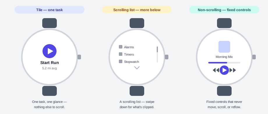 A tile fits one glance, a list scrolls for more, and a fixed layout like a media player never moves — the same round face takes a different shape depending on the task.
Design every glanceable surface for what it needs to say, not what it could show
Show only the single most critical piece of information a tile or complication needs to convey, rather than folding in every feature an app could offer — a surface that tries to do too much stops being understandable at a glance. Keep its content predictable (always about the same user-facing task) and relevant to the wearer’s present context, since a person checks it expecting a quick, specific answer, not a menu to browse.
Show only the single most critical piece of information a tile or complication needs to convey, rather than folding in every feature an app could offer — a surface that tries to do too much stops being understandable at a glance.
Keep interactive elements and key text inside the smallest screen’s edges
Design for the smallest supported screen size, not the largest — text and controls that fit comfortably on a big watch face can truncate or clip on a smaller one, and a critical call to action needs to fit without truncating on the smallest screen a person might be wearing. Use a percentage-based margin, the same one applied to overall layout, so content scales with the screen instead of being cropped by its edge, and keep interactive elements fully scrollable into view rather than letting one sit clipped at a page’s own edge. A denser layout is better served by a compact chip than a card, since a card’s larger surface makes text truncation harder to avoid.
Test typography against the full range of a person’s own text-size setting
A wearable’s own type scale is user-configurable in small increments, so a layout has to hold up at both the largest and smallest size a person might set, not just the default. Check contrast between text and its background the same as any other UI element, and check that same contrast between a bolder and a lighter type style used side by side, since both are being read at whatever size the wearer has chosen.
Reserve gesture shortcuts for one-and-done interruptions, never full navigation
A hands-free gesture belongs on a quick, one-and-done interruption — silencing a call, pausing media, dismissing a notification — not on full screen-to-screen navigation. Never make a gesture the only way to reach an action: keep a visible, tappable control doing the same thing alongside it, sized per Fitts's Law, and never let a gesture leave a person at a dead end with no touch or button fallback. Pair every recognized gesture with immediate feedback — a short haptic buzz plus a visual or audio cue — so a person knows it registered without needing to look.
Match a notification’s urgency to whether it’s worth buzzing a wrist
Before sending a notification to a wearable, ask whether the interruption is actually worth it: does the wearer need to act on this right now, on their wrist, rather than waiting to see it on their phone? Keep the message glanceable — a short line of text with a clear hierarchy a person can scan at a glance — and time it to when the information is actually relevant rather than on a delay. Give it both a collapsed state, glanceable at the first buzz, and an expanded one with fuller context on request, rather than forcing every notification into one fixed size.
Related Concepts
Patterns
Principles
Sources
Wear OS Design Guidelines (Android Developers) is this page’s sole source — its wearable-specific UX constraints, canonical layout types, tile/complication design rules, truncation-prevention techniques, user-configurable-typography testing guidance, one-handed gesture rules, and notification urgency framework all come from Google’s Wear OS design documentation.