
Dashboard Design
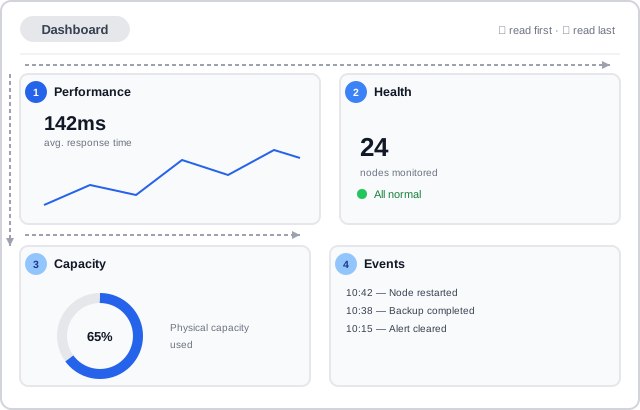 The scan path — long across the top, down the left edge, then a shorter pass along the bottom — is the F-pattern the highest-priority card should sit inside.
Background
A dashboard brings several independent metrics, charts, or summaries together onto one screen so a viewer can assess status or dig into data without navigating between separate pages — composing the chart and table patterns already covered elsewhere into one coherent whole, rather than replacing either. Two purposes pull dashboard design in different directions: a presentation dashboard exists to give a fast, at-a-glance status read of key metrics (a car’s own dashboard, a stock ticker board), while an exploration dashboard exists to support active digging through data via search, filter, and drill-down — and one layout approach rarely serves both equally well.
Problem
A dashboard’s content, unlike a single chart or table, has to be prioritized, sized, and arranged as a set — get the arrangement wrong and even individually well-designed cards compete for attention, or a viewer has to hunt for the one number that actually matters.
A dashboard’s content, unlike a single chart or table, has to be prioritized, sized, and arranged as a set — get the arrangement wrong and even individually well-designed cards compete for attention, or a viewer has to hunt for the one number that actually matters.
Solution
Choose a dashboard type before laying anything out
Decide whether the dashboard is meant to be scanned or explored, since the two calibrate different guidance further down: a presentation dashboard’s job is done once its most important metric is understood at a glance, while an exploration dashboard’s job is to stay usable across many different, user-driven digressions through the same data.
Establish a strong hierarchy before adding content
Prioritize what the dashboard shows by importance, then let a presentation dashboard’s most important metric take the highest contrast and largest area, positioned first for a left-to-right, top-to-bottom (F-shaped) reading pattern, with decreasing importance following that same path. Limit the number of metrics shown at all — non-essential information adds cognitive cost even when individually well-designed — and use White Space deliberately as a separator between groups rather than letting cards visually run together.
Limit the number of metrics shown at all — non-essential information adds cognitive cost even when individually well-designed — and use White Space deliberately as a separator between groups rather than letting cards visually run together.
Build content as a set of standard cards
Compose a dashboard from a small set of recurring card types rather than one-off layouts for each metric: an aggregate status card shows a total object count plus a breakdown by status (normal, exceptions, with an optional link to details); a trend card shows a current value alongside a sparkline of its change over time, with an optional filter to change the time range; a utilization card shows one or more proportional values via a bar or donut chart; a details card lists attribute-value pairs for a single object, often as a description list; and an events card lists time-ordered, filterable items such as alerts or system messages. Reach for a custom card only once a metric genuinely doesn’t fit one of these shapes.
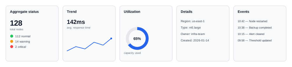 Five recognizable shapes cover most of what a dashboard needs to show — a genuinely custom card is the exception, not the starting point.
Reserve a dashbar for cross-cutting, always-visible information
A dashbar is a smaller dashboard pinned to the top of the screen, above the main card grid, for information that needs to stay visible regardless of what else the user is doing — critical system state, historical charting, a filter that scopes the rest of the page’s data, or a new feature announcement.
Design the layout in deliberate steps, not all at once
Work through a dashboard’s layout as a sequence rather than jumping straight to a finished arrangement:
- List the candidate cards the dashboard needs, treating each as an independent building block before worrying about arrangement.
- Prioritize that list, since the ordering becomes load-bearing the moment a responsive layout collapses a multi-column grid down to one column on a small screen — whatever’s prioritized highest should reach the top of that single column.
- Size each card (small/medium/large) by asking what format best displays its data, how much data it holds, and whether that amount is static or dynamic (a details card with a fixed list of attributes vs. an events card that could hold anywhere from zero to thousands of items).
- Lay out an equal-width column grid — three or four columns is most common at a standard desktop width, with consistent gutters — and place the sized-but-empty cards on it before adding any real content.
- Add real content to each card and adjust sizes as needed once actual data reveals a card needs more or less room than estimated.
- Iterate on the arrangement, treating it like a puzzle: keep the highest-priority cards toward the top, and don’t be afraid to revisit a card’s size if a later step shows the grid isn’t working.
Keep an exploration dashboard’s charts consistent and linked
Use the same layout, spacing, and legend position across every chart on an exploration dashboard, and never mix measurement systems (imperial and metric) within it. When a user filters or zooms one chart, update every other chart showing related data the same way, so the dashboard keeps presenting one coherent, multi-dimensional view of a single action rather than several charts drifting out of sync. Use annotations to call out trends, averages, peaks, and valleys without obstructing the underlying data itself.
Give a dynamic card room to grow without breaking the grid
A card whose content can grow or shrink over time — an events list is the clearest case — needs a deliberate strategy so it doesn’t leave a gap of unused space next to a shorter neighboring card, or push the whole layout down unpredictably. Either give it a fixed height with internal scrolling once its content exceeds that height, or use a flexible layout that reflows the surrounding cards as it grows.
A card whose content can grow or shrink over time — an events list is the clearest case — needs a deliberate strategy so it doesn’t leave a gap of unused space next to a shorter neighboring card, or push the whole layout down unpredictably.
Pair a chart-based card with the same accessible alternative any chart needs
A card built around a chart still needs the underlying chart’s own accessibility treatment — differentiating its data by more than color alone, and pairing it with an accessible table where the data itself matters, not just its shape. Where a card has genuinely no data to show yet, replace it with the matching empty state for that scenario rather than rendering an empty or broken-looking chart.
Related Concepts
Patterns
Principles
Further reading
Jeffrey Heer and Ben Shneiderman’s Interactive Dynamics for Visual Analysis (dl.acm.org/doi/10.1145/2133806.2133821 — Copyright © 2012 ACM, free to read but permission granted only for personal/classroom use, not an open license) proposes a taxonomy of twelve interactive tasks — including brushing-and-linking selections across multiple coordinated views, and recording and annotating an analysis history for later review — that goes well beyond what this page’s “consistent and linked” guidance covers.
Sources
Carbon Design System: Empty States and Dashboards (IBM) is the source for the presentation-vs-exploration dashboard distinction, the F-pattern hierarchy and white-space guidance, and the consistency/linked-charts/annotation rules for exploration dashboards.
PatternFly: Empty State and Dashboard Design Guidelines (Red Hat) is the source for the five standard card types, the dashbar pattern, the six-step design process, and the dynamic-card sizing guidance.