
Site Map (Navigation Page)
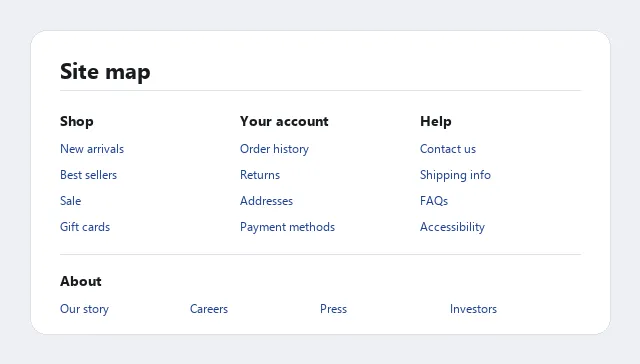 Links are grouped by what a visitor is trying to do — Shop, Your account, Help — with a separate About section below for company-facing links, rather than mirroring the site’s underlying folder structure.
Background
A live, on-site page listing every major destination on a site, provided as a last-resort backup when a customer’s other navigation attempts — browsing, searching, the homepage itself — haven’t gotten them where they need to go. This is distinct from a sitemap in the design-process sense: a high-level diagram of a site’s structure used internally during planning, never seen by an actual customer, versus the pattern documented here, which is a real page the finished site serves to visitors. A well-maintained site map also gives crawlers an alternative path to every page — see Search Engine Optimization.
Problem
No single homepage can serve every visitor’s needs — a company site built primarily for customers has limited room for job seekers, investors, or press, and no navigation method (browsing, search) works equally well for every visitor and every need. Some visitors need a comprehensive view of everything a site offers, in one place, regardless of how well the primary navigation happens to fit their specific goal.
No single homepage can serve every visitor’s needs — a company site built primarily for customers has limited room for job seekers, investors, or press, and no navigation method (browsing, search) works equally well for every visitor and every need.
Solution
Provide a live, on-site page listing every major destination on the site, treated as a last-resort backup rather than primary navigation.
Treat it as a genuine backup, not primary navigation
A site map’s job is completeness for the visitors other navigation methods fail, not day-to-day wayfinding — and if customers rely on it heavily, that’s a signal the primary navigation needs work, not evidence the site map is doing its job well. Check site logs for heavy site-map traffic to a specific section (e.g. company phone numbers) as a concrete signal of what your other navigation is failing to surface.
A site map’s job is completeness for the visitors other navigation methods fail, not day-to-day wayfinding — and if customers rely on it heavily, that’s a signal the primary navigation needs work, not evidence the site map is doing its job well.
Serve every visitor type equally
Unlike a homepage, which is designed around the most common visitor, a site map is where a section for a mostly-overlooked audience (investors, job seekers) can get real space without competing with the homepage’s higher-traffic priorities.
Unlike a homepage, which is designed around the most common visitor, a site map is where a section for a mostly-overlooked audience (investors, job seekers) can get real space without competing with the homepage’s higher-traffic priorities.
Keep it simple and fast-loading
Mostly text links in a grid layout, minimal graphics. This matters more here than almost anywhere else on the site, since a site map may need to represent a very large number of destinations at once.
Organize it, don’t just mirror the directory structure
A site map built by dumping the underlying folder structure into a page reflects how the site’s builders think about it, not how visitors do — build it the same way as any other organization task, typically combining hierarchical grouping with task-based grouping, and duplicate an item into more than one category where that genuinely helps different visitors find it. Alphabetical ordering is rarely appropriate here, unlike in some other navigation contexts, since it groups nothing meaningfully for a first-time visitor.
Link categories through to category pages
Link categories through to category pages so a visitor can jump straight to the general area they need, not just to individual leaf pages.
Fit as much as possible above the fold
Use a multi-column grid or multiple links per line rather than one long scrolling column of text — see Above the Fold.
Make it reachable from every page
A header/navigation-bar link is the most visible placement but permanently costs above-the-fold space on every page; a footer link costs nothing above the fold but is only found by scrolling. Where possible, provide both, the same logic used for placing a high-visibility action button both above and below the fold.
Related Concepts
Patterns
- Navigation Menus
- Jump Menus
- Breadcrumb Navigation
- Homepage Portal
- Category Pages
- Content Organization Schemes
- Grid Layout
- Action Buttons
- Page Not Found
- Search Engine Optimization
- Above the Fold
Processes
Sources
The Design of Sites: Pattern Group K — Making Navigation Easy is this page’s sole source — K17 in Pattern Group K — covering the last-resort-backup framing, the organize-don’t-mirror-the-directory-structure guidance, and the header-versus-footer placement tradeoff that structure this page’s design-principles list.