
Mobile Input Design
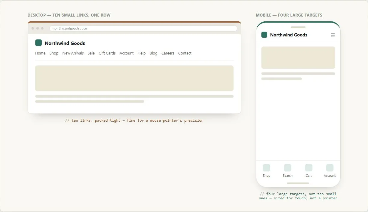 A mouse can land on a ten-item row without missing; a fingertip needs the same set of choices cut down to the few that are actually worth a dedicated tap.
Problem
Mobile devices give customers a much less precise, more effortful way to interact with a page than a mouse and full keyboard do, so a page that’s merely readable on a small screen can still be frustrating or slow to actually operate.
Mobile devices give customers a much less precise, more effortful way to interact with a page than a mouse and full keyboard do, so a page that’s merely readable on a small screen can still be frustrating or slow to actually operate.
Solution
Reduce how much precise interaction and typing a mobile customer has to do, rather than assuming the same interaction cost as desktop.
Minimize the number of interactive elements
Every link or button on a page is something a customer must navigate to using a slower, less precise input mechanism than a mouse pointer — fewer links and buttons on a mobile page means fewer effortful steps to reach whatever the customer actually wants. Where content or navigation elements would otherwise be scattered across a wide layout, reorganizing for the small screen and keeping the most important elements above the fold also keeps them within easy reach.
Every link or button on a page is something a customer must navigate to using a slower, less precise input mechanism than a mouse pointer — fewer links and buttons on a mobile page means fewer effortful steps to reach whatever the customer actually wants.
Keep positions consistent and predictable
A mobile browser that renders a page’s full desktop layout on a tiny screen shows only a small visible portion at a time, and moving between links can trigger automatic scrolling toward whichever link is selected next. Content whose position shifts or that isn’t laid out predictably makes that automatic scrolling disorienting. Keep link and button positions consistent across pages, and pay attention not just to what’s Above the Fold but to what sits at the left edge, since a small viewport typically opens on a page’s top-left corner first.
Minimize text entry
Typing is slow on a mobile device, so avoid requiring it wherever a customer’s information can be captured, remembered, or inferred instead:
- Use persistent sessions so a customer doesn’t have to sign in on every visit.
- Use Predictive Input so a field can be completed with a few keystrokes plus a selection rather than typing a full answer.
- Reuse previously entered information — a saved address or shipping method (see Quick-Flow Checkout) — rather than asking a returning customer to re-enter the same data.
Match input assumptions to the actual device
Beyond these, treat any specific input assumption (control layout, gesture support, how precisely a customer can target a small element) as something to verify for the range of devices actually in use, rather than assuming the desktop interaction model just works at a smaller size. The concrete mechanisms mobile devices use for pointing and selecting change with the hardware; the durable design lesson is what should survive that churn — minimize required interactions, keep their positions predictable, and remove typing wherever the answer is already known. This is also an Accessibility concern, not only a mobile one: some of the same limited-precision-input constraints apply to customers using assistive input devices on any screen size.
The concrete mechanisms mobile devices use for pointing and selecting change with the hardware; the durable design lesson is what should survive that churn — minimize required interactions, keep their positions predictable, and remove typing wherever the answer is already known.
Connections to other patterns
Together with Mobile Screen Sizing, this pattern forms the practical basis for a usable mobile experience — sizing determines what’s visible, input design determines how easily a customer can act on what they see. It’s the companion problem Mobile-First Design points to once its own design-first-for-constraint strategy turns to actual input mechanics rather than layout.
Related Concepts
Patterns
- Mobile Screen Sizing
- Predictive Input
- Customer Sessions
- Sign-In and Account Creation
- Quick-Flow Checkout
- Above the Fold
- Mobile-First Design
Principles
Sources
The Design of Sites: Pattern Group M — The Mobile Web is this page’s sole source, its M2 pattern — minimizing interactive elements, keeping positions consistent, and reducing text entry via persistent sessions, predictive input, and reused prior answers; the whole page is drawn directly from that one pattern.