
Cognitive Accessibility
Overview
Cognitive and learning disabilities cover a wide range — memory, attention, problem-solving, and reading comprehension all vary independently — so no single fix covers the group the way a contrast ratio covers color vision. Several of Accessibility‘s other rules already serve this group without having been introduced that way: recognition over recall, and motion/flashing limits, are cognitive-accessibility measures in substance. Low numeracy and dyscalculia, covered below, are the numbers-specific case of the same concern.
Cognitive and learning disabilities cover a wide range — memory, attention, problem-solving, and reading comprehension all vary independently — so no single fix covers the group the way a contrast ratio covers color vision.
Design for cognitive accessibility
A few concrete rules:
- Extend time limits generously, and warn before they expire. Where a time limit can’t be eliminated outright, let customers extend it to at least ten times the original length, via a simple action (e.g. a single keypress) available with at least 20 seconds’ notice before expiry. Save in-progress data before a session times out, so a customer who runs out of time doesn’t also lose their work, and warn about impending inactivity-driven timeouts rather than letting one arrive silently.
- Never change context just because an element received focus. Tabbing onto a control, or a page merely loading, should never itself trigger a navigation, a form submission, or a new window — only an explicit activation (a click, a keypress meant to activate) should. A customer moving through a page via keyboard needs to be able to trust that reaching a control is safe and reversible until they actually choose to act on it.
- Declare the page’s language, and expand abbreviations on first use. The
langattribute on<html>(and on any inline passage in a different language) lets screen readers switch pronunciation rules correctly — without it, assistive technology guesses, often wrong. The<abbr>element (with atitlegiving the expansion) serves the same first-use-clarity purpose for jargon and acronyms that Plain Language guidance already argues for in prose;<abbr>just gives that same expansion a machine-readable home. - Let customers review, confirm, and correct before anything final happens — a summary/review step before submission catches mistakes while they’re still cheap to fix, and matters most for actions that are expensive or slow to reverse once submitted (a legal filing, a financial transaction). Where a transaction genuinely can’t be pre-reviewed, build in an explicit amendment or cancellation window afterward instead, rather than treating “submitted” as irreversible by default. This is the review-and-recovery guidance in Error Prevention and Recovery applied to the specific case of a final, hard-to-reverse submission.
- Don’t make signing in, or navigating an automated phone system, depend on memory. A login shouldn’t require recalling a password, transcribing a code, or working through a puzzle or calculation — offer a single, simple step, and a lower-text alternative for customers who struggle with reading. An automated voice menu should let a caller reach a human by pressing one reserved digit, rather than holding several spoken options in memory before choosing.
A customer moving through a page via keyboard needs to be able to trust that reaching a control is safe and reversible until they actually choose to act on it.
Design for low numeracy and dyscalculia
Dyscalculia is a persistent difficulty understanding, reading, and working with numbers — it affects the ability to handle money, tell or estimate time, understand percentages, and hold number facts in working memory (a PIN, a phone number, a shopping list). It’s estimated to affect about 1 in 20 people in the UK — a similar order of prevalence to dyslexia (roughly 1 in 10–20) — but with far less public awareness, so most people with it are undiagnosed and have learned to avoid number-heavy situations rather than ever getting a name for the difficulty. The population that benefits from number-friendly design is wider still: low numeracy short of a diagnosable condition affects roughly half of UK working-age adults, and one in five people say they’d avoid a job that involves frequent number use. Government services in particular have no substitute a struggling user can switch to instead, which makes this a baseline requirement rather than a nice-to-have — the same reasoning plain language applies to text applies here to numbers specifically.
The population that benefits from number-friendly design is wider still: low numeracy short of a diagnosable condition affects roughly half of UK working-age adults, and one in five people say they’d avoid a job that involves frequent number use.
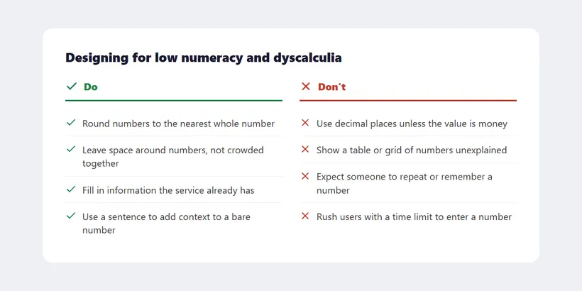
A joint DWP/HMRC accessibility poster gives concrete dos and don’ts:
 Most of these are small, concrete interface choices — not a rewrite, just noticing where a number is asked for without support around it.
- Do round numbers to the nearest whole number, and avoid decimal places except where the value is genuinely money.
- Do leave space around numbers on the page rather than crowding them together, so they don’t visually “jump around.”
- Do fill in information the service already has, rather than asking a user to re-enter or recall it (see recognition over recall).
- Do use a sentence to add context to a bare number (“1 in 20 people have dyscalculia” rather than just “5%”).
- Do let people include spaces when entering a long number (e.g. “12 34 56”).
- Do involve people who struggle with numbers directly in the design process, not only as usability-test subjects after a design already exists.
- Don’t overwhelm people with too much content at once, or show a table or grid of numbers without explaining what they mean.
- Don’t expect users to repeat or remember a number they were only shown once.
- Don’t rush users with a time limit to enter a number accurately.
- Don’t force a user to enter a number or perform a calculation purely to verify their own identity.
Related Concepts
Patterns
Principles
Standards
Sources
Cognitive accessibility (MDN Web Docs) is the source for most of “Design for cognitive accessibility” above — the time-limit extension/warning rule, never changing context on focus alone, the lang/<abbr> readability guidance, and reviewing/confirming before a final, hard-to-reverse submission.
Designing for people with dyscalculia and low numeracy is the source for “Design for low numeracy and dyscalculia” — the prevalence figures for dyscalculia and low numeracy, and the joint DWP/HMRC accessibility poster’s dos and don’ts reproduced in the checklist and image above.
Making Content Usable for People with Cognitive and Learning Disabilities (W3C WAI-COGA) is the source for this page’s memory-dependent sign-in and voice-menu guidance — the W3C’s broader supplement to WCAG for this population, organized around eight objectives (understanding, findability, clarity, error recovery, focus, memory, support, and personalization), of which this page draws specifically on the memory objective.