
Modal Dialogs
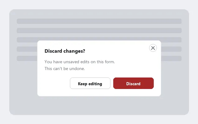 A modal dialog: the page behind it is dimmed and inert, and everything the customer needs — including the close button — lives inside the dialog itself.
Problem
A modal dialog interrupts the main flow to collect input or confirm a decision before the user can continue. Done poorly, modals are disorienting and inaccessible.
A modal dialog interrupts the main flow to collect input or confirm a decision before the user can continue.
Solution
Done well, modals are efficient for focused tasks that don’t warrant a full page — the key to doing it well is treating the dialog as a temporary mode and designing accordingly: the mode’s boundary and exit must both stay obvious.
Keep the dialog fully visible
The dialog must appear fully on screen, not partially off-view or occluded by the browser chrome. On small screens this requires explicit position constraints — a dialog that appears partially off-screen cannot be interacted with by mouse or keyboard users, and cannot be discovered at all by screen reader users.
Support keyboard interaction
- Escape must close the dialog — this is a near-universal UI convention and a keyboard-nav requirement; breaking it surprises and traps users.
- The close button must be visually inside the modal, not floating outside the dialog boundary. A close button that appears outside the modal is easy to miss and breaks the spatial model of “what belongs to this dialog.”
- Keyboard focus must move to the dialog when it opens, and must be trapped inside it while it is open — so Tab cycles within the modal rather than reaching the page content behind it. See WAI-ARIA (Accessible Rich Internet Applications) for the
aria-modal,role="dialog", and focus-management attributes that communicate this to assistive technology. - When the dialog closes (via Escape, the close button, or a confirming action), keyboard focus must return to the element that triggered the modal, so the user’s position in the page is preserved.
<div role="dialog" aria-modal="true" aria-labelledby="dialog-title">
  <h2 id="dialog-title">Discard changes?</h2>
  <p>Your edits haven't been saved. This can't be undone.</p>
  <button type="button">Keep editing</button>
  <button type="button">Discard</button>
</div>
Label buttons contextually
Buttons inside a modal should use context-specific labels that describe the action precisely — “Move to Trash,” “Discard Changes,” “Send Invite” — rather than generic labels like “OK,” “Yes,” or “No.” Generic labels require users to reread the dialog body to understand what they are agreeing to; specific labels make the consequence of each choice self-evident. This matters most for irreversible or destructive actions, where a misread or misclick is costly. For destructive actions, spatial separation and color hierarchy (see Action Buttons) reinforce the label — a confirmation modal like this one is a mitigation, not a substitute for preventing the mistake in the first place; see Error Prevention and Recovery.
Generic labels require users to reread the dialog body to understand what they are agreeing to; specific labels make the consequence of each choice self-evident.
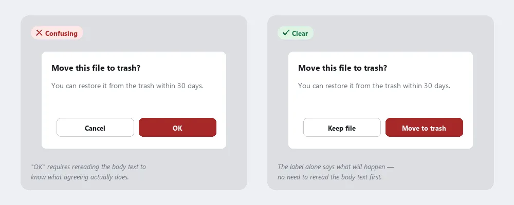 “OK” forces a reread of the body text to know what agreeing does; “Move to trash” says it outright.
Keep modal forms lightweight
Embedding a multi-field form inside a modal creates tradeoffs: no stable URL, potential scroll conflicts with content behind the modal, and reduced screen space on mobile — see Form Design for the full treatment. For substantial forms, a dedicated page is more reliable.
Reserve modals for genuinely urgent moments
Modals interrupt whatever the user was doing; overusing them trains users to dismiss without reading. Reserve modals for situations that genuinely require the user’s attention before continuing — a destructive action, a mandatory decision point, a quick focused input. For informational notices that do not require action, a non-interrupting notification (toast, banner) is less costly — see Interface Design Principles. A spatial interface’s own dialogs apply the same restraint by raising themselves above a panel’s own surface only for a moment that actually needs the extra attention.
Choose between a modal and a floating window
A modal blocks interaction with the rest of the page until the user responds; a floating window supplements the page while leaving it fully interactive underneath. Reach for a modal when a decision must be made before the user can do anything else; reach for a floating window for optional extra detail (help text, product detail, a survey) the user can freely ignore or dismiss.
A modal blocks interaction with the rest of the page until the user responds; a floating window supplements the page while leaving it fully interactive underneath.
Related Concepts
Patterns
Principles
- Accessibility
- Interface Design Principles
- Modal vs. Modeless Interfaces
- Error Prevention and Recovery