
Data Visualization
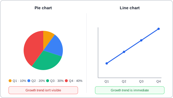 Identical numbers, arranged two ways — one hides the story the data actually tells, the other leads with it.
Background
Turning raw numbers into a visual comparison lets a reader exploit fast, automatic (“pre-attentive”) visual processing — color, size, position — instead of parsing prose or scanning a table cell by cell, which is why a well-chosen chart reads faster than the data it represents. That speed only pays off when the chart’s own form actually matches what the data needs; the wrong choice can obscure exactly what the chart was meant to reveal.
That speed only pays off when the chart’s own form actually matches what the data needs; the wrong choice can obscure exactly what the chart was meant to reveal.
Problem
The same dataset can be charted many different ways, and most of the wrong ways will still render without error — nothing stops a bar chart, pie chart, or scatterplot from displaying data it’s poorly suited to represent, so the failure only shows up in how hard the result is to read, not in whether it renders at all.
nothing stops a bar chart, pie chart, or scatterplot from displaying data it’s poorly suited to represent, so the failure only shows up in how hard the result is to read, not in whether it renders at all
Solution
Match the chart type to what the data actually represents
Choose a chart form based on the relationship the data expresses, not on visual variety or habit: a line or area chart suits change over time, a bar or column chart suits comparing discrete categories, and a pie or donut chart suits parts of a whole. Using a pie chart to show change over time, or a scatterplot to show a two-option vote split, forces a reader to reconstruct a comparison the chart’s own shape should have made obvious.
a line or area chart suits change over time, a bar or column chart suits comparing discrete categories, and a pie or donut chart suits parts of a whole
Differentiate data with more than color alone
Color is only one of several visual variables available for telling data series apart — size, orientation, texture, shape, and position can each carry the same distinguishing role, and combining more than one gives a reader redundant cues instead of relying on a single channel (the same “never rely on color alone” principle Color Theory argues for generally). Where a chart needs a related-but-distinguishable set of colors — a sequential scale for an ordered variable, say — adjust value (lightness) and saturation rather than swapping to an unrelated hue.
Test a palette by converting it to greyscale
A quick, mechanical check for whether a chart’s colors carry real contrast on their own: convert the whole visualization to greyscale. If every series or category stays distinguishable with color removed, the underlying luminance contrast is doing real work and the colors will likely read clearly in full color too. If two series collapse into the same gray, they were relying on hue alone rather than a genuine lightness difference, and something else — line style, marker shape, direct labeling — needs to carry the distinction instead.
Pair every chart with an accessible data table
A chart that distinguishes its data by color or shape alone excludes anyone who can’t perceive that visual channel, and excludes screen reader users from the data outright — see Accessibility. Data Tables covers the accessible-table structure that should accompany any chart, including a chart embedded in one card of a dashboard.
Balance detail against legibility, and plan before building
Too much detail turns a chart into visual noise; too little strips out the information it existed to convey. Get the right level by planning a visualization’s purpose and audience before laying out its specific marks — most legibility problems trace back to a chart built before its purpose was decided, not to the drawing itself.
Related Concepts
Patterns
Principles
Further reading
Edward Tufte’s The Visual Display of Quantitative Information (amazon.com/dp/0961392142 — Graphics Press, 1983, commercially published, no stated open license) is the foundational text behind the data-ink ratio, “chartjunk,” and graphical-integrity concepts this page’s chart-selection guidance assumes but doesn’t name directly, plus the small-multiples technique for comparing many similarly-scaled charts at once.
Jeffrey Heer, Michael Bostock, and Vadim Ogievetsky’s A Tour Through the Visualization Zoo (dl.acm.org/doi/10.1145/1743546.1743567 — Copyright © 2010 ACM, free to read but permission granted only for personal/classroom use, not an open license) surveys chart types well beyond bar/line/pie — index charts, stacked and horizon graphs, and stem-and-leaf and Q-Q plots for distributions — and reports the graphical-perception finding that readers judge position most accurately, ahead of angle/length, area, and volume in that order.
Stuart Card, Jock Mackinlay, and Ben Shneiderman’s edited collection Readings in Information Visualization: Using Vision to Think (amazon.com/dp/1558605339 — Morgan Kaufmann, 1999, commercially published, no stated open license) gathers the field’s foundational early papers with editorial introductions, opening with the title essay’s argument that external visual representations amplify cognition rather than just displaying data — the deeper reason matching a chart’s form to what the data represents actually matters.
Sources
The Importance of Information Visualization is this page’s sole source — chart-type selection, the color/greyscale guidance, the size/orientation/texture/shape/position visual variables, and the planning-before-detail guidance all come from it.