
Color Theory
The body of practical knowledge about how colors mix, contrast, and combine. For interface design, the useful parts split into two halves: color-wheel-based schemes and contrast effects for building and evaluating a palette, and a set of practical rules — drawn from platform design systems — for applying color to hierarchy, brand, interface state, and meaning once a palette exists. This is distinct from the typographic sense of “color” — overall text-block ink density from weight, spacing, and leading rather than hue — covered on Clear Typography.
For interface design, the useful parts split into two halves: color-wheel-based schemes and contrast effects for building and evaluating a palette, and a set of practical rules — drawn from platform design systems — for applying color to hierarchy, brand, interface state, and meaning once a palette exists.
Color models: additive vs. subtractive vs. HSL
Screens and print mix color differently, which matters whenever a design has to survive the jump from one to the other:
- RGB (additive) — screens build color by combining red, green, and blue light; more light added moves toward white.
- CMYK (subtractive) — print builds color by combining cyan, magenta, yellow, and a separate black (“key”) ink on paper. Rarely relevant to interface work directly, but worth knowing that a screen-tuned palette can shift visibly if it ever has to survive a print handoff, since CMYK reproduces some colors (notably orange and some purples) more weakly than RGB.
- HSL (hue, saturation, lightness) — a third model derived from RGB that maps the same screen colors to coordinates a designer can reason about more directly: hue (position on the color wheel, 0–360°), saturation (vividness, 0% = achromatic gray, 100% = fully vivid), and lightness (0% = black, 100% = white). Adjusting lightness or saturation in HSL produces more predictable results than the equivalent RGB operation, which is why most design tools expose HSL — or the close variant HSV/HSB, which substitutes “brightness/value” for lightness — as their primary color-picker model.
MDN’s Color Mixer and Color Format Converter tools take the manual math out of moving between these models and newer perceptually-uniform ones (Lab, LCH, Oklab, OkLCh) — useful for confirming how a color one tool exports actually looks once converted to whatever format ships in the final design.
Web color standards
sRGB is the baseline color space for the web — when a color is specified in HTML or CSS without a declared color space, it is interpreted as sRGB, and contrast ratios (see Web Content Accessibility Guidelines (WCAG)) are calculated against it. This is worth knowing when sourcing assets from design tools that default to a wider working space, since colors may look more vivid in the tool than they do in a browser rendering in sRGB — see Wikipedia’s web-colors article for the fuller technical background.
Color schemes
The color wheel is the basis for a small set of named palette strategies:
- Complementary — colors opposite each other on the wheel (red–green, blue–orange, yellow–violet), which cancel each other’s hue when mixed and produce strong visual contrast and tension when placed side by side. This is the mechanism behind Clear First Reads‘s advice to use “high contrast against the background — complementary colors, or simply black text on white” for a page’s dominant element.
- Analogous — colors next to each other on the wheel, producing a single-hued, monochromatic feel rather than contrast. Grouping by shared color is itself a direct application of Gestalt similarity — elements sharing a hue read as related whether or not they’re placed near each other.
- Split-complementary — a complementary pair softened by swapping the exact opposite color for the two hues adjacent to it instead, keeping most of the contrast while easing the tension — a reasonable middle ground when a pure complementary pair feels too visually aggressive.
- Triadic — three colors spaced equidistant around the wheel (120° apart), giving one dominant color and two supporting accents rather than the single contrast pair a complementary scheme produces — useful when a design needs more than one accent color without them competing for the same visual weight.
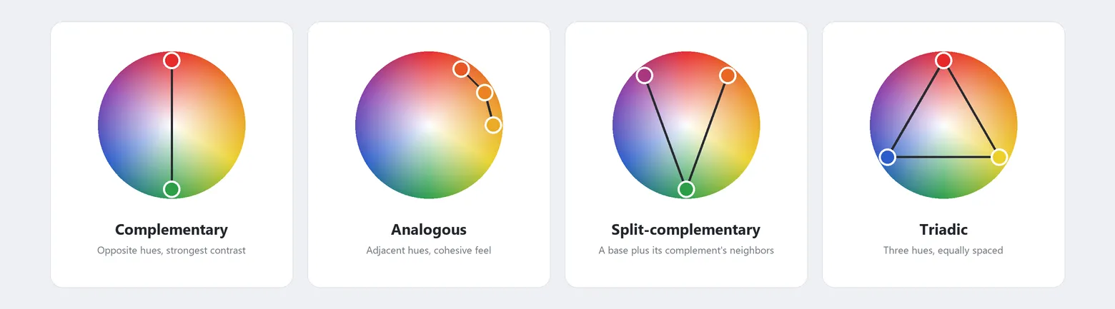 The same wheel, four ways — complementary maximizes contrast, analogous minimizes it, and split-complementary and triadic sit between the two.
A palette generator (Adobe Color, Coolors, or similar) can produce any of these schemes automatically from a single starting color, which is often faster than constructing one by eye — though the caution below about color harmony still applies to whatever the tool proposes.
Simultaneous, successive, and mixed contrast
Chevreul formalized three kinds of contrast effect. Simultaneous contrast — two colors viewed side by side alter each other’s apparent hue (a teal patch on a blue background appears more green, while a teal patch on a green background appears more blue) — is the one worth designing around directly: it’s a perceptual effect on top of, and distinct from, the measured luminance-contrast ratios WCAG (Web Content Accessibility Guidelines) sets numeric minimums for, so a page can satisfy a contrast-ratio requirement and still have colors that visually shift each other’s appearance when placed adjacent, undermining the Visual Hierarchy the design intended. A thin neutral border or gap between adjacent color blocks breaks the effect directly, since the two colors no longer share an edge to distort each other’s apparent hue across. Successive and mixed contrast — the afterimage left behind after looking away from a color, onto either a neutral background (successive) or a different color (mixed) — are rarely a practical concern in interface work by comparison.
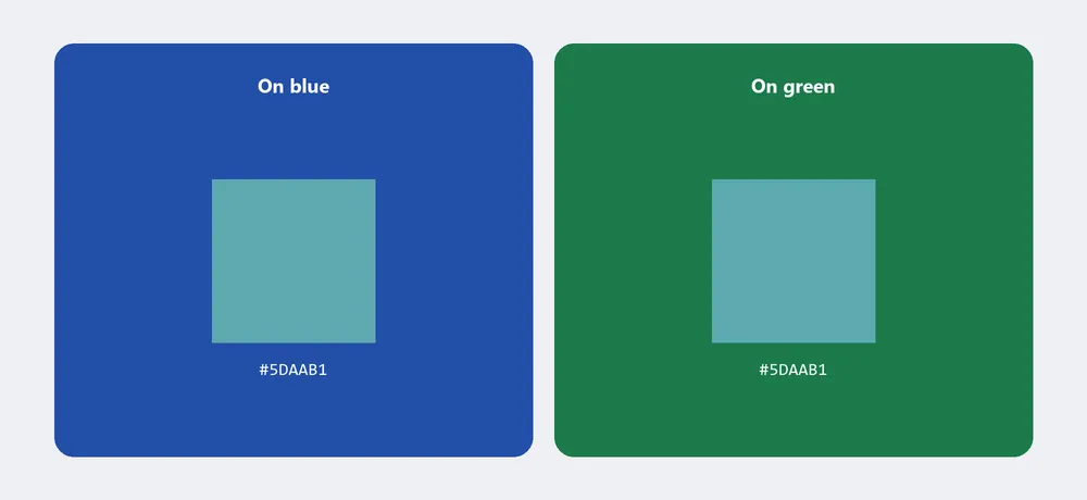 Both squares are the exact same teal — a hue picked deliberately between blue and green so the shift is obvious, rather than the barely-there tint an achromatic gray would show.
The limits of “color harmony”
A practical caution worth taking seriously before treating any color-combination rule as a formula: human response to color combines individual factors (age, personality, mood), cultural/learned associations, and surrounding context (including ambient lighting), and the space of possible combinations is effectively infinite. Wikipedia’s color theory article‘s conclusion is blunt: predictive color-harmony formulae are fundamentally unsound as universal rules. Treat a color-wheel scheme or a palette-generator’s output (above) as a starting point to test with real users and content, not a guarantee that a given combination will read as “harmonious” to everyone who sees it.
Never rely on color alone to convey meaning
Never rely on color alone to carry meaning the customer needs — pair every color cue with text, an icon, or position, so the same information still reaches customers who can’t perceive that color at all. About 8% of men and 0.5% of women in North America have some form of color vision deficiency, most commonly red–green; a form that highlights an error in red, on a page where required fields are marked in green caps, depends on a distinction a meaningful fraction of male visitors physically cannot perceive — one observed test participant with red–green deficiency abandoned a purchase entirely because he could not tell what he had done wrong and so couldn’t recover from the error. A second, independent reason the rule holds regardless of anyone’s color vision: the Stroop effect shows the same friction even for typical color vision — and color symbolism is learned and culture-bound rather than universal (see “Color symbolism is culture-bound, not universal” below).
Never rely on color alone to carry meaning the customer needs
Two easy-to-miss instances of the rule:
- The once-conventional choice of green for unvisited links and red for visited ones is exactly the pairing people with red–green deficiency can’t distinguish.
- A text-field error state communicated only by a colored stroke is invisible to a user who can’t perceive that color — combining three redundant channels instead (a colored error label, a colored field stroke, and an explicit text message below the field) means losing any one of them, color included, still leaves the state legible. A data visualization that distinguishes its series by color alone hits both halves of this problem at once: choose a color-blind-safe palette for the chart itself, and give screen reader users an actual alternative to the visual, not just a description of it — accompanying a chart with its underlying data table gives every reader the same numbers a sighted user gets from the visualization.
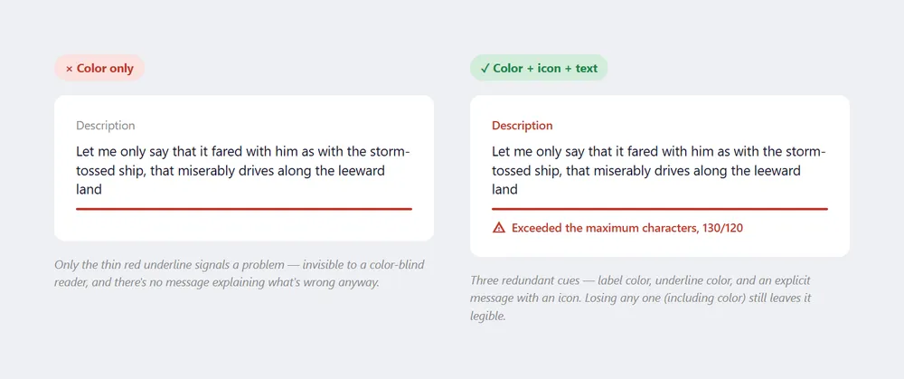 A character-limit error specifically — a case that’s easy to mark with a single colored underline, and just as easy to fix with one added icon and message.
Meet WCAG contrast ratio requirements
Two concrete rules follow from the color-alone principle:
- Always specify both foreground and background colors explicitly — relying on the browser default for one while setting the other creates unreadable combinations for any user with a custom browser color scheme (e.g., you specify white text but leave the background unset; their browser defaults that background to white).
- Meet WCAG contrast ratio thresholds: WCAG (Web Content Accessibility Guidelines) success criterion 1.4.3 sets a minimum of 4.5:1 for normal-size text and 3:1 for large text (14pt bold / 18pt regular and up) and graphics at the AA conformance level; the AAA (enhanced) level requires 7:1. Maximum contrast isn’t universally optimal, though — some readers with dyslexia find very high contrast harder to read, so treat AAA as an upper bound to approach rather than a universal target, and aim for AA compliance as the baseline.
A dark UI needs its own, stricter version of this same contrast floor, plus deliberately desaturated colors to hold it — see Dark Theme.
Decorative elements (a logo, an illustration) are a deliberate exception — they may not need to meet contrast ratios at all, but should still stay visually distinguishable if they serve a real function like linking somewhere; don’t distort a logo’s colors purely to force a contrast number.
Check contrast against the background text actually sits on, not just a flat swatch. Text placed over a gradient or an image needs to meet its contrast ratio everywhere it appears across that background, not just at one sampled point — this matters most for a parallax layout or an animation where the text and the background move independently of each other, since a contrast check done once at rest can still fail as the two layers shift relative to each other.
Luminance contrast matters more than color contrast
WCAG’s contrast-ratio formula is itself a luminance calculation — “the relative brightness of any point in a colorspace, normalized to 0 for darkest black and 1 for lightest white” — not a hue comparison. That distinction matters practically: it’s the luminance difference between two colors that makes them distinguishable to human perception, including for people with color vision deficiency, so a palette built around luminance contrast is more robust than one relying on hue difference alone.
That distinction matters practically: it’s the luminance difference between two colors that makes them distinguishable to human perception, including for people with color vision deficiency, so a palette built around luminance contrast is more robust than one relying on hue difference alone.
Blue is inherently a low-luminance color regardless of how saturated it looks, which is why it reads poorly as the lighter half of a two-color pairing — make blue the darker color in a pair instead, or add green to a light blue to raise its luminance and restore legibility. A color pair’s immediate surroundings also shift how its contrast is perceived beyond what the calculated ratio predicts — the same blue text on a gray highlight reads differently depending on whether that highlight itself sits on a black or a white background — so check a color against the real layout it actually sits in, not just an isolated swatch pairing.
A quick, mechanical way to catch a luminance collision before shipping: convert the palette to greyscale and see what survives — varying only hue between two colors is far more likely to collapse than varying their lightness and saturation too.
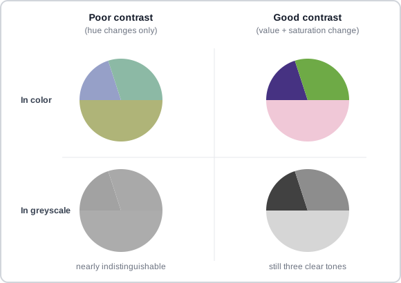 Same hue-only strategy on the left, same lightness-and-saturation strategy on the right — greyscale is what exposes the difference between them.
Use contrast — and scarcity — to establish hierarchy
Strong color contrast between an element and its surroundings draws attention to it, and pairing a color change with a simultaneous shape change (e.g. a chip growing a distinctly-colored, curved corner) signals selection or urgency more strongly than either change alone. This effect is also self-limiting: color works as a hierarchy signal only where most of the surrounding field lacks it, so restricting color to a small set of elements — a mostly grayscale palette, with color reserved for one primary action like a floating action button — makes those elements stand out far more than spreading color broadly would. See Visual Hierarchy for the general “self-depleting” version of this same argument, and Color usage (Material Design) for the source.
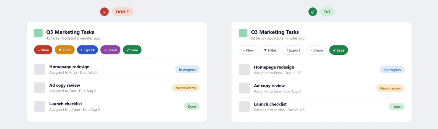 Five competing colors versus one reserved color, on the same board — the DO version has an obvious next step, the DON’T version doesn’t.
Use brand color deliberately, bold or subtle
A brand’s own color use should reflect its personality: brands wanting to feel energetic apply color boldly — saturated, high-contrast — while brands wanting to feel sophisticated use it sparingly, so a secondary accent color stands out precisely because it’s rare. Either approach still has to keep interactive areas and state changes identifiable even under a restrained palette. Placeholder/loading UI, progress indicators, and state changes are good places to inject brand color subtly, since they reinforce brand presence without ever competing with primary content for attention (see Color usage (Material Design)).
Back up state signals with a second channel
A color used to signal interface state — enabled vs. disabled, selected vs. not, interacted-with vs. not — is the state-specific case of the “never rely on color alone” rule above: it needs strong, noticeable contrast, since subtle color differences are easy to miss, and the same second-channel discipline applies, typically via an icon or a position/shape change (see “hierarchy” above and Color usage (Material Design)).
One concrete way to make this rule mechanical rather than a matter of eyeballing it: map each interaction state to a fixed number of steps on a graduated color scale — where a “step” is the distance between one graded value and the next on a fixed per-hue scale (e.g. Blue 10 through Blue 100) — a half-step for hover, one full step for selected, two full steps for active — so a state change clears a guaranteed minimum visible difference regardless of which base color it’s applied to.
Focus states get their own dedicated color reserved for that purpose alone, held to a 3:1 contrast minimum against their surroundings; disabled states are the deliberate exception, intentionally faded and exempt from contrast requirements since there’s nothing left to interact with. See Carbon Design System: Accessibility, Content, Color, Motion, Spacing, and Icon Guidelines (IBM).
Reserve status colors, and don’t reuse them for anything else
Most interfaces converge on the same rough convention for status and severity: red for errors or destructive actions, green for success or confirmation, yellow/orange for warnings, and blue (or neutral gray) for informational messages. None of this is a universal law of color — it’s a strong platform convention every user already carries in from every other product they’ve used, which is exactly what makes deviating from it costly rather than merely different (the same “match the real world” logic Interface Design Principles argues for generally).
Once a color is assigned a status role, it needs the same discipline as any other semantic role: don’t reuse it as a brand accent, a decorative highlight, or an unrelated status elsewhere in the same product — see “Keep color meaning consistent” below for the concrete failure case.
Keep color meaning consistent
Color signals meaning only through consistent use. When a given color reliably marks the same thing throughout an interface — interactive elements, destructive actions, a brand accent, a status state — users learn the association and navigate by it. Using the same hue for two different purposes in the same interface dissolves that learned signal, raising cognitive effort and increasing the chance of error — a brand color doubling as an alert color is a common, concrete instance: a brand built around red shouldn’t also use red for error states, since customers need “red” to mean one consistent thing across the product (see Color usage (Material Design)). This is a direct application of the consistency principle in Interface Design Principles: once a color carries a semantic role in an interface, that role should be held stable across the whole product.
The flip side: introducing a color for a new semantic role (e.g., red for destructive actions) only works if that color is visually distinct from every other color already in use — otherwise it reads as decoration rather than signal. In implementation terms, this semantic role is often what a design token encodes — a name like color-danger rather than a raw hex value, so the role stays consistent even if the underlying color value is later restyled.
Color symbolism is culture-bound, not universal
Even color temperature — the sense that red-through-yellow hues feel “warm” (active, advancing) and blue-through-violet hues feel “cool” (calm, receding) — is a weaker effect than it looks: to the extent it’s real, it’s largely explained by warm pigments typically being more saturated and lighter in value than cool ones, not by hue itself doing the work.
The same caution applies even more sharply to color meaning. Red alone has been used to connote excitement, danger, luck, romance, and femininity — depending entirely on culture and context, not on anything intrinsic to the color. Color associations are learned, not fixed, and don’t transfer reliably across cultures, contexts, or individuals; claims that color has measurable therapeutic effects have no real evidential support.
This is the second, independent reason behind “Never rely on color alone to convey meaning” above, beyond color vision deficiency: even customers who can see a color perfectly well may not read the meaning a designer intended into it, because that meaning was never universal in the first place — the same rule “Keep color meaning consistent” above argues for within one product, now extended across cultures.
Encode color roles as tokens, and let themes supply the values
A color’s role (what it’s for — a primary action, a subtle border, a secondary background) and its value (the actual hex code) are two different things, and keeping them separate is what makes switching between light and dark themes — or updating a whole palette later — tractable. A token names the role ($text-primary, $border-subtle, $background-hover) and stays the same across every theme; a theme is just the lookup table that supplies each token’s actual value for that particular light or dark variant. This is the same role-vs-value separation Design Tokens covers for design tokens generally, applied specifically to color: a component styled with $text-primary doesn’t need to know or care whether the current theme is light or dark, because the token — not the component — is what changes value. See Carbon Design System: Accessibility, Content, Color, Motion, Spacing, and Icon Guidelines (IBM) for a worked four-theme (two light, two dark) example, including a layering model governing how stacked surfaces (a card on a page, a menu on a card) shift value consistently within each theme.
Verify a palette before shipping it
Before a palette goes live, run it through a short, concrete check rather than trusting it by eye:
- Contrast ratio — run every text/background and icon/background pairing through a contrast checker against Web Content Accessibility Guidelines (WCAG)‘s numeric minimums, not just a visual glance.
- Color-blindness simulation — view the palette through a color-blindness simulator (built into most design tools and browser dev tools) to confirm no two semantically-different elements collapse into the same apparent color under red–green or blue–yellow deficiency.
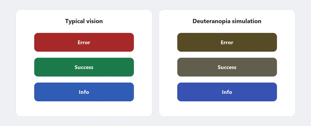 Run through a color-blindness simulator, Error and Success become nearly the same color — exactly the failure the “Meaning, not just color” check exists to catch.
- Meaning, not just color — confirm every color-coded meaning (an error, a success state, a selection) still reads correctly with color removed entirely; an icon, label, or position change should carry the same information on its own.
- Both themes — if the product supports light and dark themes, re-run all three checks above in both, since a token’s semantic role should hold but its exact value — and therefore its actual contrast — changes per theme (see “Encode color roles as tokens” above).
This is the practical payoff of everything above: a palette that passes this checklist is one where the color-wheel scheme, contrast rules, and semantic-consistency rules earlier on this page have actually been verified rather than assumed.
Related Concepts
Patterns
Principles
- Gestalt Psychology
- Accessibility
- Interface Design Principles
- Visual Hierarchy
- Design Tokens
- Stroop Effect
- Emotional Design
Standards
Further reading
Robin Williams’ The Non-Designer’s Design Book (4th edition, amazon.com/dp/0133966151 — commercially published, no stated open license) adds a shades-and-tints technique for expanding a palette without introducing a new hue — mixing in black for a shade or white for a tint of an existing color — alongside its own color-wheel-scheme chapter covering the same complementary/analogous/triadic territory above.
Apple’s Human Interface Guidelines — Color (developer.apple.com/design/human-interface-guidelines/color — Apple Inc. copyright, no open license) covers platform-specific color guidance: keep a given color’s meaning consistent rather than reusing it for unrelated purposes, and design every color for light, dark, and increased-contrast display modes rather than one fixed appearance. One concrete example of meaning not transferring: Apple’s Stocks app reverses the conventional red/green financial mapping for Chinese users, since the color’s cultural association flips between the two audiences.
Material Design 3’s color system (m3.material.io/styles/color/system/overview — Google, no stated content license) documents a much larger, token-based color architecture than Material 2’s: 26+ named color roles mapped to specific components, a built-in dark theme, and dynamic color — schemes generated automatically from a source like a user’s wallpaper, with contrast level (standard/medium/high) itself exposed as a user-facing setting rather than fixed at design time.
Sources
Color Theory (Wikipedia) is this page’s primary source — the additive/subtractive color models, the four named color-wheel schemes, Chevreul’s three contrast effects, the “color harmony formulae are fundamentally unsound” conclusion, and color symbolism’s culture-bound nature all come from it.
Web Colors (Wikipedia) is the source for the sRGB-baseline and HSL sections above, and for the “always specify both foreground and background colors explicitly” rule.
Color usage (Material Design) is the source for using contrast and scarcity to establish hierarchy, using brand color boldly or subtly, backing state signals with a second channel, and keeping a color’s meaning consistent rather than reusing it for an unrelated role.
Carbon Design System: Accessibility, Content, Color, Motion, Spacing, and Icon Guidelines (IBM) is the source for encoding color roles as tokens with per-theme layering, and for the graduated-color-scale mechanic (half/one/two-step shifts for hover/selected/active states) this page describes as a way to make state-color contrast mechanical rather than eyeballed.
Web Accessibility: Understanding Colors and Luminance (MDN Web Docs) is the source for “Luminance contrast matters more than color contrast” above — the luminance-vs-hue distinction, blue’s inherently low luminance, and the surrounding-context effect on perceived contrast.
The Importance of Information Visualization is the source for the greyscale-conversion test described under Luminance contrast matters more than color contrast above.