
Grid Layout
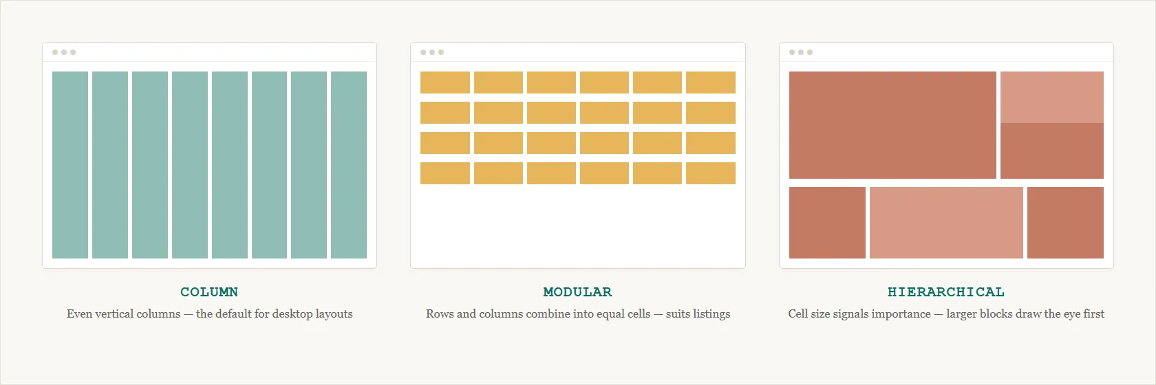 Modular suits a product catalog, where every item deserves equal visual weight; hierarchical suits a content-heavy page like a news homepage, where a lead story or hero image should visually outrank the rest.
Background
Grid layout is the structural backbone of a Web site’s Page Template; the three elements most central to it are navigation bars, a search box, and content modules. A grid has to accommodate variable-length, often dynamically-retrieved content (news items, stock quotes, and similar modules vary in length), which makes precise control over the final layout harder than the grid metaphor alone suggests.
A grid has to accommodate variable-length, often dynamically-retrieved content (news items, stock quotes, and similar modules vary in length), which makes precise control over the final layout harder than the grid metaphor alone suggests.
Problem
The many competing elements of a Web page (titles, logos, navigation, search, content modules) are hard to organize cohesively without creating clutter that overwhelms the visitor.
Solution
Divide the page into a consistent, reusable grid
Borrow grid layout from graphic design — divide the page into rows and columns and make every element fit within that grid, with constant elements (logo, navigation) always appearing in the same place. A grid’s own vocabulary: a column holds content; a gutter is the fixed gap separating one column from the next; a margin is the outer gap between the grid and the edge of the page — both gutter and margin are White Space applied to the page’s outer structure. A design system typically fixes this vocabulary as reusable specs — column count, breakpoints, gutter width — so every product team builds against the same grid rather than each re-deriving its own.
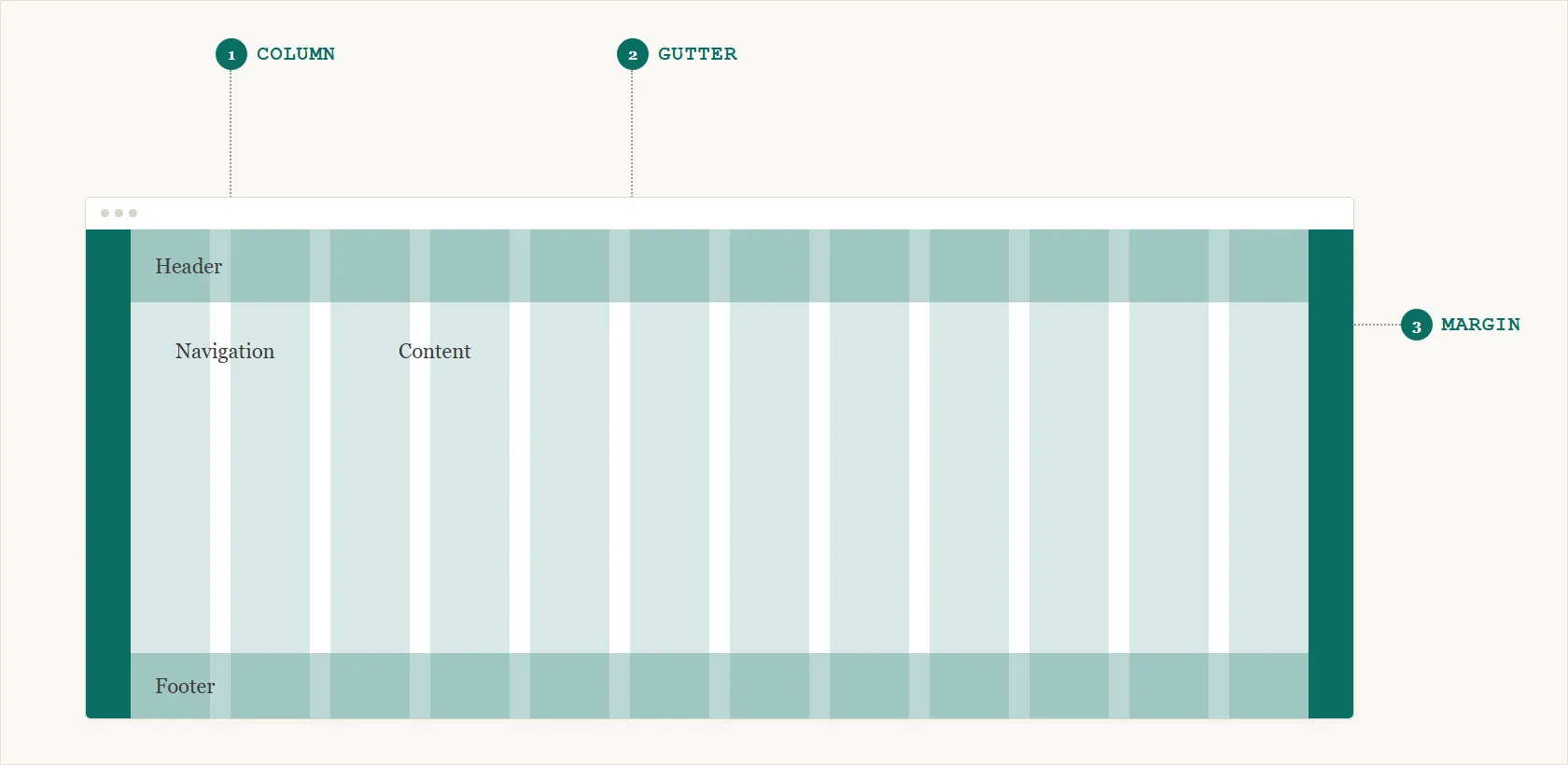 Three terms, three distinct regions — the rest of this page’s rules only make sense once “gutter” and “margin” mean something specific.
Three payoffs follow from applying this structure consistently:
- Predictability — customers can predict where things live.
- Reduced clutter — strong visual cues make content easier to find and faster to read.
- Reusability — once a grid is built, the design team can reuse it instead of re-deciding layout for every new page.
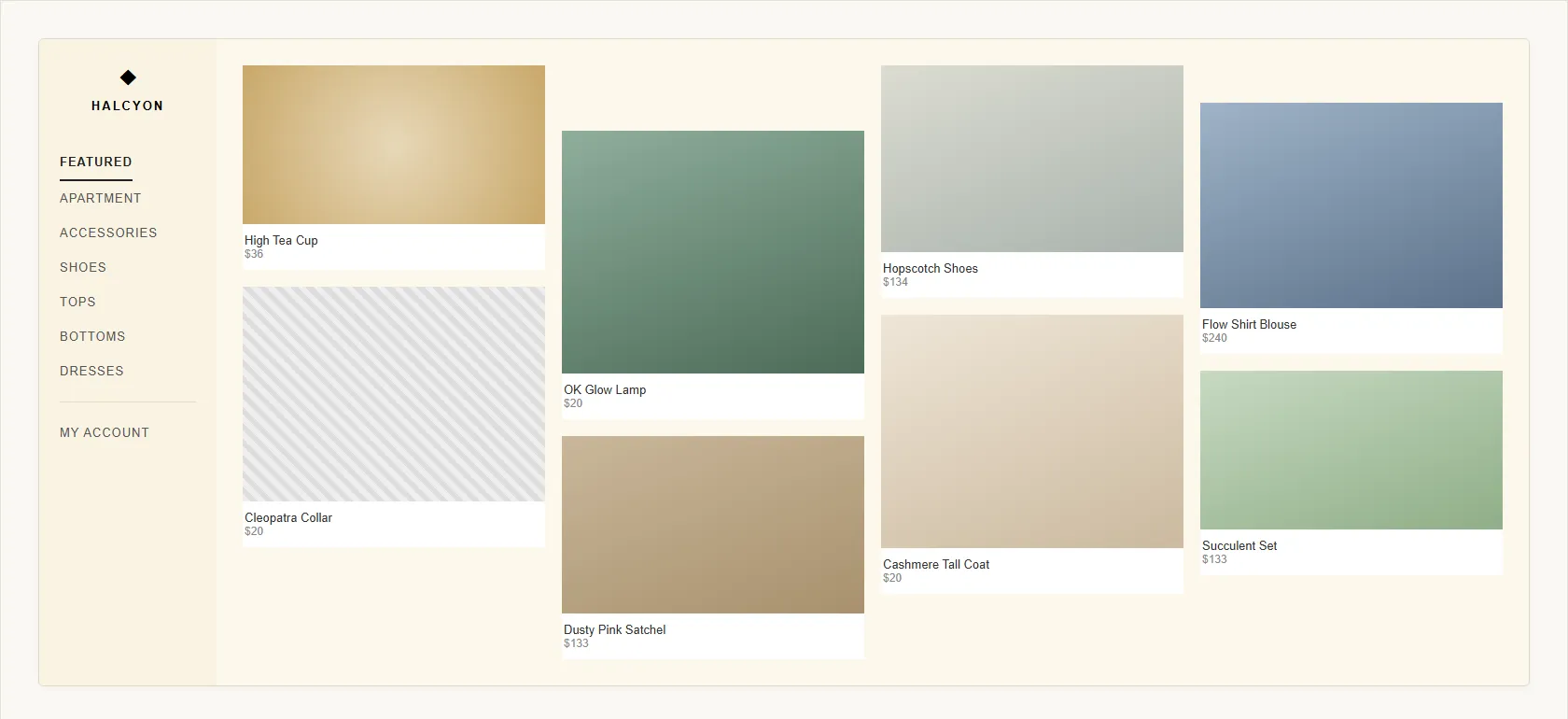 Each column sizes and starts itself independently, so nothing lines up row to row.
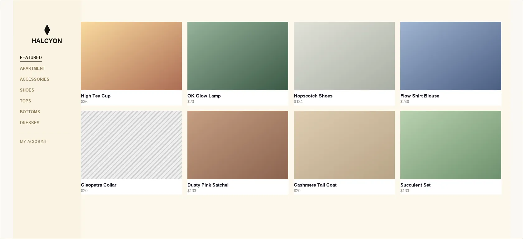 Same content, snapped to one shared grid — every card’s top, bottom, and side edges now line up.
Build the grid through a repeatable process
- Identify anchor elements common across most pages (logo, navigation bars, a search box, a privacy-policy link, content modules) and use them to anchor the grid.
- Sketch and group. Sketch several candidate grids and group related elements visually (proximity, shared size/color/font, separating lines — see Gestalt Psychology for the perceptual principles this relies on) while keeping unrelated elements apart.
- Lean on known placement expectations — an instance of the Gestalt law of past experience: people interpret a layout according to what they’ve already seen, not in a vacuum. Research at Wichita State University found people expect shopping-cart, account-management, and help links at the top right, a sign-in link near the top left, and a clickable logo back to the homepage in the very top-left corner.
- Test with greeking — replace the text with nonsense placeholder text (“greeking”) to see whether people can still identify the page’s basic elements from position and layout alone.
Research at Wichita State University found people expect shopping-cart, account-management, and help links at the top right, a sign-in link near the top left, and a clickable logo back to the homepage in the very top-left corner.
Older sites often built grids out of HTML tables; current practice favors style sheets, and reserves the table element itself for genuinely tabular data instead (see Data Tables) — though the underlying design discipline of rows, columns, and consistent placement is unchanged either way.
Break the grid on purpose, once it’s established
Grid discipline doesn’t require unbroken alignment on every element. A deliberate departure from the grid — an image bleeding across column boundaries, an element rotated off-axis, a burst of motion — can draw attention or add visual energy precisely because it contrasts with the page’s otherwise consistent structure. This only reads as intentional once the surrounding page has actually established a grid to depart from; breaking a grid that was never established in the first place just reads as disorganized rather than deliberate.
This only reads as intentional once the surrounding page has actually established a grid to depart from; breaking a grid that was never established in the first place just reads as disorganized rather than deliberate.
Related Concepts
Patterns
- Above the Fold
- Clear First Reads
- Expanding and Fixed Screen Width
- Consistent Sidebars of Related Content
- Homepage Portal
- Browsable Content
- Category Pages
- Multiple Ways to Navigate
- Page Template
- Content Modules
- Data Tables
Principles
Processes
Standards
Further reading
Robin Williams’ The Non-Designer’s Design Book (4th edition, amazon.com/dp/0133966151 — commercially published, no stated open license) frames alignment as one of four core design principles: nothing on a page should be placed arbitrarily — every element should share a visible edge with something else — a discipline that generalizes grid layout’s own row/column structure to any page, gridded or not.
Kelley Gordon’s Using Grids in Interface Designs (Nielsen Norman Group, 2022 — copyright NN/g, no open license; https://www.nngroup.com/articles/using-grids-in-interface-designs/) gives setup rules of thumb beyond the three variants shown above, like defaulting to a 12-column grid at desktop size and keeping content inside columns rather than gutters.
Sources
The Design of Sites: Pattern Group I — Designing Effective Page Layouts is this page’s source — its I1 Grid Layout pattern supplies the anchor-elements/sketch-and-group process, the greeking test, and the Wichita State placement-expectations research above.
The Grid - Structure and Style supplies the column/modular/hierarchical grid taxonomy shown in the image above and the Break the grid on purpose guidance below it.