
Context-Sensitive Help
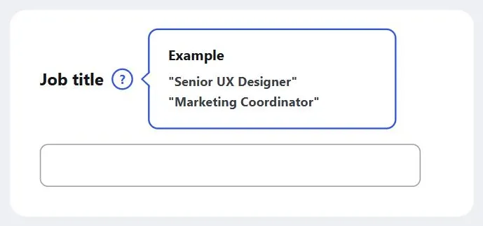 The help pop-up sits right beside the field it explains, not on a separate help page.
Problem
In the middle of a task, a customer sometimes has a question that can’t be answered by the current page — but sending them to a separate general help page loses the context of what they were doing, and many won’t come back to finish.
In the middle of a task, a customer sometimes has a question that can’t be answered by the current page — but sending them to a separate general help page loses the context of what they were doing, and many won’t come back to finish.
Solution
Match the help form to what the customer needs at that spot
Place help text and links spatially close to where the question is likely to arise, rather than centralizing all help in one place. Context-sensitive help can take several forms depending on what the customer actually needs at that spot:
- An example of expected input, which doubles as error prevention (see Form Design)
- A meaningful error message describing a problem and how to fix it
- A detailed explanation, shown in a floating window or a pop-up
- Step-by-step instructions for the immediate task
- A pointer into the frequently asked questions (FAQ) page
Place help text and links spatially close to where the question is likely to arise, rather than centralizing all help in one place.
Place help beside the control
Put the help link or text directly beside the control it explains, not in a separate section of the page.
Choose floating windows or pop-ups for help content
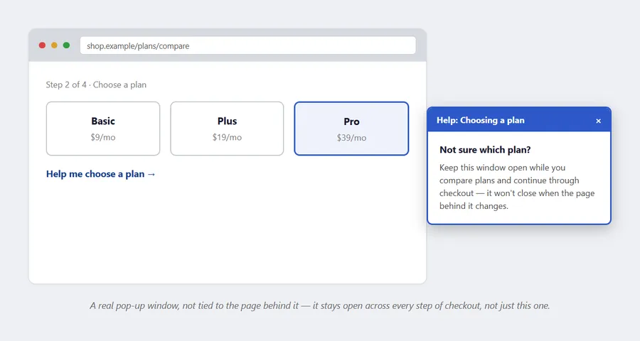 Unlike a floating window, this is a genuinely separate window — it survives the main page navigating to the next checkout step.
A floating window is the default choice for showing help content without losing the customer’s place. Reach for an actual pop-up window instead only when the help itself needs to stay open while the customer navigates across multiple pages of your site — something a floating window, tied to a single page, can’t do.
Reach for an actual pop-up window instead only when the help itself needs to stay open while the customer navigates across multiple pages of your site — something a floating window, tied to a single page, can’t do.
Related Concepts
Patterns
- Frequently Asked Questions
- Floating Windows
- Process Funnel
- Form Design
- Error Messages
- Sign-In and Account Creation
- Page Template
- Web Apps That Work
Sources
The Design of Sites: Pattern Group H — Helping Customers Complete Tasks (Pattern H8) is this page’s source — the spatial-placement principle for help text, the five help-content forms (example input, error message, floating-window explanation, step-by-step instructions, FAQ pointer), and the floating-window-vs-pop-up-window distinction for help that must survive multi-page navigation.