
Visual Hierarchy
Overview
Visual hierarchy is the deliberate arrangement of elements in a visual field so that the most important information attracts attention first, creating a perceived order of importance. In UX and graphic design, the practical goal is to align the visual order (what the eye reaches first) with the conceptual order (what matters most to the user).
Visual hierarchy is the deliberate arrangement of elements in a visual field so that the most important information attracts attention first, creating a perceived order of importance.
The concept is grounded in Gestalt Psychology: the brain organizes visual input into wholes before perceiving individual parts, and elements that break from the surrounding pattern “stand out.” The Von Restorff effect (the isolation effect) is the sharpest form of this — an element that differs from its neighbors in any salient way attracts disproportionate attention. The general rule: elements with the highest contrast to their surroundings are recognized first. The underlying mechanism has a name: preattentive processing, the rapid, effortless visual scan that runs before focused attention even engages — a genuinely distinct outlier is found in well under 200 milliseconds, before a person has consciously started looking for it.
The general rule: elements with the highest contrast to their surroundings are recognized first.
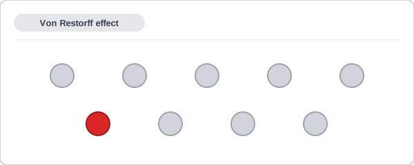 It isn’t in any special position — the contrast alone does all the work.
Four Physical Characteristics
Four types of contrast drive visual hierarchy:
Color
Hue, saturation, value, and perceived texture. Dark figures stand out on light backgrounds; bright, saturated elements stand out in muted fields; light figures stand out on dark backgrounds. Color is a particularly powerful hierarchy variable because the visual system processes color pre-attentively, before deliberate scanning begins. See Color Theory for how contrast schemes and complementary pairings work in practice.
One consequence of the Von Restorff effect is that color’s hierarchy power is self-depleting: applying distinct color to every interactive element, status badge, and brand accent simultaneously means each use competes against all the others, and none stands out. Color works as a hierarchy signal precisely because most elements in the surrounding field don’t have it — the more freely it is applied, the closer it approaches a new neutral, and a different contrast variable must carry the hierarchy load instead.
Size
Larger elements attract attention, given they read as distinct figures. Size is the primary signal for typographic hierarchy (headline larger than subhead, subhead larger than body) and for indicating the relative weight of interface regions.
Alignment
The arrangement of forms relative to one another and within the field. For left-to-right readers, elements in the upper-left corner of a page are typically reached first. Negative space amplifies hierarchy: an element isolated within generous white space stands out more than the same element surrounded by competing elements — isolation is itself a contrast.
Character
Contrast in shape, pattern complexity, or detail. Intricate or unexpected shapes attract more attention than simple or predictable ones, as long as they contrast with the surrounding field. What matters is the contrast, not the absolute level of complexity — a plain element in a complex field also stands out.
Preattentive processing works on one feature at a time
Vision science names a fuller set of preattentive variables than the four physical characteristics above: color, shape, size, orientation, intensity/contrast, texture, and position. A blurred screenshot of Google‘s older Gmail interface still shows its red Compose button and blue Search button standing out clearly with no legible detail visible at all, because color alone separates each from everything around it.
That pop-out has a real limit: it only works when exactly one feature sets the target apart. An outlier that differs from its neighbors in color alone, or shape alone, is found instantly — but a target that differs by two features at once (a shape that’s both a different color and a different form from everything around it) doesn’t pop out at all. Finding it takes a slow, deliberate scan instead, because neither color nor shape alone is enough to isolate it from every distractor.
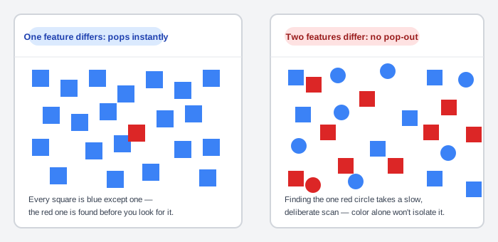 Same two colors used either time — only the number of features the target differs by changes.
Design implications
In web and interface design, visual hierarchy serves two goals simultaneously: it helps users focus on elements that facilitate getting things done (navigation, primary actions, key content), and it increases the likelihood that they notice designed content carrying intent (value propositions, calls to action, alerts, nudges). A hierarchy that serves design goals at the expense of user tasks is a hierarchy working against itself.
This is the same consistency discipline Interface Design Principles argues for generally: a hierarchy signal (a color, a size, a position) only keeps working if it’s held stable across the whole product rather than spent on whatever the design team wants to emphasize that day. As a rough numeric ceiling: limit a single page to one or two elements actively competing for pop-out at once — past that, the self-depleting effect above sets in and nothing reads as prominent anymore.
A hierarchy that serves design goals at the expense of user tasks is a hierarchy working against itself.
Clear First Reads is the direct application of visual hierarchy to page design: coordinate color, size, font, and position to establish one dominant visual element per page, with everything else receding behind it. These four levers map directly onto the four physical characteristics above.
Grid Layout applies hierarchy at the regional level — dividing a page into a consistent row/column structure sets expectations about where important content lives before any individual element is inspected.
Clear Typography controls the size and weight dimensions of hierarchy within running text — the difference between a headline, a subhead, and body text is a visual hierarchy of reading priority enacted through type alone.
Evaluation: The Squint Test
 A page with no visual hierarchy at all — nothing survives the squint test as a dominant element.
A quick informal check: view the design out of focus (squint, or step back to create distance). Details disappear; what remains visible is the overall gestalt pattern — the dominant shapes and regions. If the intended primary element doesn’t survive the squint as the most prominent thing in the field, the hierarchy isn’t strong enough to survive real scanning conditions. More formal evaluation uses eye tracking to verify that users’ actual gaze sequence matches the intended conceptual order.
Related Concepts
Patterns
Principles
Further reading
Anthony Hobday’s Visual design rules you can safely follow every time (anthonyhobday.com — no stated open license) gives a concrete arrangement rule for a row or column of unevenly-weighted elements (e.g. two buttons and three links): order them like a triangle, heaviest first and lightest last, with the heaviest element sitting against whichever outer edge the group itself is aligned to.
Robin Williams’ The Non-Designer’s Design Book (4th edition, amazon.com/dp/0133966151 — commercially published, no stated open license) teaches contrast and alignment as two of its four core principles (alongside repetition and proximity), with graphic-design exercises that isolate each one the way this page’s own Von Restorff example isolates contrast from position.
Sources
Visual Hierarchy (Wikipedia) is the primary source for this page’s Gestalt/Von Restorff grounding, the four physical characteristics (color, size, alignment, character), and the squint-test evaluation method.
Preattentive Processing in UX Design, or the Magic of Making Things Pop Out is the source for naming preattentive processing directly (including the sub-200-millisecond figure), the fuller seven-variable list (color, shape, size, orientation, intensity/contrast, texture, position), the single-feature-vs-two-feature pop-out distinction, the blurred-Gmail example, and the one-or-two-elements-per-page guidance.