
Effective Images
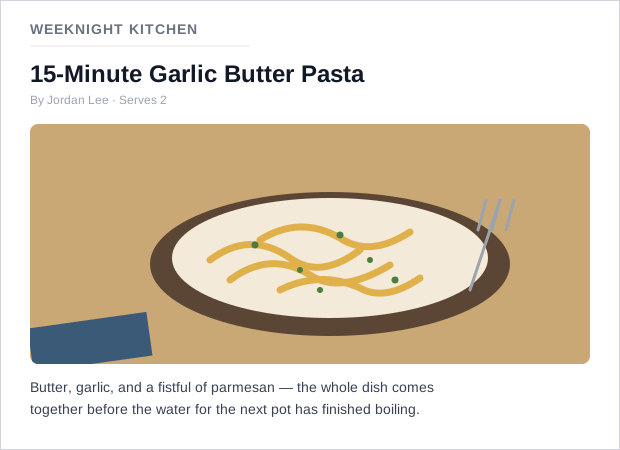 A photo of the specific dish the recipe makes, not a generic stock plate of pasta — and the sentence underneath it is real, readable text.
Background
Images can communicate faster than a paragraph of text, but every image is also a fixed asset that doesn’t reflow, translate, or resize the way real text does — the more information is pushed into an image, the more of that flexibility a design gives up.
Images can communicate faster than a paragraph of text, but every image is also a fixed asset that doesn’t reflow, translate, or resize the way real text does — the more information is pushed into an image, the more of that flexibility a design gives up.
Problem
Teams reach for images by default without asking whether an image is the right tool at all, and even when one genuinely helps, it’s easy to pick the wrong type of image (photography where an illustration would communicate more simply, an icon where a text label would be clearer) or to bake essential information directly into the pixels as text — both of which undermine the content’s actual job instead of supporting it.
Solution
Written content should carry the actual information; an image is only a visual aid on top of it, added when there’s a real user need — not by default, and not as decoration. Where a service is tempted to explain something with an image, try clear, simple written content first.
Choose the right image type
- Photography — use it to show a lifelike, real representation of something (a preview of a document a customer just uploaded). Avoid photography for abstract concepts (conveying a mood or impression), and avoid generic stock photography, which reads as filler rather than information.
- Illustration — use it to simplify something complex into its essential visual elements (demonstrating a physical action like scanning a passport, or pointing out where a reference number sits on a form). Keep the visual vocabulary consistent across a set of illustrations — a fixed, limited color palette (tints of an already-established palette per Color Theory rather than new hues), flat blocks of color, and no shadows or gradients unless one is genuinely needed to show depth or layering. When an illustration depicts people, be deliberate about who’s shown — defaulting to a narrow range of age, gender, or ethnicity across a set of illustrations excludes real users and reinforces stereotypes.
- Icons — use sparingly, and pair an icon with a visible text label in most cases, since a single icon reads differently to different people and is a weak signifier on its own (see Icons for the full pattern, and Accessibility). Icon-only presentation is more defensible in a tool people return to frequently and already know how to read (an expert, high-frequency interface), where icons mainly speed up scanning for people who’ve already learned them. Never let one icon stand for two different actions or meanings in the same interface — a magnifying glass icon used for search shouldn’t also mean “zoom” elsewhere on the same site.
Preserve the image’s aspect ratio
When a photo is placed into a container whose proportions don’t match the image’s own, stretch it non-uniformly to fill both dimensions and the result reads as an obvious bug rather than a design choice. Faces are the least forgiving case, since even mild squishing or stretching is immediately visible to any viewer regardless of whether they can articulate why it looks wrong. Crop the image to the container’s proportions (CSS object-fit: cover) or pad it to fit without cropping (object-fit: contain, letterboxing the remaining space) instead of forcing it to fill the container exactly.
When a photo is placed into a container whose proportions don’t match the image’s own, stretch it non-uniformly to fill both dimensions and the result reads as an obvious bug rather than a design choice.
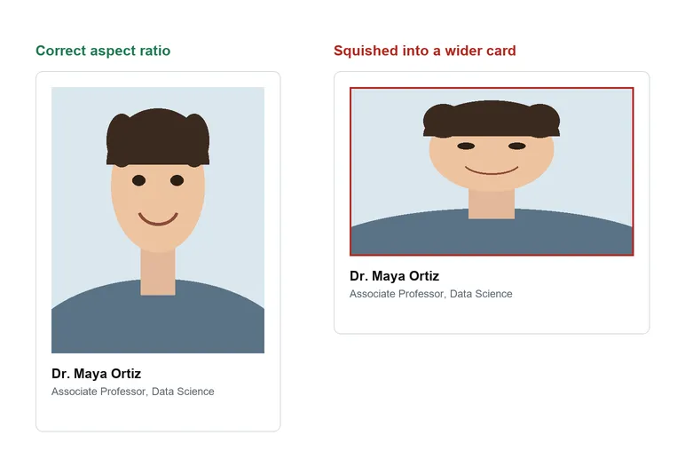 The squished card looks wrong at a glance, and her face is where the distortion shows first.
Avoid baking text into images
Generally, give information as real written content rather than as an “image of text” — a screenshot of a social media post, an excerpt from a document, a slide of key facts. Text trapped inside an image can’t be read by a screen reader, copied, searched, highlighted, resized, or recolored the way real text can, which shuts out exactly the customers who need those affordances most.
Text trapped inside an image can’t be read by a screen reader, copied, searched, highlighted, resized, or recolored the way real text can, which shuts out exactly the customers who need those affordances most.
Text inside an image only counts as essential when it carries meaning that would genuinely be lost without it — a portion of a historical document shown specifically for its handwriting style, a photograph of a shopfront sign, a logotype, or a signature. This is a narrow exception, not a default: most text-bearing images (a screenshot, a slide) don’t qualify, because the same information could just as easily be given as real text.
Where text inside an image truly can’t be avoided:
- Overlay real HTML text on the image instead of baking it into the pixels, keeping the contrast between text and every part of the image it overlaps at WCAG‘s minimum ratio at every zoom level.
- Use a vector format (SVG) rather than a raster one (PNG, JPEG) for any image that must contain text, so the text stays crisp instead of pixelating when a customer zooms in.
- For charts, diagrams, and other complex images, write short alt text conveying the image’s overall meaning, and a separate, visible longer text description covering the specific data the image carries — alt text alone can’t substitute for a data table’s worth of content. See Alt Text for the fuller alt-text writing craft and the informative/decorative/functional taxonomy this pairs with.
Related Concepts
Patterns
Principles
Standards
Further reading
Siteimprove’s All in One Digital Accessibility E-Book (siteimprove.com — no stated open license) flags a related but distinct failure with emoji: a screen reader reads an emoji’s literal Unicode name rather than the social meaning it’s carrying in context, so a marketing image built entirely from emoji characters — with no alt text of its own — can leave a screen-reader user hearing nothing more useful than the word “image.”
Sources
GOV.UK Design System (Open Government Licence v3.0) is the source for the choose-the-right-image-type breakdown above (photography/illustration/icons) and the guidance against baking essential information directly into an image’s pixels.