
Shopping Cart
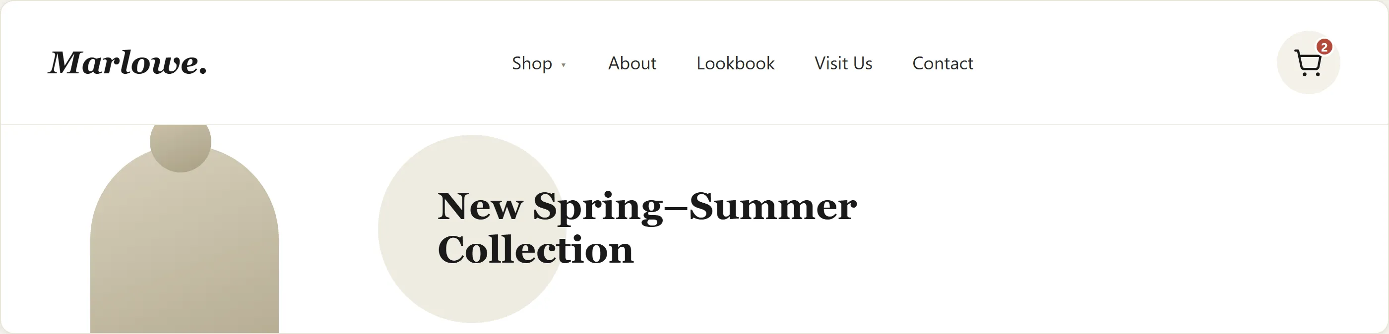 A cart icon that stays in the header on every page, so the cart itself is never more than one click away no matter where browsing takes a customer.
Background
Favoring the ready-to-buy customer (pushing straight to checkout) frustrates the still-browsing one, and favoring the browsing customer (burying the checkout path) costs conversions from the customer who’s ready — the right balance depends on the site’s typical purchase-consideration length (see “Balance browsing and checkout paths” below).
Problem
A cart has to serve two distinct customer states at once — someone ready to purchase right now, and someone collecting items to evaluate later or return to on a subsequent visit — and a design choice that suits one (e.g. forcing a redirect to checkout on every add) actively works against the other.
a design choice that suits one (e.g. forcing a redirect to checkout on every add) actively works against the other.
Solution
The shopping cart is the holding area between browsing and buying, reachable from every page, showing enough per-item detail to be recognizable without a return trip to the product page, and persisting across visits so neither customer state loses their selections.
Make the cart accessible from every page
The cart should be reachable from every page of the site — typically via a persistent icon (shopping bag, cart) in the header that shows the current item count. This serves as both a navigation target and a visual confirmation that adding an item succeeded. A customer should never have to wonder “did that add?” — the cart indicator updates immediately.
Confirm every add to cart
The Add to Cart button on a product page should be unambiguous in both label and placement. After adding an item, the customer should receive a clear confirmation — an updated cart count, a brief confirmation message, or a mini-cart dropdown — and a clear path to either continue browsing or proceed to checkout. A confirmation too subtle to notice fails the same way no confirmation at all would: it’s Change Blindness left unaddressed, not a genuine fix. Forcing a redirect to the cart page on every add-to-cart interrupts browsing for customers who want to accumulate multiple items.
Forcing a redirect to the cart page on every add-to-cart interrupts browsing for customers who want to accumulate multiple items.
Allow browsing without an account
Do not require login or account creation before adding items to the cart. Customers should be able to browse and accumulate selections before committing to a purchase or an account. The checkout flow handles account identification — the cart is not the right moment to demand it.
Show enough detail per cart item
Each item in the cart needs enough detail to be recognizable without returning to the product page:
- Product name and a brief description or variant (size, color, edition)
- Availability status — confirm the item is in stock or flag if stock is uncertain
- Price per unit
- Quantity selector with an easy way to change quantity or remove the item
- Item subtotal
The cart should also show a running order subtotal, and a shipping estimate if it can be calculated at this stage. Surprises at the payment step — unexpected shipping costs, unavailable stock — are among the most common causes of checkout abandonment.
Balance browsing and checkout paths
The cart page must present two paths without favoring one over the other inappropriately: continue shopping (to add more items) and proceed to checkout (to complete the purchase). The balance point depends on the site: a high-consideration purchase site (furniture, electronics) may want to make “continue browsing” easy; a consumables site may benefit from emphasizing “check out.” Both links should be clearly visible. Hiding or obscuring “continue shopping” frustrates customers who wanted to add one more item.
Persist the cart across visits
Carts should persist for returning customers — at minimum 24 hours, ideally for the customer’s full consideration period (which for high-cost purchases may be days or weeks). A customer who spends time building a cart, leaves, and returns to find it empty has lost real effort and is unlikely to rebuild it. Persistent carts also function as a form of wish list for customers who are not yet ready to buy.
A customer who spends time building a cart, leaves, and returns to find it empty has lost real effort and is unlikely to rebuild it.
Offer a wish list
A wish list is a second holding area, distinct from the cart, for items a customer wants to save for later without yet intending to purchase. It serves customers who are in a research or gift-planning mode. The key design decisions:
- Make it easy to move items from the cart to a wish list and back.
- Make wish lists persistent across sessions.
- Allow sharing a wish list (supporting gift purchase by others).
The cart and wish list serve different intentions — the cart implies near-term purchase intent, the wish list implies deferred or potential purchase intent — and conflating them removes a useful signal. Barnes & Noble’s site is a worked example: items move directly between the wish list and the cart, and lists can be shared with others for gift planning.
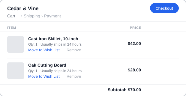 Every line item offers a one-click path to save-for-later, not just delete.
Cross-sell carefully and localize terminology
Cross-sells in the cart are appropriate but should be visually secondary to the cart contents and checkout action. Prominence that rivals the checkout path turns a cross-sell into a distraction.
Terminology for the cart itself varies by market: “shopping cart,” “shopping basket,” and “shopping bag” each carry associations. The dominant usage in a given market or locale is worth observing — presenting what customers already expect removes one unnecessary source of confusion.
Related Concepts
Patterns
- Process Funnel
- Quick-Flow Checkout
- Clean Product Details
- Cross-Selling and Up-Selling
- Action Buttons
- Multiple Destinations
- Gift Giving
- Order Tracking and History
- Site Header
Principles
Sources
The Design of Sites: Pattern Group F — Basic E-Commerce is this page’s sole source — F3 in Pattern Group F — covering the cart’s persistent-storage requirement, the per-item detail list, the wish-list distinction, and the secondary cross-selling guidance that structure this page’s Solution section.