
Clean Product Details
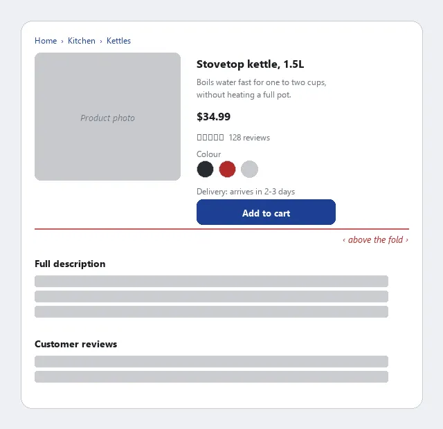 Everything needed to decide sits above the fold; everything for deeper research sits below it.
Background
The product details page sits between browsing (Featured Products, category pages, Organized Search Results) and committing (Shopping Cart, Quick-Flow Checkout). Its Add to Cart button is the handoff point into the checkout flow. Getting the handoff right — clear button, no ambiguity about what gets added — prevents the confusion that causes customers to abandon between product page and cart.
Problem
A product page has to hold everything from purchase-critical facts (price, options, availability) to supplementary research material (full specs, reviews), and giving all of it equal visual weight buries what a customer actually needs to decide whether to buy.
A product page has to hold everything from purchase-critical facts (price, options, availability) to supplementary research material (full specs, reviews), and giving all of it equal visual weight buries what a customer actually needs to decide whether to buy.
Solution
The product details page is the decision point where a customer chooses to buy or leave. Most of the design work on this page is about sequencing information: putting what a customer needs to make a purchase decision above the fold, and everything else below it.
The product details page is the decision point where a customer chooses to buy or leave.
Put these elements above the fold
The following elements belong above the fold — visible without scrolling — because they are the minimum needed to make a purchase decision:
- Navigation — a category breadcrumb or site navigation, so the customer can orient, return to browsing, or compare alternatives without losing the page
- Product image — a clear, zoomable thumbnail; for products with variations (color, style), images that update to match the selected option. Link the thumbnail to a higher-resolution image customers can examine for close-up detail, and provide multiple angles where they matter: a rotatable back view for products where the back is as important as the front, or a pannable view for a product that encompasses a room or an outdoor space. Use real photography here rather than an illustration or stock image — see Effective Images for why photography specifically suits showing a lifelike, accurate representation of a physical thing a customer is about to buy.
- Needs-oriented description — a short summary written around what the customer wants to accomplish with the product, not what the company wants to say about it; the distinction matters because customers evaluate products against their own tasks, not against a feature list
- Price — including any discount from a regular price, and taxes or shipping if they can be known at this stage
- Options pick list — size, color, quantity, or other variants; selecting an option should update the image and price where applicable
- Customer ratings — a summary (star rating, number of reviews) that signals social proof and links to the full review section below
- Delivery estimate — the expected arrival date or time window, visible before the customer commits
- Add to Cart button — the primary action button, large and unambiguous; for out-of-stock items, hide or disable this button and show availability status instead; for pre-order items, substitute a “Pre-order” label
Put these elements below the fold
Below the fold belongs everything useful after the decision has been made or for customers doing deeper research:
- Full product description — complete specifications, materials, dimensions, compatibility notes
- Expert and customer reviews — the Recommendation Community section (write/preview/post flow, meta-ratings for surfacing trustworthy reviews)
- Related products — cross-sells and up-sells relevant to this product; accessories, complementary items, higher-tier alternatives
- Product comparator — a side-by-side table if the site carries multiple variants or competing items in the same category
Standardize templates by product category
Product pages benefit from standardized templates per product category, not universal templates across all products. What “above the fold” means for a book (author, edition, ISBN, page count) differs from what it means for clothing (size chart, fabric, care instructions) or electronics (compatibility, technical specs). A template built for the product category ensures the right fields appear in the right order for every product in that group, without requiring custom layout work on each item.
The organizing principle throughout is to prioritize information the customer needs to make a decision over information the company wants to tell them. Customer-centered ordering: what does it do for me, what does it cost, when will I have it, what do others think of it. Company-centered ordering (history, marketing language, certifications) belongs further down or in a separate tab.
Customer-centered ordering: what does it do for me, what does it cost, when will I have it, what do others think of it.
Related Concepts
Patterns
- Above the Fold
- Grid Layout
- Action Buttons
- Quick-Flow Checkout
- Shopping Cart
- Cross-Selling and Up-Selling
- Recommendation Community
- Featured Products
- Floating Windows
- Page Template
- Progressive Disclosure
- Effective Images
Principles
Sources
The Design of Sites: Pattern Group F — Basic E-Commerce (Pattern F2, Clean Product Details) is this page’s sole source — the above-the-fold/below-the-fold element split, the per-category-template recommendation, and the multi-angle/zoom product-image guidance all come directly from it.