
Navigation Menus
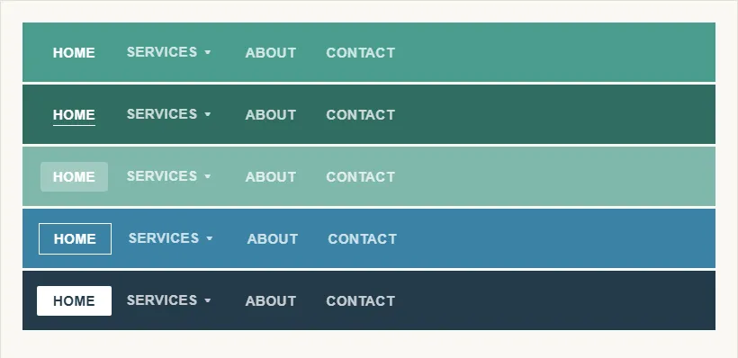 Five ways to signal a menu item’s active/hovered state — bold weight, an underline, a light highlight box, an outline, or a filled box — any of which works as long as active and inactive states stay distinguishable without relying on color alone.
Background
Site Header establishes the structural region where primary navigation lives. Breadcrumb Navigation and Multiple Ways to Navigate are the complementary orientation and recovery tools for users who navigate deeply and need to retrace steps. A navigation menu is also one of the most commonly codified components in a design system‘s own pattern library, alongside buttons and form fields.
Problem
A site has more sections and destinations than can be shown as visible links at once, and no single navigation-bar layout communicates every choice at every scale without becoming cluttered or unusable.
A site has more sections and destinations than can be shown as visible links at once, and no single navigation-bar layout communicates every choice at every scale without becoming cluttered or unusable.
Solution
A navigation menu is a collection of links that represents the site’s structure and lets users move between sections, drawn from a small set of conventional layouts (top-running, side-running, or a top-and-left combination) and exposed via flyouts, dropdowns, or tabs suited to how much needs to be shown at once. Menu design governs how structure is communicated, how the user’s current position is signaled, and how multi-level hierarchies are exposed without overwhelming.
Mirror the site’s structure
A well-designed menu directly mirrors the site’s Information Architecture — categories at the top level, subcategories nested beneath them. This correspondence matters: when the visual grouping of menu items doesn’t match the underlying IA, users develop an inaccurate mental model of where things live and predict wrong locations. See Content Organization Schemes for how to decide what top-level categories to expose.
This correspondence matters: when the visual grouping of menu items doesn’t match the underlying IA, users develop an inaccurate mental model of where things live and predict wrong locations.
Standard information-architecture vocabulary distinguishes three layers this structure operates at:
- Hierarchical navigation — the general-to-specific structure itself, giving a clear path to any page from anywhere in the site.
- Global navigation — the fixed, top-level set of section links present on every page (what this section’s “top level” refers to).
- Local navigation — the in-page links to other pages within the same section, scoped to wherever the user currently is rather than repeated site-wide.
A menu’s top level is global navigation; the flyout/dropdown and mobile patterns below are how that same global navigation gets exposed under different space constraints.
The number of top-level items is a Hick's Law decision: more items slow navigation decisions logarithmically, but consolidating too aggressively hides destinations users need. The practical resolution is grouping by Gestalt proximity and keeping category labels mutually exclusive enough that a user can predict which heading their destination falls under.
Signal the current page
Every menu item representing the current page must be visually distinct — typically via a different background, font weight, or border — from inactive items. This serves two populations: users with attention or memory limitations who need an ambient reminder of where they are, and anyone who entered mid-hierarchy (from a search engine or direct link) and is orienting themselves. The current-page indicator should not rely on color alone; pair it with position, weight, or a non-color style change so it’s perceivable without color vision.
The current-page indicator should not rely on color alone; pair it with position, weight, or a non-color style change so it’s perceivable without color vision.
Design accessible flyouts and dropdowns
Flyout (hover-triggered) and dropdown (click-triggered) menus expose subcategories without requiring a full page transition. Hover-only flyouts are inaccessible to keyboard and touch users, so flyouts must also respond to keyboard focus (Tab to open, arrow keys to navigate, Escape to close) and touch tap. Each additional level of nesting adds a Cognitive Load cost — two levels (top-level + one flyout) are common; three levels are rarely justified.
A nested list inside a labeled <nav> gives the menu’s hierarchy to assistive technology directly from the markup structure, independent of how it’s styled; aria-haspopup and aria-expanded on the trigger communicate the flyout’s existence and current open/closed state to a screen reader:
<nav aria-label="Primary">
  <ul>
    <li>
      <button aria-haspopup="true" aria-expanded="false">Products</button>
      <ul>
        <li><a href="/products/a">Product A</a></li>
        <li><a href="/products/b">Product B</a></li>
      </ul>
    </li>
  </ul>
</nav>
aria-expanded must be kept in sync with the flyout’s actual visible state (updated to "true" when opened), not left static — a mismatched value tells assistive technology the opposite of what’s actually on screen.
Choose a navigation bar layout
Three conventional placements, each suited to a different scale of navigation (see Navigation bar (Wikipedia) for how the same “navigation bar” term spans file-browser, OS-level, and HTML5 contexts beyond this web-design sense):
- Top-running — stretches across the top of the page, most often carrying top-level navigation (links to entire subsites or categories).
- Side-running — positioned along the left edge (a right-side bar is rare, even on sites in right-to-left languages). A side bar has more room than a top bar and commonly carries second-level navigation — links within the current subsite.
- Top-and-left (“inverted L”) — combines both: a top-running portion for broad, cross-subsite navigation and a side-running portion for deep navigation within the current subsite. This layout needs a page reload (or dynamic JS update) to refresh the left-hand menu whenever the top-running selection changes, unless the page is built to update it live.
Link navigation-bar items with text, or icons paired with text — icons alone are frequently not understood consistently across cultures or even within one, so a text label should always back up an icon rather than replacing it.
Make tab rows read as tabs
A tab row is one specific implementation of a navigation bar: a horizontal set of tabs, styled after physical file-folder tabs, that shows both what’s currently open and what else is available. Two details make a tab row actually read as tabs rather than a row of buttons:
- A visually distinct active tab — different color and enough brightness contrast to remain legible for users who can’t distinguish by hue alone — with one tab preselected by default so the row reads as tabs immediately, even before a customer clicks anything.
- An indicator line connecting the active tab to its content — a line in the same color as the active tab, running left to right beneath it and extending across the full content width below, reinforcing that everything on the page currently belongs to that tab.
Tab rows have a practical ceiling: about ten items fit on a single row before it starts to feel cluttered, and multiple stacked rows of tabs consume too much of the page. Past that ceiling, combine a tab row with a jump menu (rendering the overflow as a floating list that appears on click or hover) rather than adding a second row.
Follow visual conventions
Use recognizable, commonly understood patterns rather than novel menu designs. Conventions users already know:
- Horizontal navigation bar across the top (primary site navigation)
- Vertical sidebar (section navigation, filters)
- Hamburger icon
≡(collapsed mobile menu) — though this icon alone has lower discoverability than a labeled button (“Menu”)
Convey information through multiple channels beyond color: active states via position or typography weight, inactive states via visual lightness. Sufficient contrast between menu text and background is a baseline; sufficient contrast between active and inactive states is equally important and often overlooked.
Collapse into a mobile menu on small screens
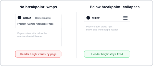 Without a breakpoint, the nav bar’s own item count decides how tall the header is on any given page.
 The same icon that opens the menu becomes its close control — one predictable place to look, whether the menu is opening or closing.
On small screens, horizontal navigation bars typically collapse into a hidden menu triggered by an icon or button, rather than being left to wrap onto a second line and stretch the header’s height unpredictably from page to page depending on how many items happen to fit. The collapsed state must be clearly labeled (icon + “Menu” is more discoverable than icon alone). When the mobile menu is open, focus should enter and be managed within it, and closing the menu should return focus to the trigger.
Related Concepts
Patterns
- Multiple Ways to Navigate
- Content Organization Schemes
- Breadcrumb Navigation
- Site Header
- Jump Menus
- Unified Browsing Hierarchy
Principles
- Hick's Law
- Affordance
- Interface Design Principles
- Cognitive Load
- Mental Models
- Information Architecture
Standards
Further reading
Steve Krug’s Don’t Make Me Think, Revisited (3rd edition, amazon.com/dp/0321965515 — commercially published, no stated open license) argues navigation isn’t a feature of a site but the site itself, and offers the “trunk test” — a user dropped blind onto any page should instantly be able to answer what site and page this is, what the major sections are, and what their options are — as a quick check on a navigation design.
Schade, Cheng, and Sherugar’s Top 10 Enduring Web-Design Mistakes (Nielsen Norman Group, 2016 — copyright NN/g, no open license; https://www.nngroup.com/articles/top-10-enduring/) names “competing links and categories” — menu items or navigational categories similar enough that users can’t tell which path leads where — as one of ten recurring mistakes, traced to either too-similar labels (fix by rewording) or genuinely overlapping content (fix by reorganizing).
The W3C WAI‘s Menus tutorial (w3.org/WAI/tutorials/menus/ — W3C Document License; permits copying but not derivative works) covers flyout/dropdown accessibility in more depth, including a recommendation to allow a short dwell delay (roughly 100–200ms) before a hover-triggered flyout closes, so a cursor briefly crossing outside the menu boundary — or a user with fine motor difficulties — doesn’t lose the open menu prematurely.
Sources
Web navigation (Wikipedia) supplies the hierarchical/global/local navigation vocabulary used in the “Mirror the site’s structure” section to distinguish the three layers a menu’s structure operates at.
The Design of Sites: Pattern Group K — Making Navigation Easy (its K2/K3 patterns) is the source for the three navigation-bar layouts (top-running, side-running, top-and-left), icon-plus-text labeling guidance, and the tab-row conventions (active-tab styling, indicator line, the roughly-ten-tab ceiling).
Navigation bar (Wikipedia) is cited directly for how “navigation bar” spans file-browser, OS-level, and HTML5 contexts beyond the Web-design sense the rest of this page covers.