
Process Funnel
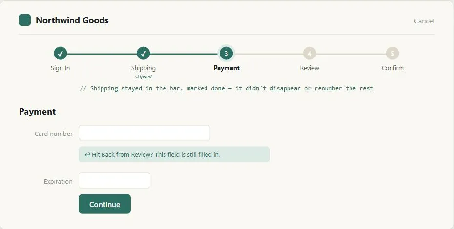 A skipped step and a step revisited by Back are the same problem from opposite directions — the funnel has to remember what happened either way, not just march forward.
Background
Distinct from task-based organization, a looser sibling pattern: a process funnel forces one narrow, specific task through a fixed sequence with few choices at each step, while task-based organization offers a relevant next step among several rather than mandating one. In Iterative Design and Interface Design Principles, it’s the canonical example of deliberately restricting customer control and freedom to help a customer complete a task — a trade that only pays off when the task is genuinely narrow and linear (see task-based organization for the looser alternative when it isn’t). E-commerce checkout is the pattern’s own running example, documented in Quick-Flow Checkout.
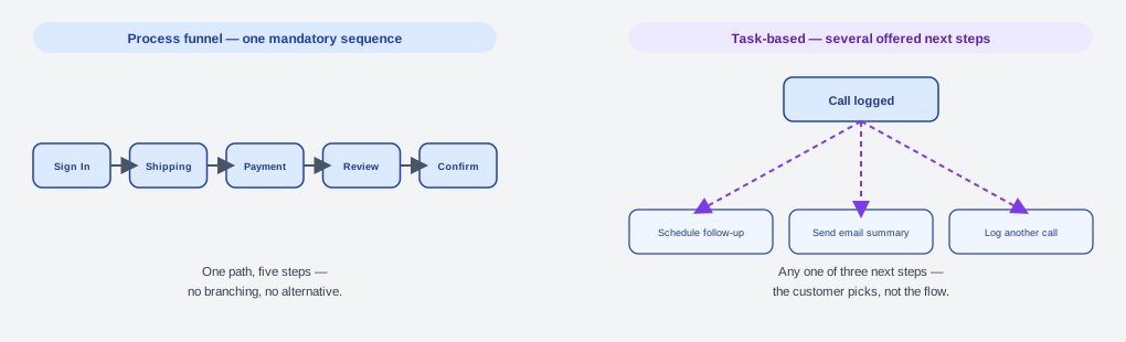 A funnel’s arrows all point the same single way; task-based organization’s arrows fan out to several equally valid next steps, none of them required.
Problem
A multi-step task presented as an ordinary part of the site — with full navigation, tangential links, and unrelated content still available — gives customers many ways to get sidetracked, distracted, or lost before they finish the one specific thing they came to do.
A multi-step task presented as an ordinary part of the site — with full navigation, tangential links, and unrelated content still available — gives customers many ways to get sidetracked, distracted, or lost before they finish the one specific thing they came to do.
Solution
A process funnel is a sequence of pages designed to walk a customer through one specific, well-defined task (e.g., a purchase checkout), step by step, completing one of the higher-level patterns described in Web Design Patterns. Effective process funnels keep instructions concise, minimize links that could lead someone out of the sequence, and minimize the total number of steps required to finish.
Size and structure the funnel
Keep a funnel to two to six discrete steps — fewer than two isn’t really a process, and more than six becomes unmanageable. If a task genuinely needs more steps, either split it into two or more separate funnels or combine several steps onto one page; neither is always viable, since one choice may have to precede another and not every page can hold everything a customer might need at that point. Show a Progress Bar at each step so customers know how much farther they have to go — it’s usually not worth making the individual steps clickable, since that adds complexity for little benefit (see Progress Bar for when clickable navigation does pay off).
Keep a funnel to two to six discrete steps — fewer than two isn’t really a process, and more than six becomes unmanageable.
Remove links and content unrelated to the task at hand — extraneous navigation bars, tab rows, breadcrumbs, and Embedded Links — leaving only what helps the customer reach the goal, plus an obvious exit that cancels the funnel. At the same time, keep the site’s branding (fonts, images, colors, layout, logo) fully intact throughout, so that removing navigation doesn’t also strip away the customer’s sense of being on the same site — see Trust and Credibility.
Preserve state
Make sure the browser’s Back button always works: temporarily store what a customer has entered on each page, redisplay it if they hit Back, and overwrite the stored copy only if they actually change it. Without this, customers who use Back to revise an earlier answer lose everything and have to retype it — in the worst case with a cryptic “posted information was lost” error. Persistent customer sessions are the usual mechanism for tracking a customer through this.
customers who use Back to revise an earlier answer lose everything and have to retype it — in the worst case with a cryptic “posted information was lost” error.
Let customers skip steps that become unnecessary — e.g. a shipping-address step skipped because signing in already supplied it, or an address-confirmation step skipped via a “same as billing” checkbox. See Progress Bar for how to reflect a skipped step in the bar itself without disorienting the customer mid-process.
Offer supplementary information
Use a floating window to show extra detail — product specs, context-sensitive help, or an answer from frequently asked questions (FAQ) — without taking the customer out of the funnel to a separate page.
Prevent errors
Combine clear forms with structured fields, sample input, and Predictive Input to prevent errors before they happen, and provide a meaningful error message whenever one does occur anyway. Each step of a process funnel benefits from a clearly distinguished action button to reduce the chance of a customer clicking the wrong thing and falling out of the funnel.
Related Concepts
Patterns
- Action Buttons
- Content Organization Schemes
- Multiple Ways to Navigate
- Form Design
- Error Messages
- Quick-Flow Checkout
- Shopping Cart
- Easy Returns
- Sign-In and Account Creation
- Floating Windows
- Progress Bar
- Customer Sessions
- Embedded Links
- Breadcrumb Navigation
Principles
Processes
Further reading
Victor Ponamariov’s 50 Tips to Improve User Interface (goodreads.com/book/show/58085971-50-tips-to-improve-user-interface — self-published ebook, no stated license) contributes funnel-related tips beyond this page’s own guidance. One example: progress indicators leverage the goal gradient effect, where people accelerate toward a visible finish line — see Form Design for the full treatment.
Sources
The Design of Sites: Ch. 2 — Making the Most of Web Design Patterns supplies the six-part pattern-documentation format (Background/Problem/Forces/Solution) this page’s own Background/Problem/Solution skeleton follows, plus the broader pattern-language framing behind this page’s reference to process funnel as “one of the higher-level patterns.”
The Design of Sites: Ch. 4 — Involving Customers with Iterative Design is the source of the Background section’s point that deliberately restricting customer control and freedom is a legitimate trade-off only for a genuinely narrow, linear task — one of the seven design principles that chapter adapts from Shneiderman, Nielsen, and Tufte.
The Design of Sites: Pattern Group H — Helping Customers Complete Tasks (H1 Process Funnel) is this page’s primary source — the two-to-six-step sizing rule, back-button state preservation, and the floating-window use for supplementary detail all come directly from H1.
The Design of Sites: Pattern Group F — Basic E-Commerce supplies e-commerce checkout as the pattern’s running example, referenced via Quick-Flow Checkout, and the page-combining tradeoff discussed under Size and structure the funnel.