
Progress Bar
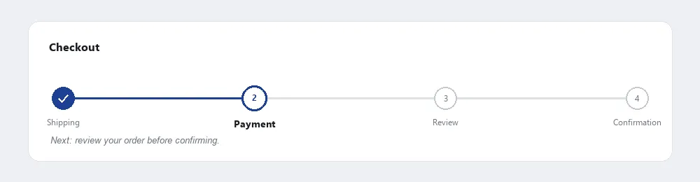 Completed, current, and remaining steps are distinguished at a glance, not just by their labels.
Background
A progress bar and a loading state solve adjacent but different problems: a progress bar communicates position within a multistep task the customer is actively driving (a checkout, a form wizard), while a loading state communicates that the system is working on a single operation the customer is waiting on. A long-running single operation with named phases can reasonably combine both — but a progress bar without any customer-driven steps is really just a slow loading state in disguise.
A progress bar without any customer-driven steps is really just a slow loading state in disguise.
Problem
A multistep process funnel can take a while to complete, and a customer with no sense of how many steps remain may abandon it out of frustration — with the bad impression that abandonment leaves behind spreading further by word of mouth.
A customer with no sense of how many steps remain may abandon it out of frustration — with the bad impression that abandonment leaves behind spreading further by word of mouth.
Solution
A progress bar tells customers what a process involves and roughly how far through it they are.
Outline the major steps
Name each step where space allows, so customers know what’s happening at every point, not just that something is happening — a checkout’s “SHIPPING & PAYMENT” step, for instance. Where there are too many steps or the steps are too complex to name concisely, this can be dropped, but naming is the default. Include the overall goal as a final label (“PLACE ORDER”), not just the intermediate steps.
Visually distinguish completed, current, and remaining steps
Commonly a dimmer shade for completed steps, a highlighted color for the current one, and light grey for what’s ahead — so the customer’s position is legible at a glance, not just inferable from a label.
<nav aria-label="Progress">
  <ol>
    <li>Shipping <span class="visually-hidden">(completed)</span></li>
    <li aria-current="step">Payment</li>
    <li>Review</li>
    <li>Confirmation</li>
  </ol>
</nav>
Don’t overload the bar
Too many listed steps can make a process look longer than it is and increase the odds a customer bails before starting. Steps also don’t need to be visually proportional to each other, since they rarely take equal time — but one dramatically longer step can still make the whole process feel long even if the others are quick.
Too many listed steps can make a process look longer than it is and increase the odds a customer bails before starting.
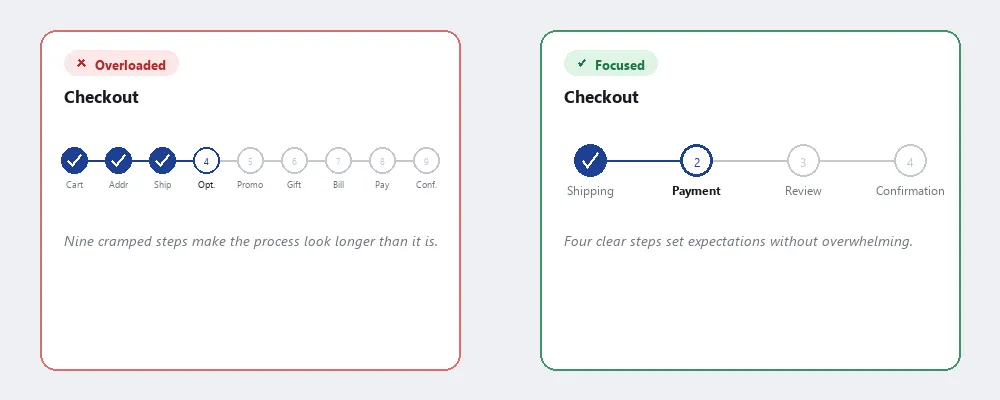 The abbreviated, hard-to-read labels (“Opt.,” “Conf.”) are the visible cost of cramming in every step; the four-step version doesn’t need to shorten a single word.
Choose how customers navigate the bar
Two legitimate models, chosen by whether the steps genuinely have to happen in order:
- Use non-clickable, sequential navigation — appropriate when steps must be completed in a fixed order. Label steps so they read clearly as steps (e.g. “1 2 3 4”) without looking clickable, and rely on Back/Next buttons for movement.
- Allow clickable, direct navigation — appropriate when steps are independent of each other once an initial choice is made (a product configurator, once a base model is selected, may let customers jump freely between trim and accessory tabs). Make the clickable Affordance visually obvious — a tab-row treatment is a common signal — and provide Back/Next buttons alongside it for customers who prefer moving linearly.
Include step-specific edit links
Include step-specific edit links on later steps so a customer can correct information entered earlier (e.g. a mailing address) without losing whatever they entered in between — an edit button next to the relevant summary field, jumping back to just that step, rather than forcing a restart of the whole funnel.
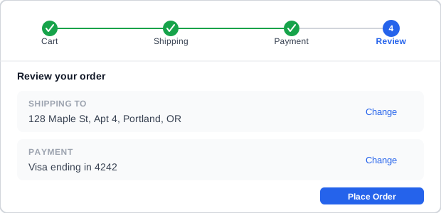 Fixing the address means clicking “Change” on that one row — not restarting at Cart.
Indicate what’s coming next
Indicate what’s coming next, not just the current step’s label — a short explanatory line for the upcoming step reduces the chance a customer abandons out of uncertainty about how much is left or what it will ask for.
Skip steps without removing them from the bar
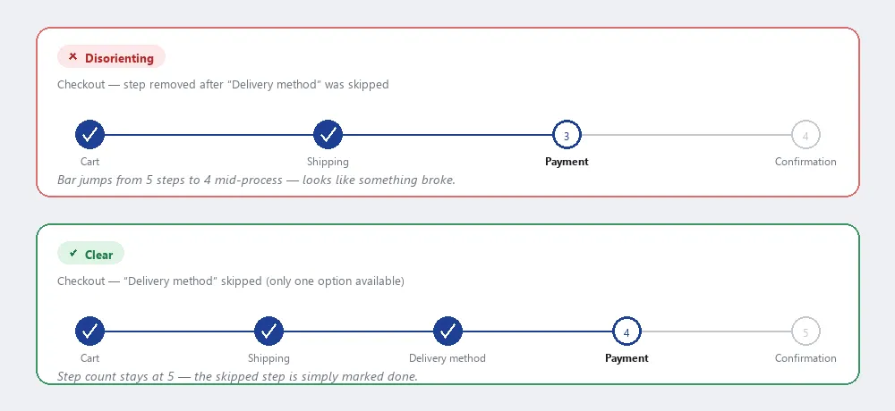 Renumbering the bar mid-process reads as a bug; marking the skipped step done and leaving the count alone reads as intentional.
When an earlier choice makes a later step unnecessary (see Process Funnel), mark that step as completed in the display rather than deleting it or renumbering the bar mid-process — changing the step count while a customer is partway through is more disorienting than a step that’s marked done without the customer having filled anything in.
Related Concepts
Patterns
Principles
Sources
The Design of Sites: Pattern Group H — Helping Customers Complete Tasks (H13 Progress Bar) is this page’s sole source — outlining named steps, visually distinguishing completed/current/remaining states, the clickable-versus-non-clickable navigation choice, step-specific edit links, and the mark-completed-rather-than-renumber rule for skipped steps all come directly from H13.