
Category Pages
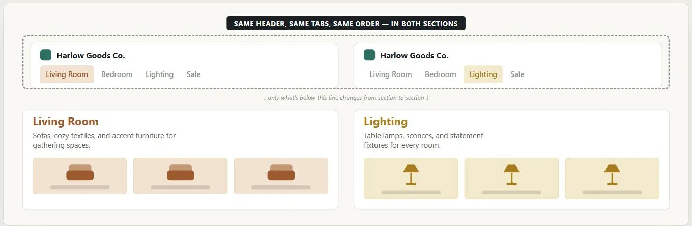 The piece inside the dashed border stays fixed — only the section below it is free to change, which is what keeps a new section feeling like part of the same site rather than a different one.
Background
The landing/section page reached through whichever organizational scheme a site uses (a hierarchy branch, a task grouping, a popularity list, etc.) — a directory to the content in that subcategory rather than the content itself. Consistency doesn’t mean every category looks identical, though — the goal is a shared underlying structure customers can rely on, with enough room for each section to feature its own content distinctly.
Consistency doesn’t mean every category looks identical, though — the goal is a shared underlying structure customers can rely on, with enough room for each section to feature its own content distinctly.
Problem
When a customer reaches a new section of a site, an inconsistent layout or navigation scheme can make that section feel like a different site entirely — even if the content is exactly where it should be.
When a customer reaches a new section of a site, an inconsistent layout or navigation scheme can make that section feel like a different site entirely — even if the content is exactly where it should be.
Solution
Keep category sections distinct in identity but obviously part of one larger site.
Use a consistent layout
The same grid and Page Template across every category section means customers recognize the structure even in an area they’ve never visited, and don’t mistake “I’m in a new section” for “I’m on the wrong site.”
Keep navigation elements unchanged in position
Even if you vary a detail like a tab’s color to signal which section is active — radical layout changes between sections break the consistency this pattern exists to protect.
Even if you vary a detail like a tab’s color to signal which section is active — radical layout changes between sections break the consistency this pattern exists to protect.
Signal clearly that the customer has “arrived”
A clear first read naming the section accomplishes this the same way a “Welcome to —” sign does when you drive into a new town.
Carry strong information scent into the section
Not just at the entry point to it — see Browsable Content for what that means concretely (text, images, and grouping that confirm a customer is getting closer to, or has reached, what they wanted).
Related Concepts
Patterns
- Content Organization Schemes
- Browsable Content
- Grid Layout
- Clear First Reads
- Site Map (Navigation Page)
- Permalinks
- Printable Pages
Processes
Sources
The Design of Sites: Pattern Group B — Creating a Navigation Framework (Pattern B8, Category Pages) is this page’s sole source — the consistent-layout, unchanged-navigation-position, and “arrived” signal guidance above, plus carrying information scent into a section.