
Dark Patterns
A dark pattern (also called a deceptive design pattern) is a user interface deliberately crafted to trick a customer into an action they wouldn’t have chosen with clear information — buying an overpriced add-on, sharing more data than intended, or struggling to cancel a subscription they’d otherwise stop. Every pattern documented on this page is an anti-pattern to recognize and avoid, not a technique to implement: each one optimizes a short-term business metric at the customer’s direct expense, working against the usability and trust a legitimate interface depends on rather than serving the customer’s own interest.
A dark pattern (also called a deceptive design pattern) is a user interface deliberately crafted to trick a customer into an action they wouldn’t have chosen with clear information — buying an overpriced add-on, sharing more data than intended, or struggling to cancel a subscription they’d otherwise stop.
Common dark patterns
Bait-and-switch
Advertise an item at an appealing price or availability, then redirect the customer toward a pricier or different option once they’re already committed to the flow. TurboTax’s “free filing” claim, unavailable to most filers who started the flow expecting it, led to a $141 million multistate settlement between Intuit and state attorneys general in 2022, separate from the FTC’s own administrative action against Intuit over the same claim.
Drip pricing
Reveal mandatory fees incrementally through checkout rather than up front, exploiting the time a customer has already invested by the point the true cost appears. This is the manipulative inverse of the honest “answer deal-breakers early” guidance on Quick-Flow Checkout.
Confirmshaming
Word a decline option to shame the customer into accepting instead (“Don’t want our newsletter? Click here to prove you hate savings.”). This targets the same decline/accept option wording Form Design otherwise treats as a neutral labeling choice.
Misdirection
Pair a prominent, visually weighted accept action with a deliberately minimal or hidden decline option, often bundling an unwanted install or charge behind it. This inverts the deliberate visual-weight hierarchy Action Buttons recommends for legitimate choices — instead of clarifying which action a customer should take, it exploits the same hierarchy to obscure it.
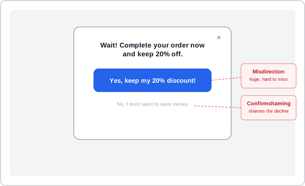 Both patterns often ride the same dialog — one exploits size, the other exploits wording, and they reinforce each other.
Privacy zuckering
Obscure or delay opt-out controls so a customer shares more personal data than they intended; named for Facebook’s early privacy-settings practices. A Cookie Consent Banner that defaults a “legitimate interests” toggle on beside a “consent” toggle defaulted off is this same trick applied to cookie/tracking consent specifically. This is the direct inversion of the disclosure-and-choice principles and the accessible, plainly-worded Privacy Policy a legitimate site publishes them through. The FTC has documented a specific visual variant of this trick beyond wording or defaults alone: an “Accept” control styled as a bold, solid button next to a “Reject” control styled to resemble muted, inactive text — a user can select Accept purely “out of expediency,” without ever registering that Reject was a real, equally available choice.
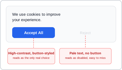 This banner never lies in words — the manipulation is entirely in which option looks clickable; a compliant banner styles both as equally real, equally clickable choices.
Roach motel
Make signing up effortless and canceling deliberately hard, such as requiring a printed, mailed cancellation letter for an account that took two clicks to create online. In the US, this specific asymmetry has its own regulatory standard under ROSCA (the Restore Online Shoppers’ Confidence Act): a cancellation mechanism must be at least as easy to use as the one the customer used to sign up in the first place — not merely possible, but genuinely comparable in effort. The FTC’s case against a children’s-education subscription service alleged a cancellation path requiring 6 to 9 sequential screens with no way to skip ahead, several of which offered an unrelated “special offer” that, if clicked instead of “Continue,” diverted the customer out of the cancellation flow entirely without warning.
Make signing up effortless and canceling deliberately hard, such as requiring a printed, mailed cancellation letter for an account that took two clicks to create online.
Recognize the trust and regulatory cost of dark patterns
Every dark pattern works by inverting a legitimate, established UX pattern, aimed at the customer’s disadvantage rather than their benefit. The actual cost is trust: a dark pattern trades a short-term conversion or data-collection gain for the same trust an honest site spends the rest of its patterns earning, and the damage doesn’t stay contained to the interaction that caused it — a customer who notices a fee revealed late, or a cancellation path deliberately buried, extends that suspicion to the rest of the site.
Every dark pattern works by inverting a legitimate, established UX pattern, aimed at the customer’s disadvantage rather than their benefit.
Regulatory response:
- EU — GDPR requires consent to be unambiguous and freely given, and the Digital Services Act explicitly names and addresses dark patterns.
- California — CCPA bans deceptive cookie-consent opt-out interfaces.
- UK — the Children’s Code prohibits privacy-undermining “nudges” aimed at children.
- US — the FTC issued a 2021 enforcement policy statement and a 2022 staff report (“Bringing Dark Patterns to Light”), and has brought enforcement actions including a $245 million settlement with Epic Games (announced 2022, order finalized 2023) over deceptive in-game purchase defaults.
Related Concepts
Patterns
Principles
Standards
- Fair Information Practices
- GDPR (General Data Protection Regulation)
- CCPA / CPRA (California Consumer Privacy Act / California Privacy Rights Act)
Further reading
The Norwegian Consumer Council’s “Deceived by Design” (2018, no stated open license) is the landmark report that put misdirection and confirmshaming on the regulatory map, documenting Facebook, Google, and Windows 10 all pairing privacy-intrusive defaults with confirmshamed decline options — a case study beyond the FTC’s own report already cited.
Sources
Dark pattern (Wikipedia) (CC BY-SA 4.0) is this page’s primary source — the six named pattern types (bait-and-switch, drip pricing, confirmshaming, misdirection, privacy zuckering, roach motel) with their real-world examples, and the regulatory-response rundown covering GDPR, California, the UK Children’s Code, and FTC actions against Intuit and Epic Games.
Bringing Dark Patterns to Light (FTC Staff Report) (public domain) is the source for the ROSCA cancellation-effort standard, the asymmetric-prominence Accept/Reject visual example, and the multi-screen cancellation-path example under Roach motel and Privacy zuckering above.