
Information Architecture
Information architecture is the structural design of a site’s or app’s content — how it’s organized, labeled, connected by navigation, and made findable through search — so a customer can predict where something lives and locate it without hunting page by page. (The same term is also used, in narrower senses unrelated to interface design, for the information-modeling side of enterprise and data architecture; this page covers only the user-facing sense.) A site’s navigation, breadcrumbs, and content organization all have to accurately reflect this underlying structure — get the architecture itself wrong, and no amount of polish on the navigation built on top of it will make the site easy to find things in.
Information architecture is the structural design of a site’s or app’s content… so a customer can predict where something lives and locate it without hunting page by page.
The four systems of information architecture
A site’s information architecture is usually described as four interlocking systems working together:
- Organization — how content is grouped and categorized. See Content Organization Schemes‘s five combinable schemes.
- Labeling — the words used to represent a category or link, which need to make sense in the visitor’s own vocabulary rather than the organization’s internal jargon. See Plain Language.
- Navigation — the wayfinding structure that lets a visitor move through the organization. See Navigation Menus, Browsable Content, and Breadcrumb Navigation.
- Search — a direct-query alternative to browsing the organization. See Search Action Module, Straightforward Search Forms, and Organized Search Results.
A navigation menu or breadcrumb trail is only ever as good as the organization system underneath it — a menu that mirrors a confusing category structure just exposes that confusion to the visitor faster.
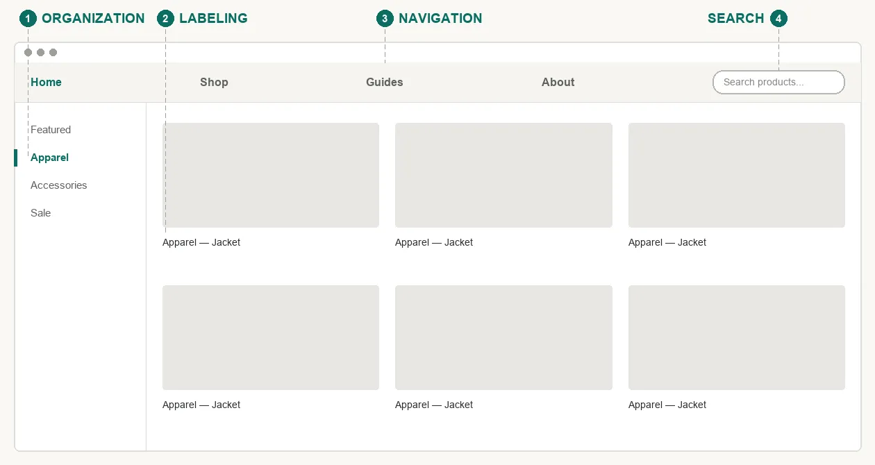 All four systems are doing their job on this single page at once — organization, labeling, navigation, and search working together.
The eight principles of information architecture
A commonly cited set of eight principles gives a shorthand for the recurring judgment calls an information architecture has to get right:
- The principle of objects. Treat content types as distinct things with their own lifecycle and properties, not as interchangeable text on a page — Content Organization Schemes and Card Sorting both depend on first knowing what the actual content “objects” are before organizing or naming them.
- The principle of choices. Keep the number of options on a single page small and meaningful rather than exhaustive — the same reasoning behind Hick’s Law.
- The principle of disclosure. Show just enough about a category to help a visitor decide whether to open it — see Progressive Disclosure.
- The principle of exemplars. Describe a category by showing a few real examples of what’s inside it, not just its abstract name — see Category Pages and Featured Products.
- The principle of front doors. Assume many visitors will land on some page other than the homepage, so every page needs enough of its own orientation and navigation to stand alone — see Above the Fold and Page Template.
- The principle of multiple classification. Offer more than one way to browse the same content, since no single scheme fits every visitor’s mental model — see Content Organization Schemes‘s five combinable schemes and Filters and Facets.
- The principle of focused navigation. Keep one navigation scheme consistent to one kind of relationship (e.g. all hierarchical, or all by topic) rather than mixing unrelated logics in the same menu — see Navigation Menus.
- The principle of growth. Design the structure to absorb far more content than exists on day one, since almost every site’s content outgrows its first architecture — see Content Organization Schemes.
Producing and testing an information architecture
An information architecture is rarely designed top-down from a blank page. Card Sorting has customers do the categorizing themselves, discovering a candidate structure from their own vocabulary; Affinity Diagramming does the same from the researcher’s side, clustering raw field notes into a hierarchy.
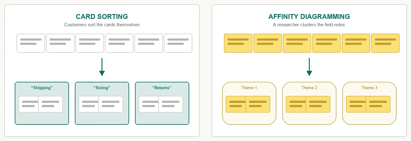 Same six items sorted two ways — a customer’s own words on the left, a researcher’s judgment call on the right.
Either technique produces a candidate architecture that still needs validating before it ships — tree testing checks whether an already-built structure actually matches visitor expectations. Once an architecture is real, a site map is the page that documents it directly for visitors who need a comprehensive, last-resort view of the whole thing.
A responsive site’s information architecture should stay stable across screen sizes even as the visual layout adapts — reflowing a hierarchy on a small screen is a presentation change, not license to reorganize the underlying structure.
Related Concepts
Patterns
- Content Organization Schemes
- Navigation Menus
- Browsable Content
- Breadcrumb Navigation
- Search Action Module
- Straightforward Search Forms
- Organized Search Results
- Plain Language
- Progressive Disclosure
- Category Pages
- Featured Products
- Above the Fold
- Page Template
- Filters and Facets
- Site Map (Navigation Page)
- Responsive Web Design
Principles
Processes
Further reading
Rosenfeld, Morville, and Arango’s Information Architecture: For the Web and Beyond (4th edition, amazon.com/dp/1491911689 — commercially published, no stated open license) is the field’s standard full-length textbook. It develops the four-systems framework above (organization, labeling, navigation, search) at far greater length than this page covers, alongside additional practice areas — thesauri and controlled vocabularies, IA strategy and governance documents — outside this page’s scope.
Sources
Information architecture (Wikipedia) is this page’s sole source — the definition, the user-experience/information-systems distinction, the four-systems framework, and the named list of eight principles all come from it.