
Gestalt Psychology
Overview
An early-20th-century school of perceptual psychology, founded by Max Wertheimer, Wolfgang Köhler, and Kurt Koffka (Wertheimer’s 1912 paper on the phi phenomenon marks its formal start), built around one central claim: people perceive organized wholes before they perceive the individual parts that make them up — “the whole is something else than the sum of its parts.” Several existing UX patterns rely on specific Gestalt principles without naming them; this page makes that shared foundation explicit.
“the whole is something else than the sum of its parts.”
The principles of perceptual organization
Proximity
Elements placed close together are perceived as a single group, independent of what they actually are. Grid Layout‘s instruction to “group related elements visually… while keeping unrelated elements apart” is a direct application. Amazon’s older customer-review layout ran into the failure mode directly: four rating categories (Durability, Fun, Educational, Overall) ran on one line, each preceded by its own star rating — but the gap between one category’s label and the next category’s rating was no wider than the gap within a single rating-label pair, so nothing marked where one pair ended and the next began. It’s the same ambiguity the elevator panel below produces, just rendered in text instead of buttons.
Similarity
Elements that share visual traits (shape, color, size) are perceived as related, even when they’re physically apart. Grid Layout‘s “shared size/color/font” grouping technique applies this alongside proximity.
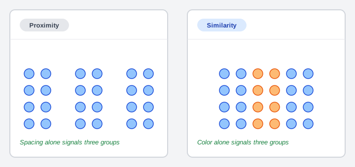 Two different cues — spacing and color — produce the identical perception of three groups.
Connectedness
An explicit visual link — a line, a bar, a shared border — groups the elements it joins regardless of how far apart or different they otherwise look, overriding proximity and similarity rather than working alongside them. An elevator panel makes the case cleanly: when a floor number sits exactly midway between two buttons, spacing can’t resolve which button it labels — but a bar spanning the number and its one intended button removes the ambiguity without moving anything.
An explicit visual link — a line, a bar, a shared border — groups the elements it joins regardless of how far apart or different they otherwise look, overriding proximity and similarity rather than working alongside them.
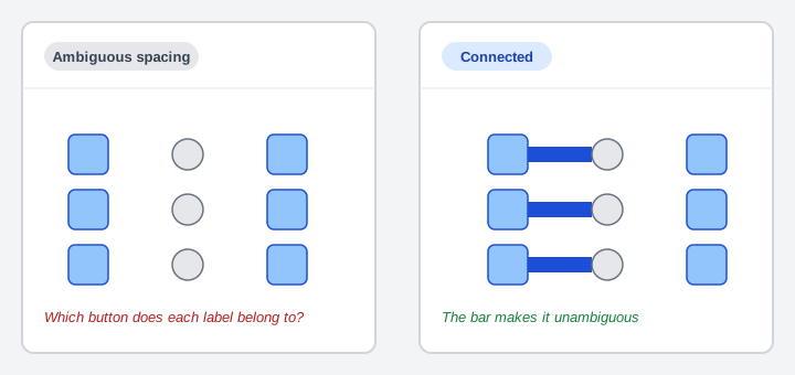 Identical spacing in both panels — only the bar decides which button each label belongs to.
Closure
People mentally complete a shape with visual gaps in it, rather than perceiving the gaps as missing information; the classic example is a logo (the article cites IBM’s) read as a complete word or mark despite literal gaps in its strokes.
 Nothing here draws a complete circle — the missing arcs are filled in by perception, not by the image.
Continuity
Elements arranged along a smooth line or curve are perceived as belonging together, continuing in the direction already established, rather than as separate fragments.
Common fate
Elements that move together (or appear to) are perceived as one group, even if they look nothing alike — the visual-design analog of “things that move together belong together.”
Symmetry
Symmetric elements are perceived as a single coherent unit organized around a center, rather than as independent halves.
Figure–ground organization
Perception splits a scene into a prominent figure and a receding background, never both at once. Clear First Reads‘s “first read” — the one dominant element a visitor’s eye lands on, with everything else receding behind it — is figure-ground organization applied to a Web page, which is also the source of that pattern’s informal use of the word “gestalt” for the page’s overall first impression. Visual Hierarchy generalizes this same figure-ground effect into a full framework (the Von Restorff effect, and four contrast variables beyond just “dominant vs. receding”).
Law of past experience
Ambiguous visual stimuli get categorized according to what a person has already seen before, not from the stimulus alone — the perceptual basis for why Grid Layout‘s placement-expectation research (where customers expect a shopping cart or sign-in link to be) works at all, and the same underlying mechanism mental models describes at the level of a whole interface rather than a single visual stimulus.
Design implications
The source article names interface design directly (radio-button placement — see Form Design for the option-selector guidance this maps onto), alongside cartography and desktop layout design as fields where these principles get applied deliberately. Put plainly: nearly every existing layout pattern that talks about “grouping,” “consistent placement,” or a page’s “focal point” is leaning on one or more of these principles already, whether or not the source material for that pattern named Gestalt psychology explicitly.
Limitations
The theory is criticized as more descriptive than explanatory: it names reliable perceptual effects without a precise, agreed mechanism for why the visual system organizes information this way, and critics note the laws can sound vague when stated loosely (“things that go together, go together”). For design purposes this isn’t disqualifying — the principles are well-replicated descriptions of what people actually perceive, which is what a layout pattern needs, even without a settled account of the underlying neuroscience.
For design purposes this isn’t disqualifying — the principles are well-replicated descriptions of what people actually perceive, which is what a layout pattern needs, even without a settled account of the underlying neuroscience.
Related Concepts
Patterns
Principles
Further reading
Victor Ponamariov’s 50 Tips to Improve User Interface (goodreads.com/book/show/58085971-50-tips-to-improve-user-interface — self-published ebook, no stated license) applies the proximity principle to form layout, and cites Miller’s Law (working memory holds ~7±2 objects) as the rationale for grouping related form fields with clear White Space between clusters.
Scott McCloud’s Understanding Comics: The Invisible Art (1st HarperPerennial edition, 1994; amazon.com/dp/006097625X — commercially published, no stated open license) extends closure to sequential art: readers mentally complete the action that happens in the “gutter,” the blank space between two panels, the same perceptual gap-filling this section describes for a single incomplete shape.
Sources
Gestalt Psychology (Wikipedia) (CC BY-SA) is this page’s source for eight of the nine perceptual-organization principles above (all but Connectedness) and their design applications, including the Von Restorff-effect connection to Visual Hierarchy.
Grouping Elements: Turning Visual Chaos into Intuitive Design is the source for “Connectedness” (the elevator-panel example illustrating that an explicit link overrides spacing) and the Amazon customer-review example added to “Proximity.”