
Quick-Flow Checkout
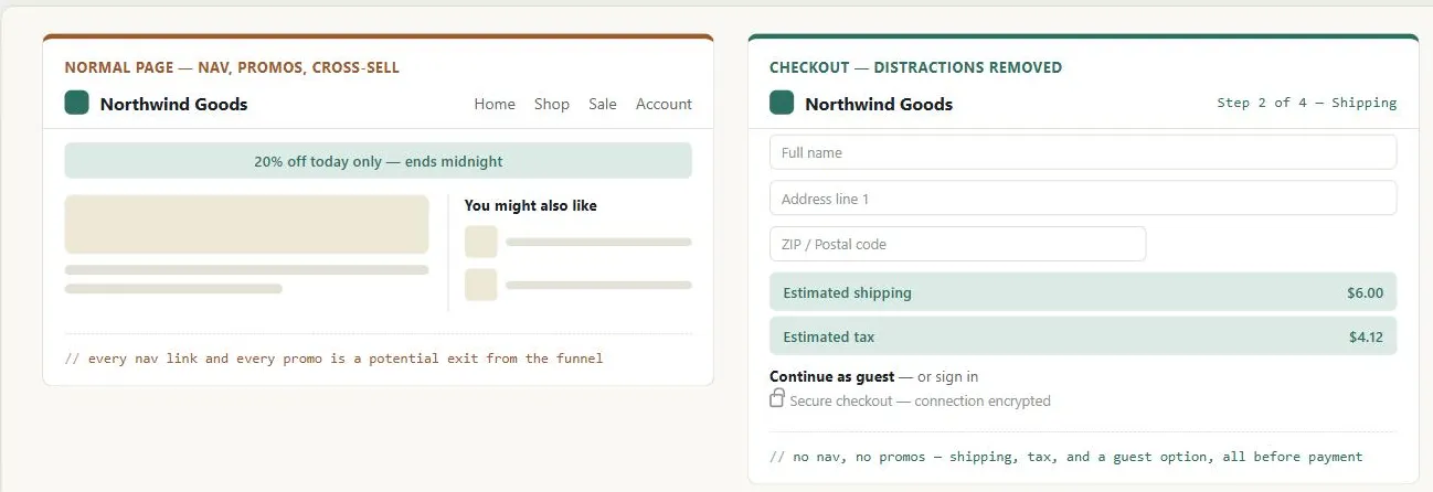 Everything that earns its place on a normal page — navigation, promotions, related items — is exactly what has to disappear once a customer has already decided to buy.
Background
Quick-flow checkout is the canonical instance of the Process Funnel pattern: a fixed page sequence, minimal exit links, a clear action button at each step, and an explicit completion signal at the end. The failure modes documented in Process Funnel — accidental funnel exit, data loss on browser back-navigation — carry direct revenue consequences here. See Shopping Cart for what happens before checkout begins, and Easy Returns for what comes after.
Problem
A customer who reaches checkout has already decided to buy, yet drop-off at this stage is common — almost always caused by friction (tedious data entry, unclear steps) or trust failures (hidden charges, unfamiliar security feel), not by a change of mind.
A customer who reaches checkout has already decided to buy, yet drop-off at this stage is common — almost always caused by friction (tedious data entry, unclear steps) or trust failures (hidden charges, unfamiliar security feel), not by a change of mind.
Solution
The checkout funnel is the most conversion-critical sequence in e-commerce, so the design’s job at this stage is not to persuade but to avoid creating reasons to leave. A handful of principles apply across the whole flow — detailed first, below — before the solution walks through a minimal checkout’s four stages in order: account identification, shipping, order summary and payment, and confirmation.
Eliminate distractions
During checkout, suppress or remove navigation, promotions, and cross-selling that might pull a customer away from completing the flow. Each link that could exit the funnel is an invitation to abandon. This is the opposite of normal page design — content that improves a homepage or product page actively hurts a checkout page.
This is the opposite of normal page design — content that improves a homepage or product page actively hurts a checkout page.
Answer deal-breakers early
Before collecting any personal information, make available: shipping costs and options, a tax estimate, the return policy, stock and availability status, and gift-wrapping options if relevant. A customer who discovers an unexpected charge or a surprising policy at the payment step will often abandon. Request information in order of least to most personal — shipping options first, full billing address only once that decision is resolved.
Offer a guest account path
Requiring account creation before checkout is a primary abandonment cause. A guest option — or the ability to create an account after completing the purchase — captures the sale first and preserves the chance to convert the customer into an account holder later.
Build trust progressively
Display a visible Privacy Policy link and a secure-connection indicator (HTTPS lock) at each step that collects sensitive data. These signals matter most at payment entry, where security concern peaks, but should also be present at address entry. Completion is also a natural moment to offer an opt-in sharing choice — see Privacy Preferences for the pattern of surfacing that choice right after checkout rather than only in account settings.
Recap before submission
The step immediately before payment confirmation shows the complete order: items, shipping address, shipping method, payment method, all charges (items, shipping, tax, total), and gift options. An edit control on each section lets customers correct mistakes without losing the data they’ve already entered. Make unmistakably clear that the order has not yet been placed.
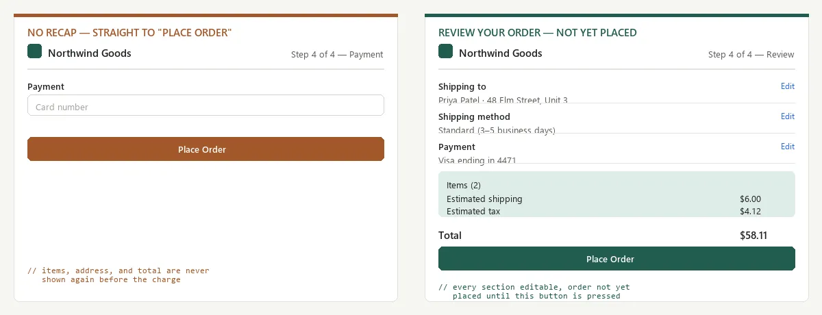 A customer asked to trust a total they’ve never seen has only the button’s wording to go on.
Identify the account
Offer guest checkout or login as the first step; let new customers register after purchase instead of before, per Offer a guest account path above.
Select the address
For returning customers, show stored addresses at the top so they don’t have to retype. For new addresses, use a single-column form with a minimal field set: Name, Address 1, Address 2, City, State/Province, Zip/Postal Code, Country, Phone. Right-align labels and left-align inputs on the same vertical grid line. Show meaningful validation errors near the relevant field, not in a banner. A single “Use This Address” action button confirms the selection.
Choose a shipping method
Show all options via radio buttons or a pick list, with delivery time range and cost visible for each simultaneously. Update the order total automatically when the customer changes their selection so they can make an informed cost/time tradeoff without leaving the page. Email notification if a delay occurs after purchase, giving the customer the option to cancel or update.
Collect payment
Display a privacy policy link and a secure-connection indicator. For returning customers, list stored cards by last four digits — they can select without re-entering full card numbers. New card entry uses the same minimal-fields principle as the address form. Place gift certificate and promotion code redemption at the payment step, not earlier and not later — a customer who discovers at payment that they can’t use a coupon will often exit the funnel.
Show the order summary
Show all information entered: shipping address, shipping method, items with quantities and prices, payment method. Each section has an edit control. Show all charges: item subtotal, shipping cost, tax, and total. The “Place Order” / “Complete Order” button appears above the fold without scrolling and again below the full summary, since customers often want to review everything before they commit. A progress indicator or step heading must make clear the order is not yet placed.
Confirm and thank the customer
Thank the customer clearly and immediately. Show the order number and order date prominently — these are what the customer needs if anything goes wrong later. Reproduce the full order summary. Send a parallel email confirmation. Make the page printable. Cross-selling at this stage is genuinely secondary and can be well-received: the transaction is complete, the customer is in a positive state, and a relevant product suggestion (accessories for what they just bought) lands differently than in-funnel promotion. A confirmation this clear and reassuring is worth the extra design attention beyond what a purely functional receipt would need: by the peak-end rule, the whole checkout flow is remembered largely by how it ends, regardless of any friction earlier in the funnel.
the whole checkout flow is remembered largely by how it ends, regardless of any friction earlier in the funnel.
Related Concepts
Patterns
- Process Funnel
- Form Design
- Shopping Cart
- Order Tracking and History
- Action Buttons
- Multiple Destinations
- Gift Giving
- Easy Returns
- Cross-Selling and Up-Selling
- Above the Fold
- Privacy Policy
- Privacy Preferences
Principles
Further reading
Schade, Cheng, and Sherugar’s Top 10 Enduring Web-Design Mistakes (Nielsen Norman Group, 2016 — copyright NN/g, no open license; https://www.nngroup.com/articles/top-10-enduring/) names “hidden fees and prices” — costs revealed only after a customer advances through several steps of a checkout or signup flow — as one of ten recurring mistakes, corroborating this page’s own “answer deal-breakers early” principle.
Sources
The Design of Sites: Pattern Group F — Basic E-Commerce (F1, F4–F8) is this page’s sole source — the four-stage checkout structure, the distraction-elimination and deal-breaker-disclosure guidance, the guest-checkout option, and the per-step address/shipping/payment/summary/confirmation detail all come directly from that pattern group.