
Motion Design
Motion in an interface communicates what changed, why, and what to expect next — an element that appears, moves, or disappears carries meaning about state and hierarchy that a static change alone doesn’t convey. Motion is cross-cutting rather than tied to one pattern: the guidance below applies to any component that transitions between states, not to a single page section.
Motion in an interface communicates what changed, why, and what to expect next — an element that appears, moves, or disappears carries meaning about state and hierarchy that a static change alone doesn’t convey.
Choose motion for a specific communicative purpose
Before deciding how an element moves, decide why it’s moving at all. A motion should serve one of three purposes:
- Drawing attention to an element or a change.
- Defining or reinforcing a spatial relationship between two states — an image that expands to fill the screen while keeping one or two edges in place reads as the same surface growing, not a jump to a new one.
- Establishing atmosphere or character consistent with the product’s own purpose — an exaggerated swipe gesture on a confirm/reject choice reinforces a playful tone in a way a bank’s transaction confirmation shouldn’t.
A product built around trust and precision can reasonably use less motion overall than one built around playfulness — the same restraint that would read as a missing purpose in one context reads as deliberate credibility in another.
Motion can fail in either direction. Too much motion for too little reason undermines an interface’s credibility — a distinct failure from overusing the loud, expressive register specifically (see Reserve expressive motion for occasional, high-attention moments below). Too little motion is a real failure mode too: an interface with a deep or complex hierarchy that relies only on an instant crossfade between screens gives up motion’s ability to reinforce spatial relationships, leaving users to reconstruct how deep they are in the structure from static cues alone.
Reserve expressive motion for occasional, high-attention moments
Interfaces need two distinct motion styles. Productive motion creates a sense of efficiency and stays subtle and out of the way — appropriate for moments when the user is focused on completing a task, such as button states, dropdowns opening, revealing additional information, or sorting table rows. Expressive motion delivers enthusiastic, vibrant, highly visible movement — reserved for significant moments such as opening a new page, clicking a primary action button, or a system alert appearing, where the movement itself is part of what’s being communicated. Because expressive motion draws attention specifically by contrast with the more common productive style, using it too often erodes its own effect — default to productive motion, and spend expressive motion only where the moment genuinely warrants the emphasis.
Because expressive motion draws attention specifically by contrast with the more common productive style, using it too often erodes its own effect — default to productive motion, and spend expressive motion only where the moment genuinely warrants the emphasis.
Use physically-inspired easing curves, never linear or bouncy motion
Strictly linear movement reads as unnatural to the eye. Elements should speed up quickly and slow down smoothly, as though obeying the physics of a lightweight material — avoid easing curves that suggest bounce, stretch, or a sudden stop, since those read as decorative rather than purposeful. Three easing curves cover most cases:
- Standard easing — for an element that’s already visible from the start to the end of a motion, such as an expanding tile or reordering table rows.
- Entrance easing — for an element newly introduced to the view: a modal or toast appearing, a dropdown opening, a toggle switching. The element appears quickly and slows to a stop.
- Exit easing — for an element being removed from view, such as a closing modal or toast. The element speeds up as it leaves, signaling that its departure is permanent. Exception: an element that leaves the view but stays nearby, ready to reappear on request (e.g. a side panel), should use standard easing instead — the smooth slow-down implies it’s coming to rest just out of view rather than leaving for good.
Draw on classic animation principles to reinforce physical realism
Beyond the easing curves above, a handful of techniques developed for hand-drawn character animation reinforce that a moving object has real mass and inertia:
- Never let an object simply appear or vanish. An object should always arrive from, and depart to, somewhere — nothing in the physical world just pops into or out of existence. This is the same conclusion the easing curves above already reach (an entering or exiting element eases rather than cutting instantly), restated as the underlying physical reason for it.
- Squash and stretch. An object should visibly compress along the direction of impact when it lands or is struck, and stretch — compressing in its direction of travel — when it accelerates rapidly, in both cases while keeping its apparent volume constant, so it reads as a flexible material rather than a rigid shape abruptly changing size. This deforms the object’s own shape rather than its motion’s timing curve, so it doesn’t conflict with Use physically-inspired easing curves, never linear or bouncy motion above, which is about the shape of the timing curve itself.
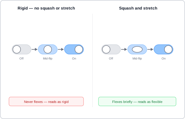 The only difference between the two is the thumb’s shape at the midpoint — everything else about the motion is identical.
- Motion blur. An object moving more than roughly half its own length within a single frame should blur along its direction of travel rather than render sharp — a sharp fast-moving object strobes instead of reading as continuous motion. The blur doesn’t need to be photorealistic to work.
- Anticipation. A small counter-movement in the opposite direction, just before the main motion begins, prepares the eye for what’s about to happen and where — the interface equivalent of a dancer bending their knees before a jump. A faster main motion needs more anticipation, since a quick movement with no lead-in is easy to miss.
- Follow-through. A secondary part attached to something that just stopped should keep moving briefly afterward, at its own rate, rather than the whole assembly halting at once. Momentum scrolling — where content keeps drifting briefly after a swipe ends instead of stopping the instant contact lifts — is the direct interface analog.
- Arcs. Let an object’s path curve gently rather than travel in a straight line wherever the motion has a real-world physical analog — a swinging limb or a thrown object naturally arcs, and only rigid mechanical motion is genuinely straight-line. This is the same instinct behind the rounded-corner paths described under Choreograph multiple elements as one coherent movement below, generalized to any single object’s motion rather than just a staggered multi-element sequence.
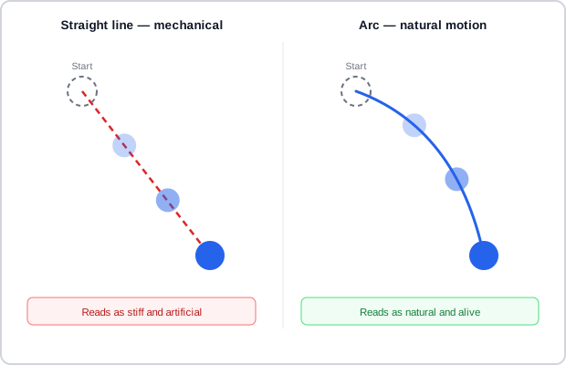 Same start, same end — only the shape of the path between them differs.
Scale duration to the size of the motion
Duration should be dynamic based on the size of the animation: the larger the distance traveled or the change in scale, the longer the motion should take, so perceived speed stays consistent across differently-sized elements. Productive motion runs significantly faster than expressive motion covering the same distance. Large or full-screen transitions should rely on continuous shared elements to help the user track what moved, rather than relying on duration alone.
Choreograph multiple elements as one coherent movement
When several elements move together, treat that as a single choreographed sequence instead of independent, unrelated animations:
- Move along the grid, not diagonally. Stagger horizontal and vertical movement so a path traces a rounded corner along the grid rather than cutting a straight diagonal across it — a diagonal path breaks the grid and reads as harsh. Apply the same rounded-corner logic when sorting or reordering items; criss-crossing diagonal paths read as disorganized.
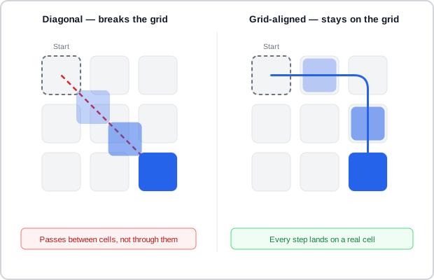 Same start, same end, same distance — one path only ever touches real cells, the other doesn’t touch any.
- Give elements that mean the same thing the same motion. If two elements convey the same meaning or serve the same function elsewhere in the product, animate them with the same style and easing, even if their size difference calls for a different duration — this reinforces what the motion means and builds the user’s proficiency with the interface. Conversely, use different motion to distinguish elements that look similar but occupy a different spatial relationship: content stacked in a layer above should slide in while dimming what’s beneath it, while content on the same layer should push and reveal via a mask.
- Reserve inconsistent motion for a genuine change in meaning. Deliberately breaking a motion convention — for example, reversing an entrance motion for a cancel action instead of a confirm action — signals that two visually similar actions are semantically different. Use this sparingly, only when the inconsistency itself is communicating something real. Forward and back navigation through a hierarchy are exactly this kind of genuine difference, so they should animate as opposite motions (e.g. slide left to go deeper, slide right to return) — sliding both directions the same way is a common failure that breaks the user’s sense of which way they’re moving through the hierarchy.
- Distribute entrances over time instead of introducing everything at once. Staggering the entrance of multiple elements (e.g. table rows loading in roughly 20ms apart) reduces cognitive load compared to everything appearing simultaneously, without letting the total sequence run long enough to feel sluggish. Sequence content by importance — load stable, static content such as headers first, and the most important actionable content (a primary button, a calculation result) last, so the sequence itself directs the user’s attention toward what matters most.
- Use shared elements to carry continuity across screens. An element present on both the before and after screen (a title panel, a button) should transition smoothly between them to guide the user through a multi-layered structure — but a continuity element should never distract from the sequence finishing on the actually important content.
Always provide a non-motion fallback for the same information
A meaningful share of users have impaired vision or an impaired ability to perceive or handle motion, and not every device can render every animation smoothly regardless of how essential the motion feels to its design. Never make a transition the only way a state change is communicated — offer a simplified or reduced-motion alternative, particularly on mobile and tablet, and make sure whatever the motion conveys is also stated statically. This is the same underlying principle as any other Accessibility accommodation: motion is a layer added on top of a state change, and the state change itself must remain understandable without it.
Never make a transition the only way a state change is communicated — offer a simplified or reduced-motion alternative, particularly on mobile and tablet, and make sure whatever the motion conveys is also stated statically.
Related Concepts
Principles
Further reading
Bay-Wei Chang and David Ungar’s original 1993 paper, Animation: From Cartoons to the User Interface (dl.acm.org/doi/10.1145/168642.168647 — Copyright © 1993 ACM, free to read but permission granted only for personal/classroom use, not an open license), develops the Solidity/Exaggeration/Reinforcement framework at full length against the authors’ own “Self” object-interface testbed, including a technique this page doesn’t cover: fading a newly-active object to the front of a stack of overlapping objects rather than snapping its stacking order instantly.
Frank Thomas and Ollie Johnston’s The Illusion of Life: Disney Animation (amazon.com/dp/0786860707 — Abbeville Press, 1981, commercially published, no stated open license) is the original full-length treatment of the twelve principles 12 Basic Principles of Animation (Wikipedia) summarizes, developed through the authors’ own decades of Disney animation work and film examples well beyond what a summary article can cover.
Smashing Magazine’s Smart Transitions in User Experience Design (smashingmagazine.com/2013/10/smart-transitions-in-user-experience-design — copyright Smashing Magazine, no stated open license) argues an interface should never swap states as abruptly as nothing does in the physical world, with examples including a pull-to-refresh gesture and a progressively-disclosed multi-step form.
Pasquale D’Silva’s Transitional Interfaces (medium.com/@pasql/transitional-interfaces-926eb80d64e3 — copyright the author, no stated open license) proposes easing a list into the space made for a newly-inserted item rather than having it pop in instantly, and argues that expanding a tapped list item inline, rather than sliding to a fully separate view, can remove the need for a hierarchical breadcrumb trail altogether.
Sources
Carbon Design System: Accessibility, Content, Color, Motion, Spacing, and Icon Guidelines (IBM) (Apache License 2.0) supplies the productive-vs-expressive motion-style distinction, the three named easing curves, duration-scaling-by-size, and the multi-element choreography rules (grid-aligned paths, semantic consistency, staggered entrances, continuity elements across screens).
12 Basic Principles of Animation (Wikipedia) (CC BY-SA 4.0) supplies the object-level realism principles — squash and stretch, anticipation, follow-through, and arcs — distinct from Carbon’s page-level easing and choreography guidance.
Animation in the Interface (CMU 05-430 Programming Usable Interfaces, Lecture 22) (used with the author’s permission) supplies the same squash-and-stretch/anticipation/follow-through/arcs principles under its own Solidity-Exaggeration-Reinforcement framing, plus motion blur and the never-simply-appear-or-vanish rule.
Applying Animation: An Independent Study on Motion in Mobile App Interfaces (used with the author’s permission) supplies the three-purpose framing for why an element moves, the forward/back direction-reversal rule, and the underuse failure mode alongside the overuse one.